This is one of the longest journals I’ve ever done. And I think it my represent a turning point in my work. Strap yourselves in. This is going to be a big one.
This is a continuation from this journal I wrote last week https://johnhawk.art.blog/2019/11/29/painting-101-week-3/ So if you wnat read that first then go ahead.
What I’ve been doing
I have, as I have been trained, trying to record my working. It’s somethin teachers like, or that they at least say they like. I never seem to get praise or better marks for it.
Anyhow here is the work I made last week.
But rather than just show what I did and say how I feel about it. I want to use this journal to to show I’ve been working on trying to find the best way to record my drawings. Using both my camera and the art-block scanner in differnt ways to see what works. To show I have been experimenting, not just in drawing, but in my recording too.
For each drawing I will show the differnt versions, say what I took it on, and if I can remember, what i did to make them the way they are (There’s a lot I’ve forgotten).
I hope this will show that I am engaged with the project, and still trying out new things to improve my recording.
Firstly I start with just doodling what I imagined in my head using the coloured pencils. The results were surprisingly on point. I felt no need to correct them or try again.
I then followed them with simple thumbnails to figure out the actual composition and make the details a little stronger.
The doodles and thumbnails.
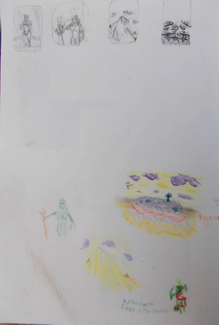
Taken with my camera
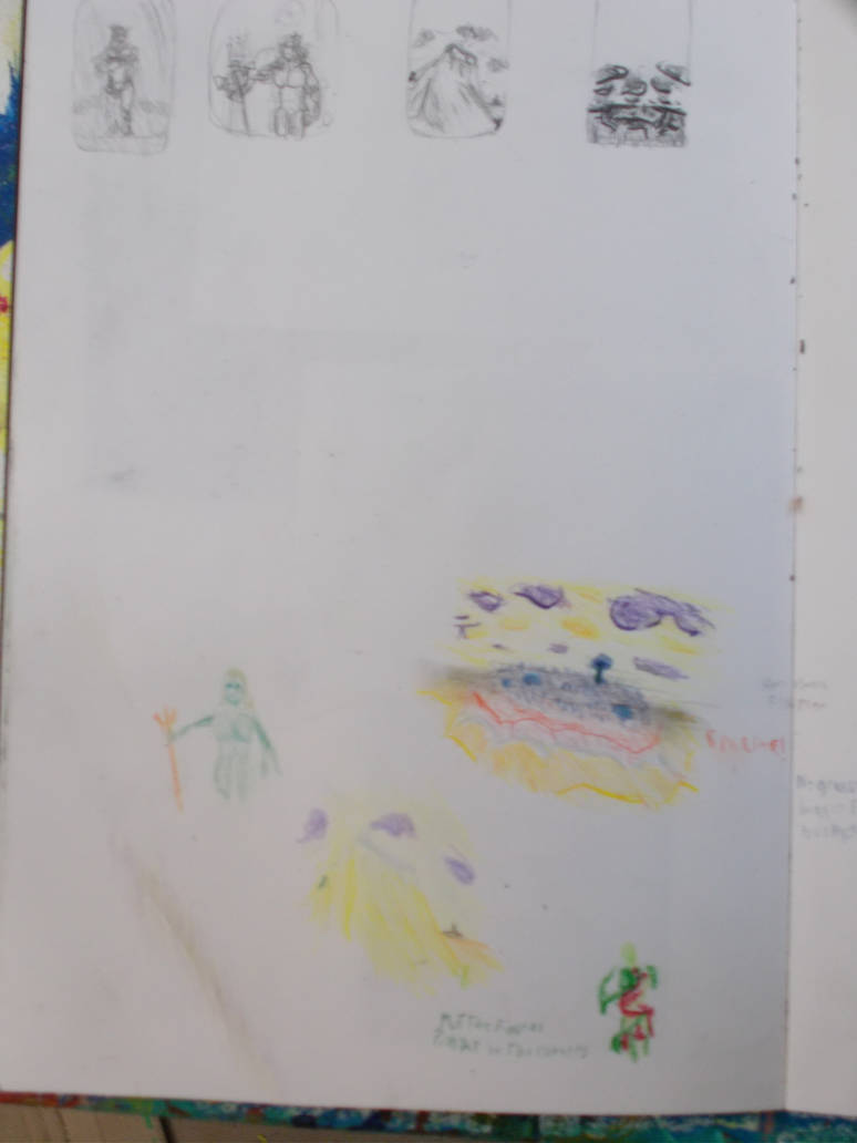
Taken with my camera from further away. No improvement.
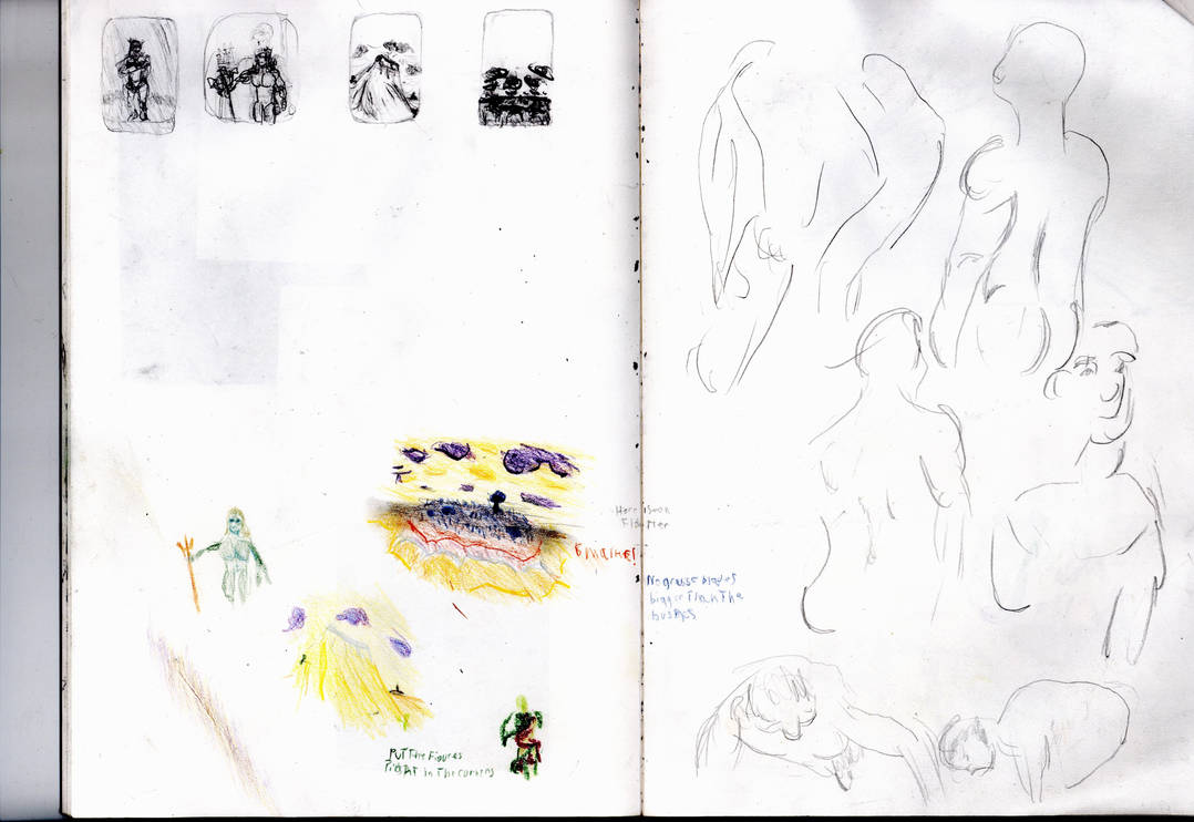
Taken with scanner. Looks a lot better, But maybe too bright.
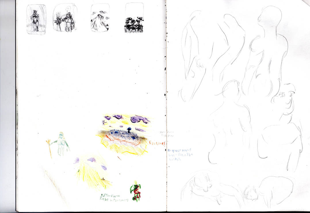
Taken with scanner. Way too bright.
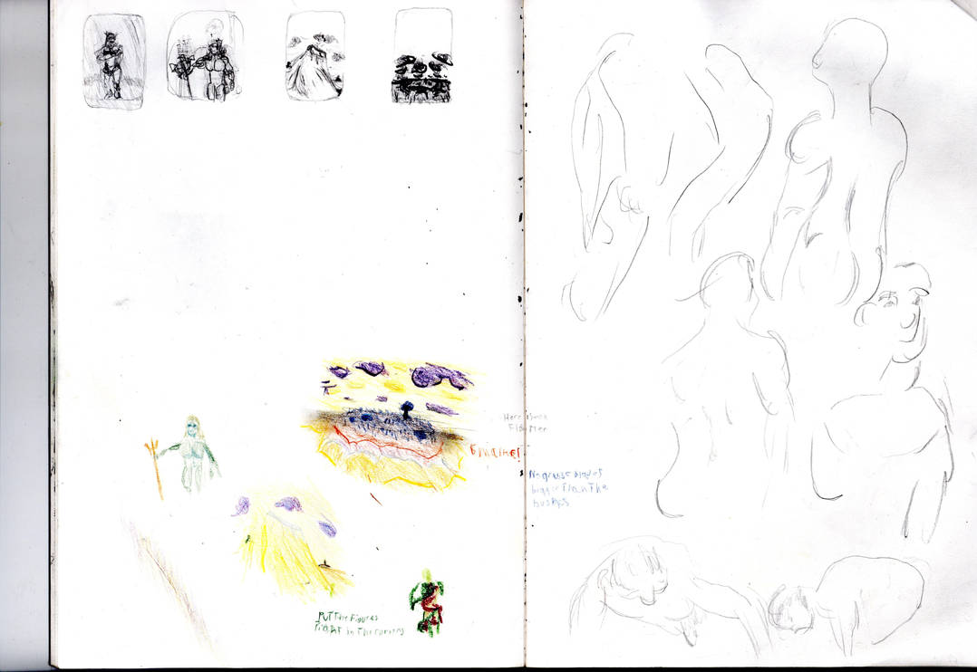
Taken with scanner, trying to aim for a mid-point between the other two.
Individual doodles: The New Eve
Taken with my camera
Taken from my camera closer up.
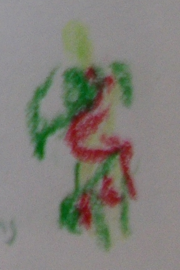
Taken from my camera as close as I could get and with better focus.
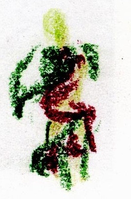
Taken with scanner.
I love how the texture comes out. But the red and the main green are way too dark. And the light green doesn’t quite look right. The colours in the photos are in the dark and slightly washed out. But they look right and look how they do in the real world.
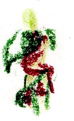
Taken with scanner at a brighter setting. Kinda better. But the colours are still wrong. Maybe it’s a contrast thing.
The New Adam
Taken with my camera. Forgetting to focus.
Taken with Camera. No better.
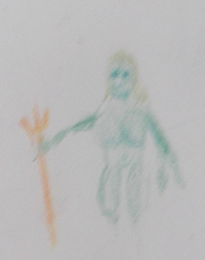
Taken with Camera. Focusing a little (I think)
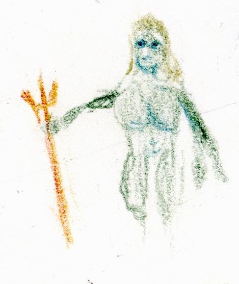
Taken with scanner. Colours are good. But it’s too harsh. Like bits of it have been shaved off. It’s good. But It’s not right.
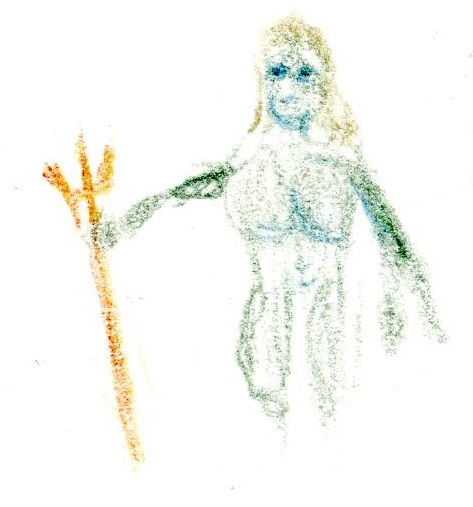
Taken with scanner at a brighter setting. Linework looks better but even more detail is missing. I don’t get this.
The Wave
Taken with my camera. Forgetting to focus
Taken with Camera. No better.
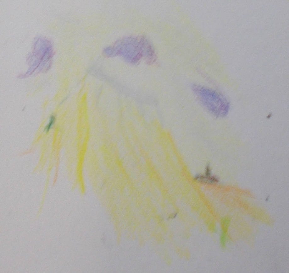
Taken with camera. More focus. Closer up. A little better.
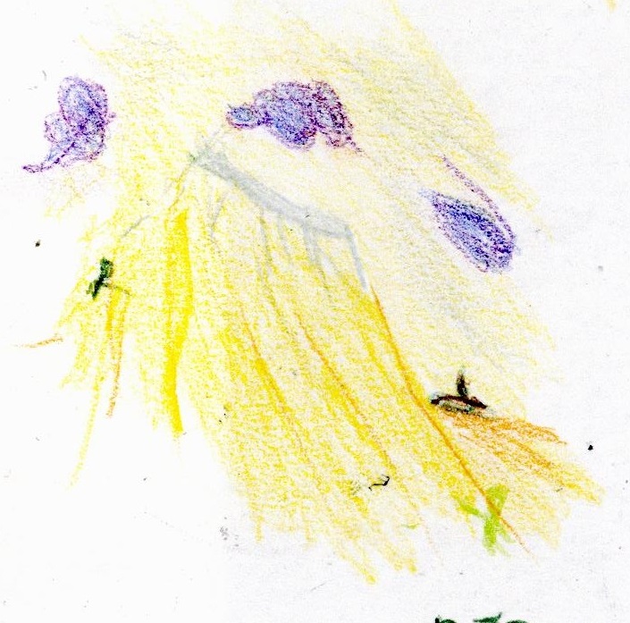
Taken with scanner. At first it looks so much better. But the colours slightly off, The wave and sea are too close in colour. The figure on the right seems to be a bit too sickly. The island and figure on the left and too dark. And the colours in the clouds are too separated. It’s like the colours have been smooshed together and the fine details done with dark colours get extra darkened. I hope it doesn’t seem like I’m ungrateful. It just the scanning seems so good at first it makes the imperfections stand and so much more to me.
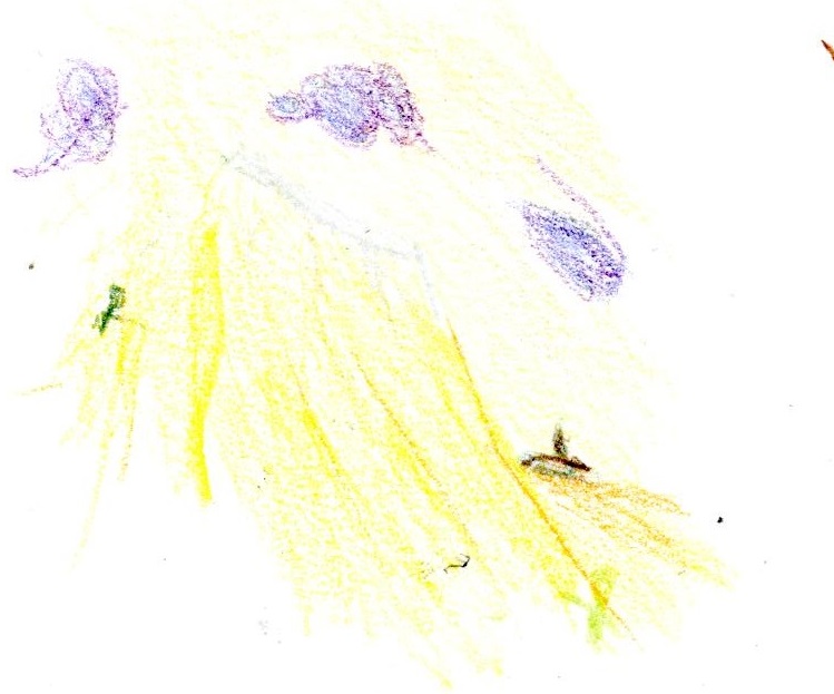
Taken with scanner. Waaaay too bright. It’s a sensitive tool.
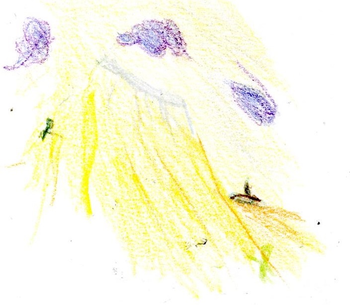
Taken with scanner, trying to aim for a mid-point between the other two. The colurs are almost right now. But a lot of detail is still missing.
The Fixed Land
Taken with my camera. Forgetting to focus.
Taken with camera. No better.
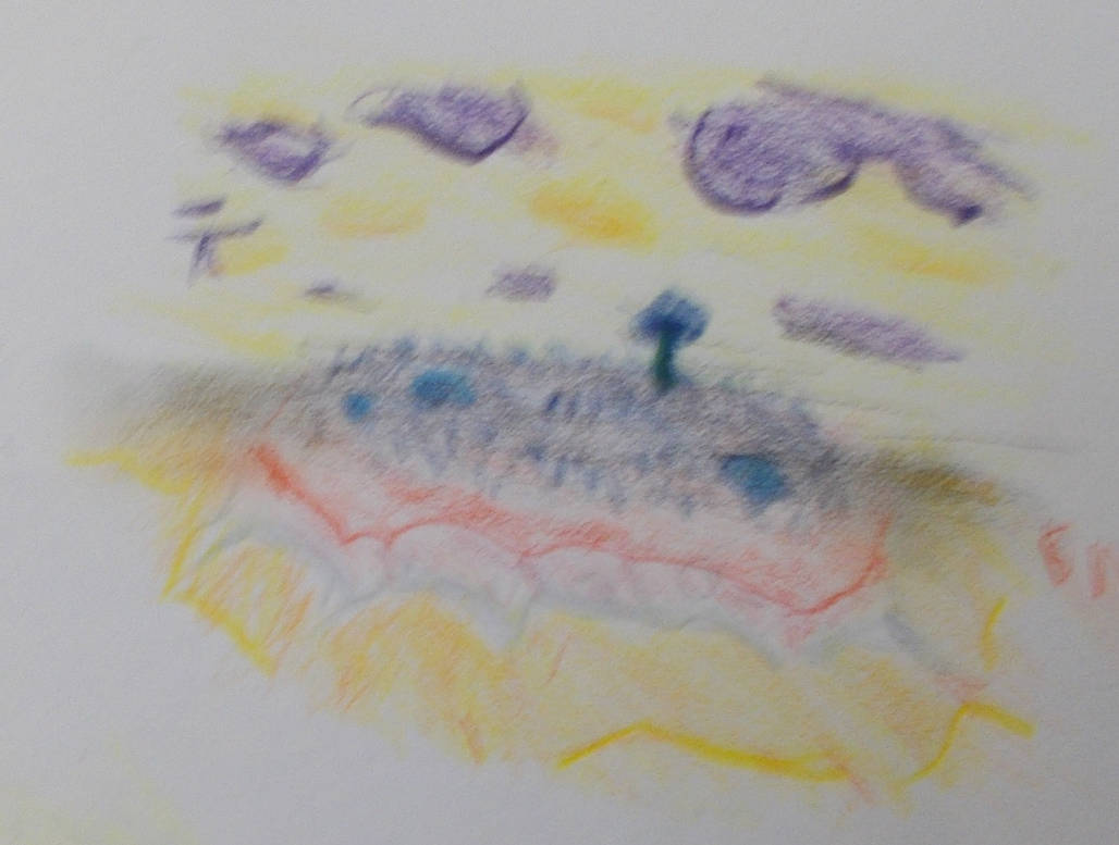
Taken with camera. Actual focus. Slightly better.
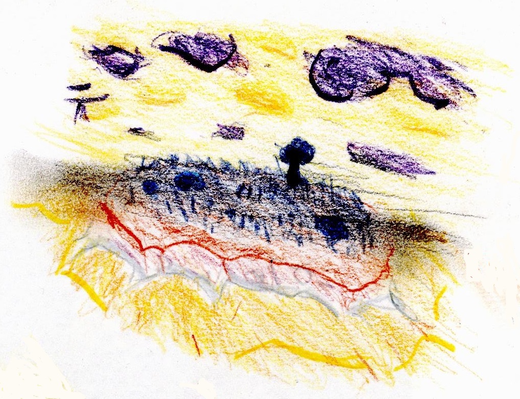
Taken with scanner. The slight colours look great and the details come out so much stronger than in the photographs. But again the dark colours are too dark. So nearly perfect.
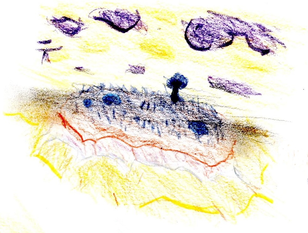
Taken with scanner at a brighter setting. It makes the colours less blocky, which I like. But it phases some of the lightest colours out and the dark parts are even darker. Urgh.
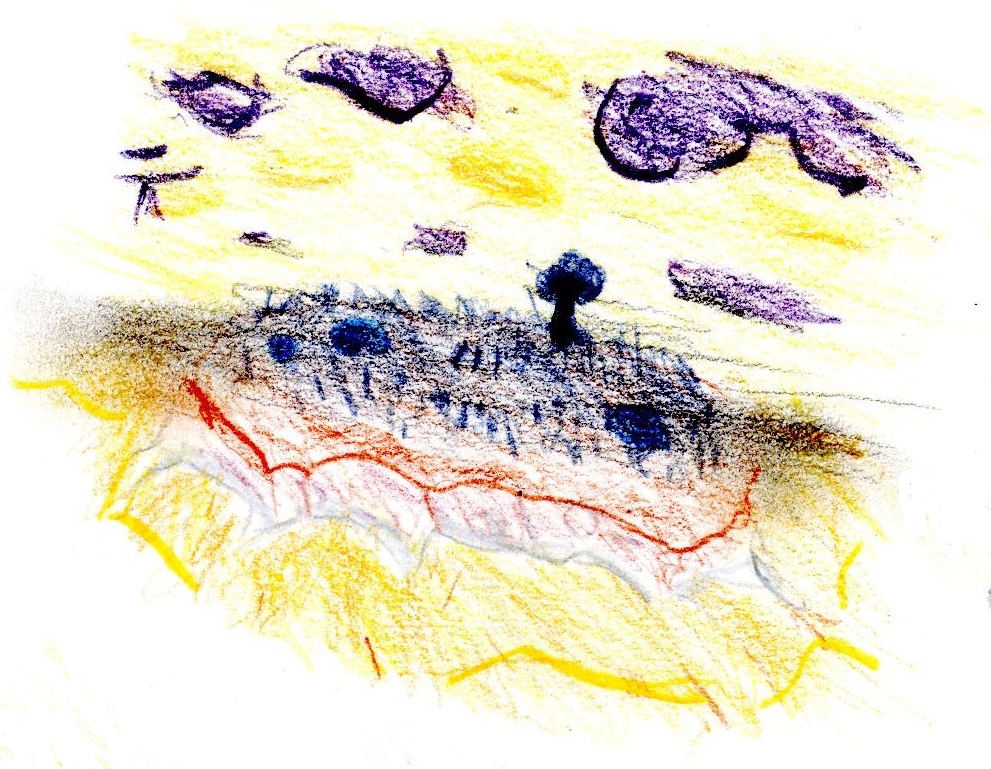
Taken with scanner, trying to aim for a mid-point between the other two. I guess it looks okay. It doesn’t hit a sweet spot though. The scanner really struggles when there is light and dark colours or shades on the page at once. It can do both very well. But it can’t do both at the same time. The fact it sometimes makes the darks darker really doesn’t help.
The Thumbnails
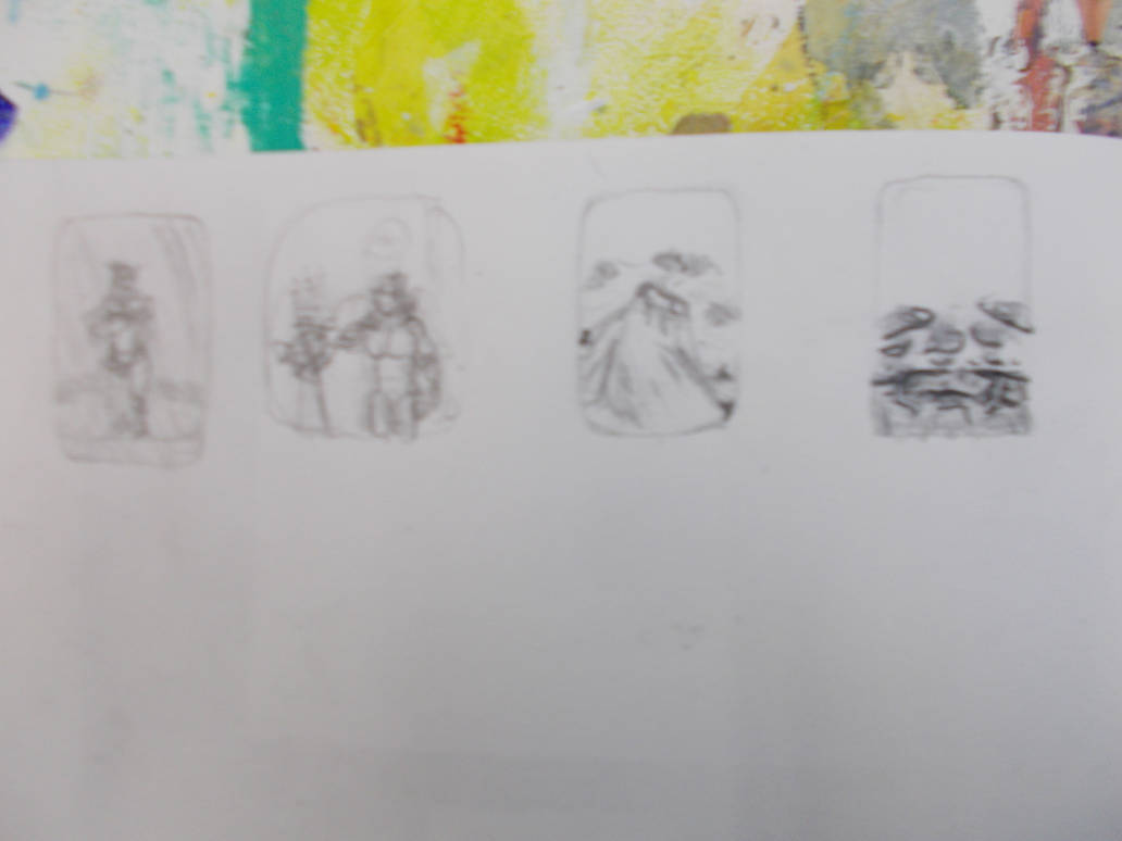
Taken with my camera
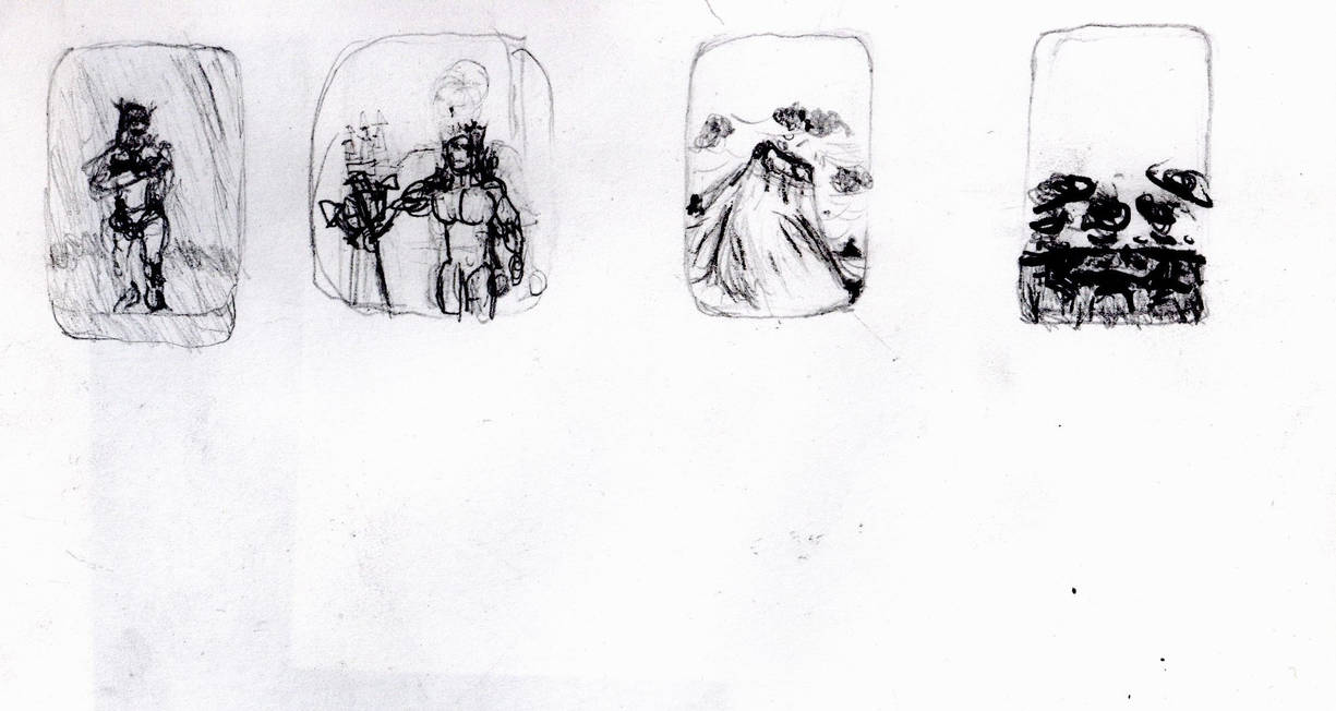
Taken with scanner. A lot better. But it makes the dark lines too dark. The wave (The one with the least dark lines) looks the best.
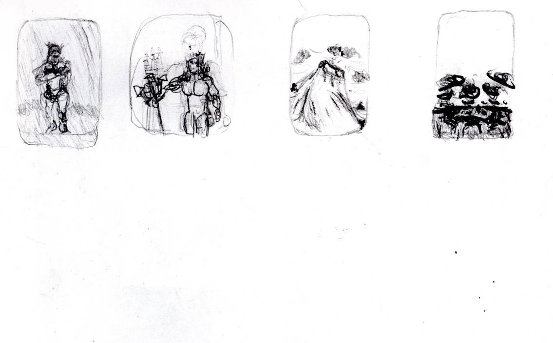
Taken with scanner at a brighter setting. For some reason it looks better here.
Individual Thumbnails: The New Eve
Taken with my camera. An awful lack of focus.
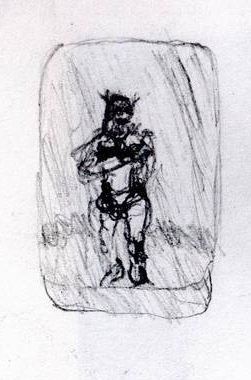
Taken with scanner. Again. great Focus. But the dark bits are too dark.
The New Eve
Taken with my camera. An awful lack of focus.
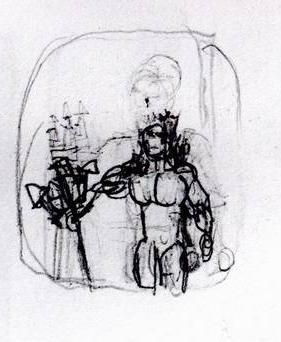
Taken with scanner. More focus. Dark bits still too dark.
The Wave
Taken with Camera. Awful lack of focus. But the black coloured pencil makes it stand out better.
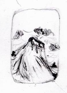
Taken with scanner. This one also looks better and I don’t know why.
The Fixed Land
Taken with camera. My hands must have been shaking hard.
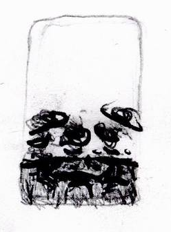
Taken with scanner. Both times this was the worst one. Why? Was it just the worst thumbnail? There must be some more technical reason?
With that done I started making test drawings, to iron out the kinks and figure out the details.
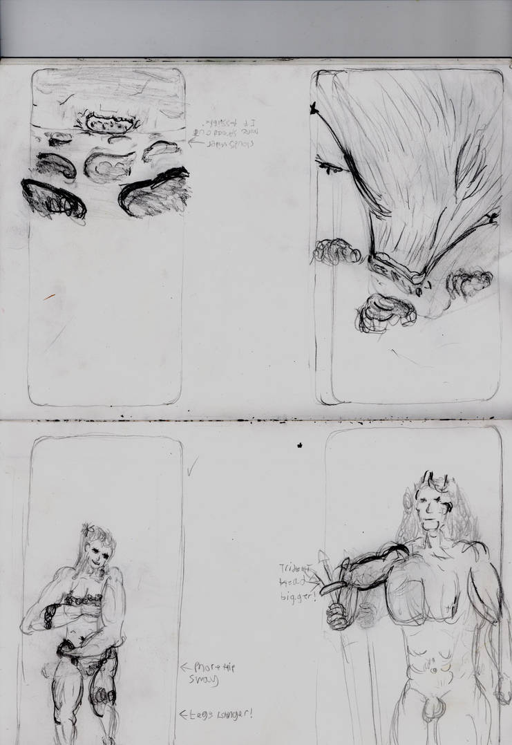
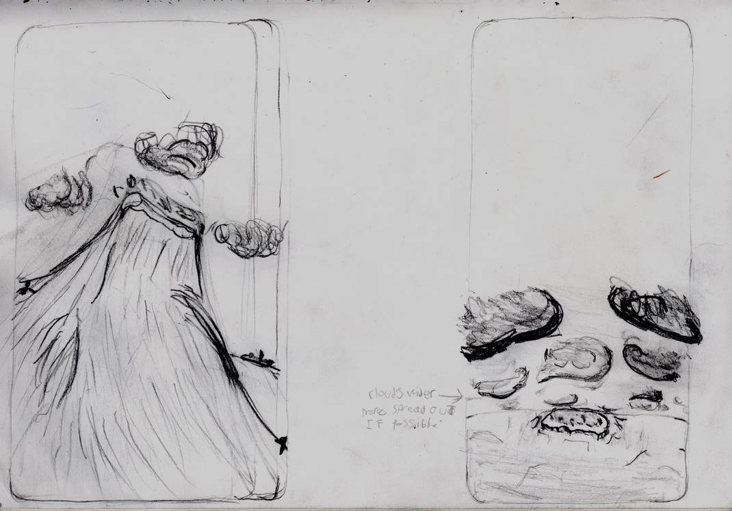
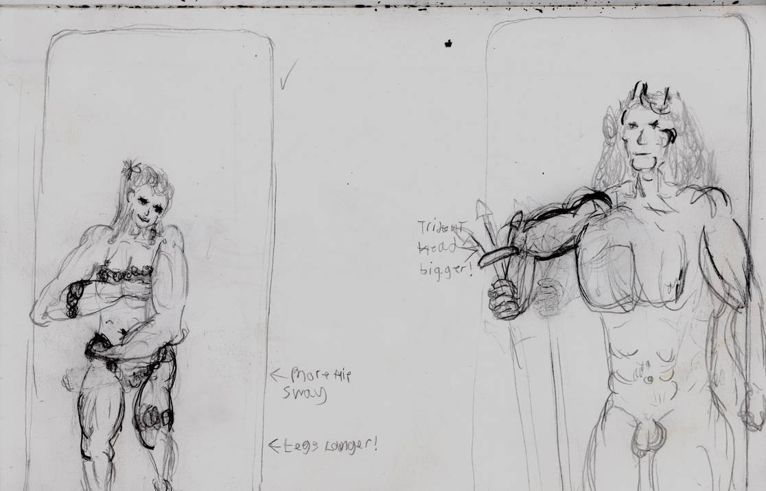
All taken with Scanner. Darkened compared to the scans of coloured drawings.
I think this process helped enormously. Yes the thumbnails gave me a lot to work with. But this let me understand how these would need to change to fit the greater detail of a larger scale.
They were also extremely useful for taking notes for my future self when making future versions of these. A trend I have and will keep using.
I started off with The New Eve
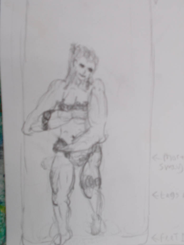
Taken with camera kinda blurry.
Taken with camera. Even worse.
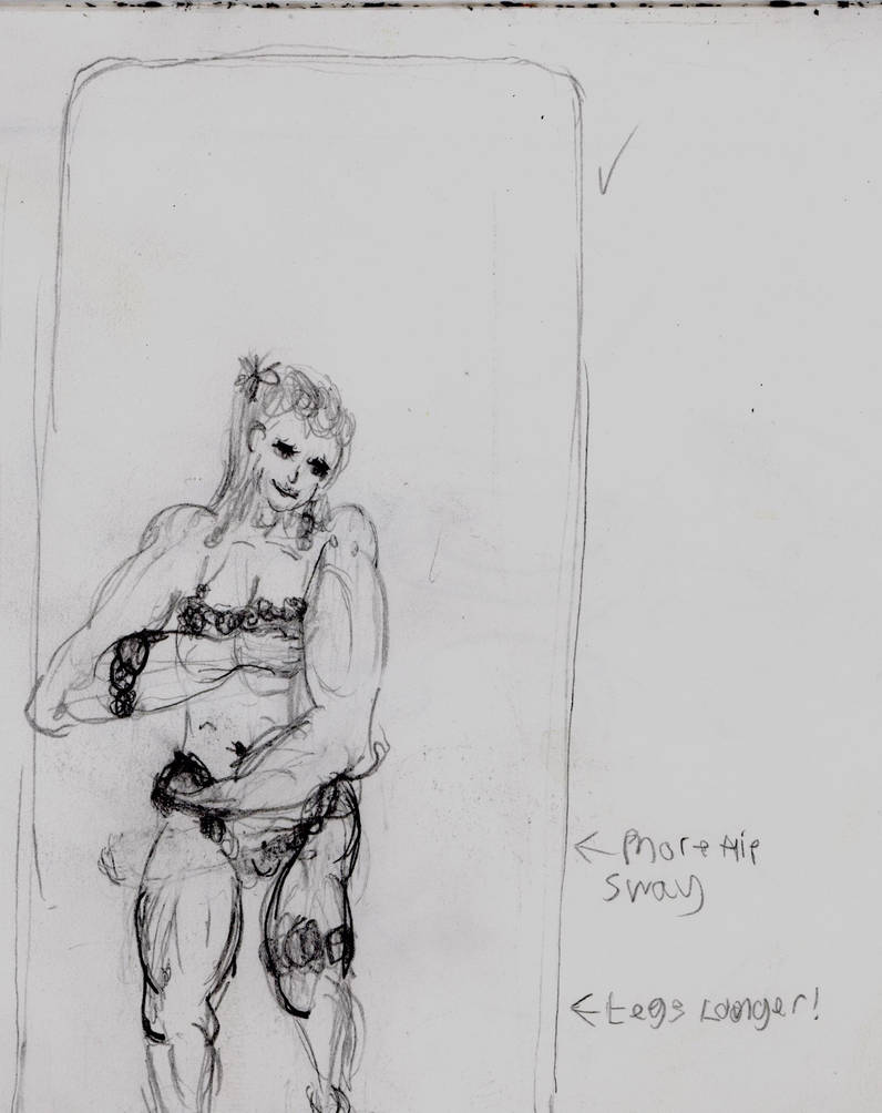
Taken with scanner. Objectively better.
The New Adam
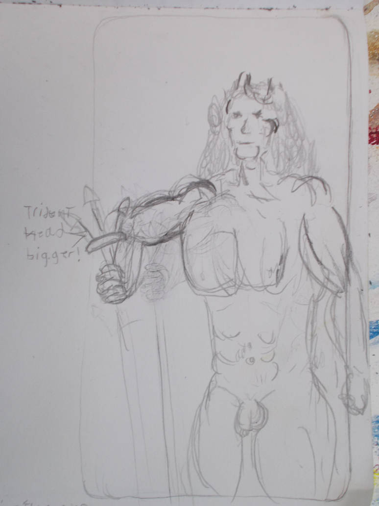
Take with camera. Pretty good.
Stronger lighting but Not as good.
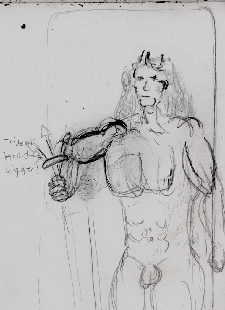
Taken with the scanner. Best one. But I wonder if it over-dramatizes the difference between the light and the dark lines. Ironic considering how it smooshes colours together (As we’ll see later)
The Wave
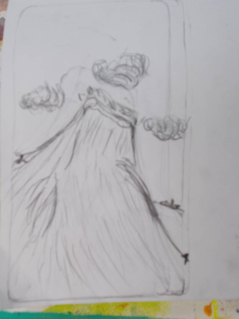
Taken with camera. Little blurry.
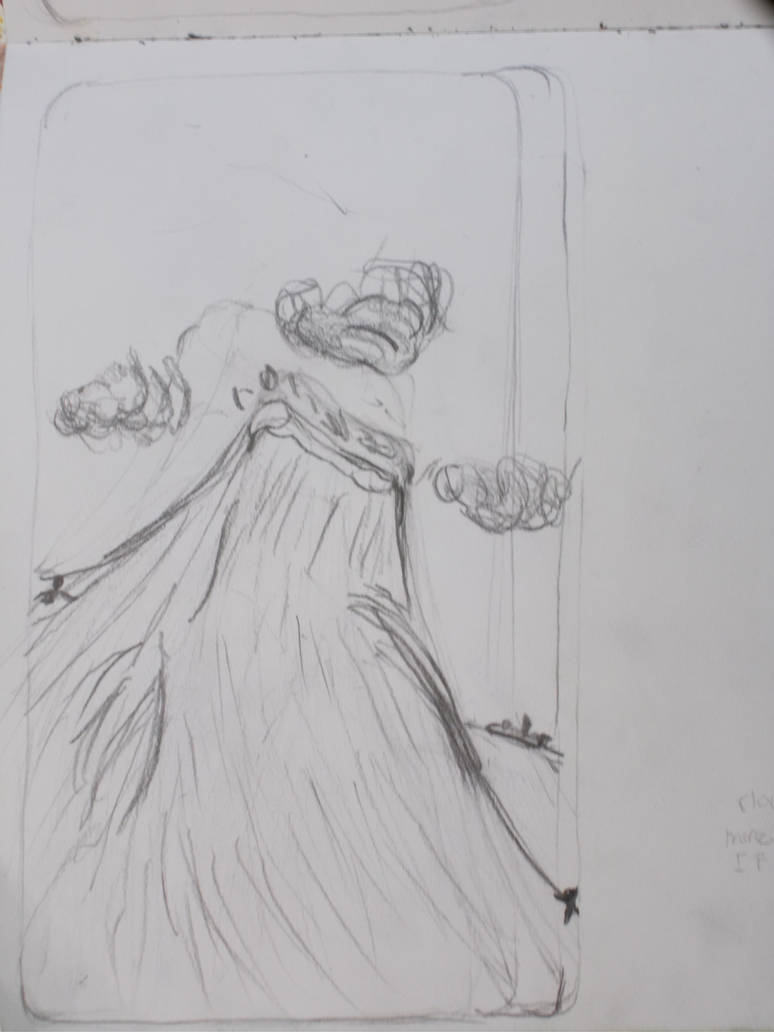
Taken with camera. A lot better. Must have been using a better focus.
Taken with camera. Again, at some point my experiments with the camera made things worse.
Best one taken with the camera. Or at least the clearest. Not sure why.
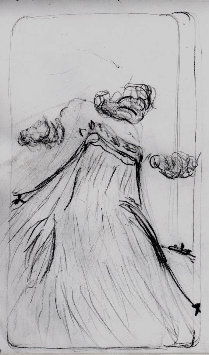
Taken with scanner.more defined. And certainly has more weight to it. But the feeling of depth is lost a little.
The Fixed Land
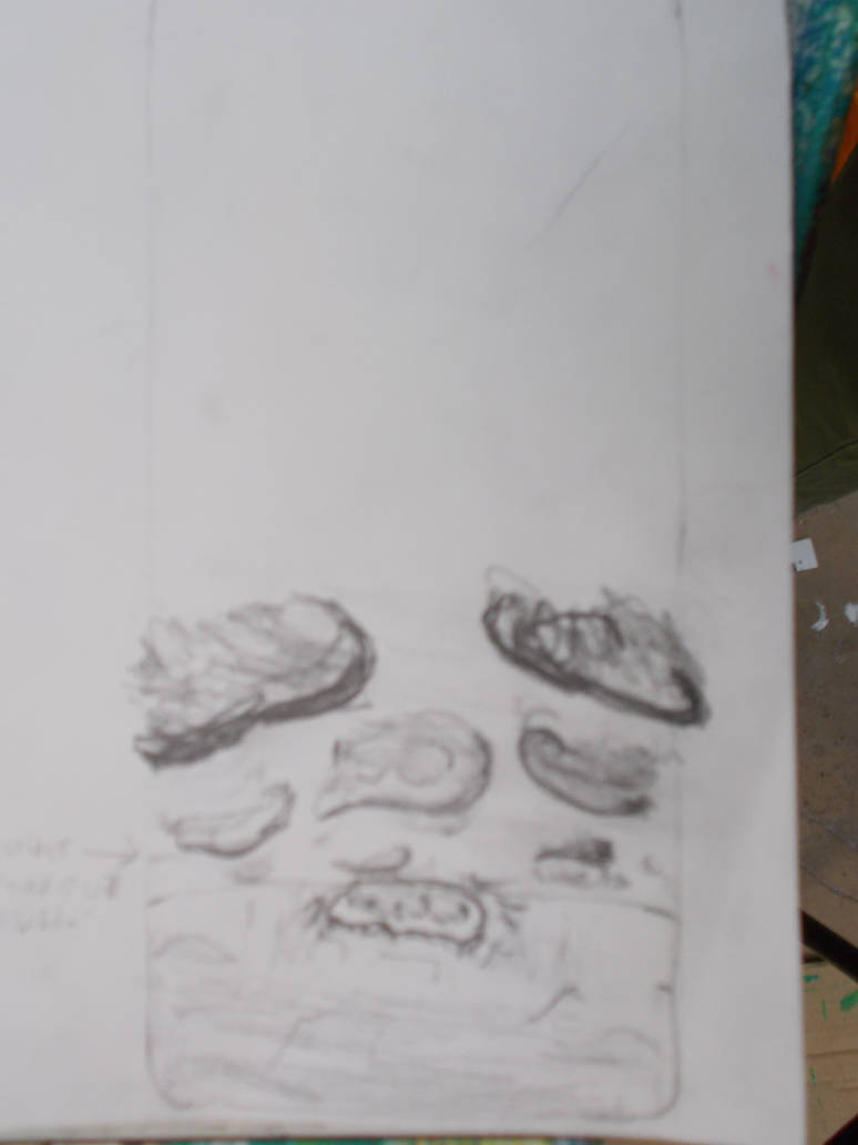
Taken with Camera. Not too bad.
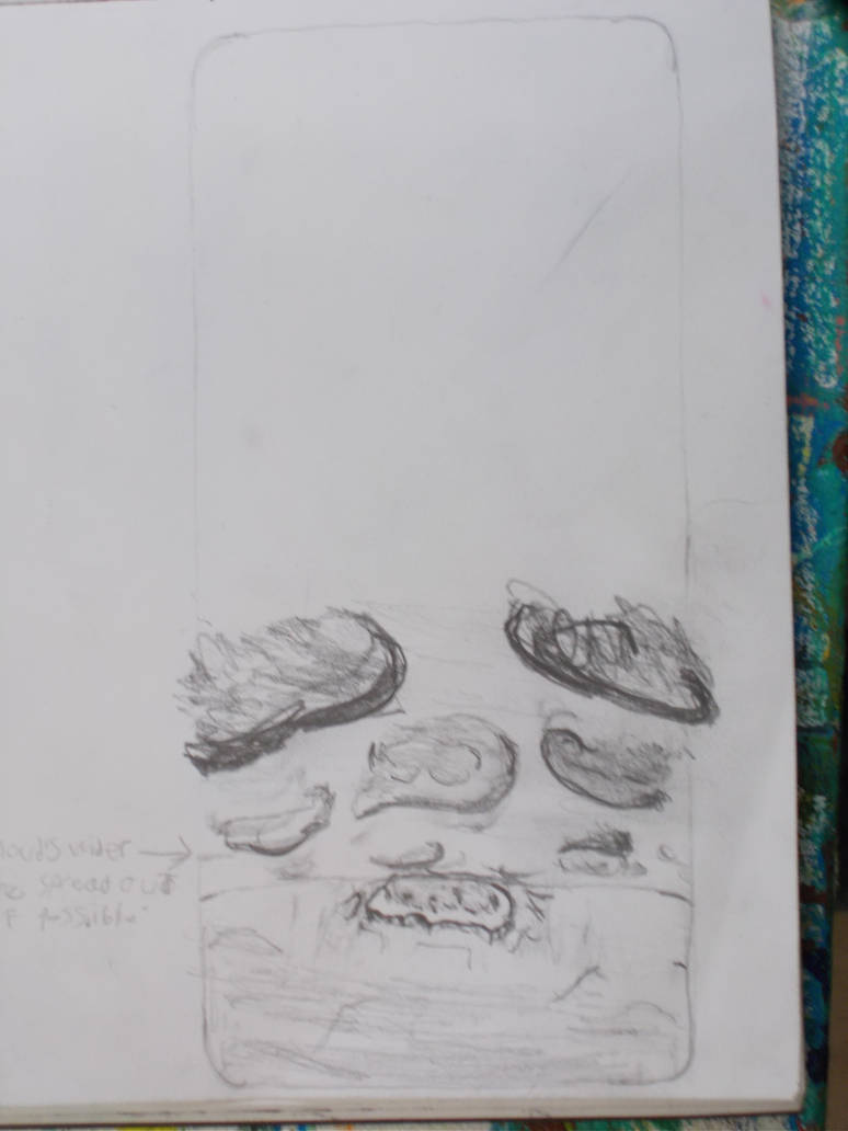
Taken with camera. So much better. Don’t know even know how I got a look this good.
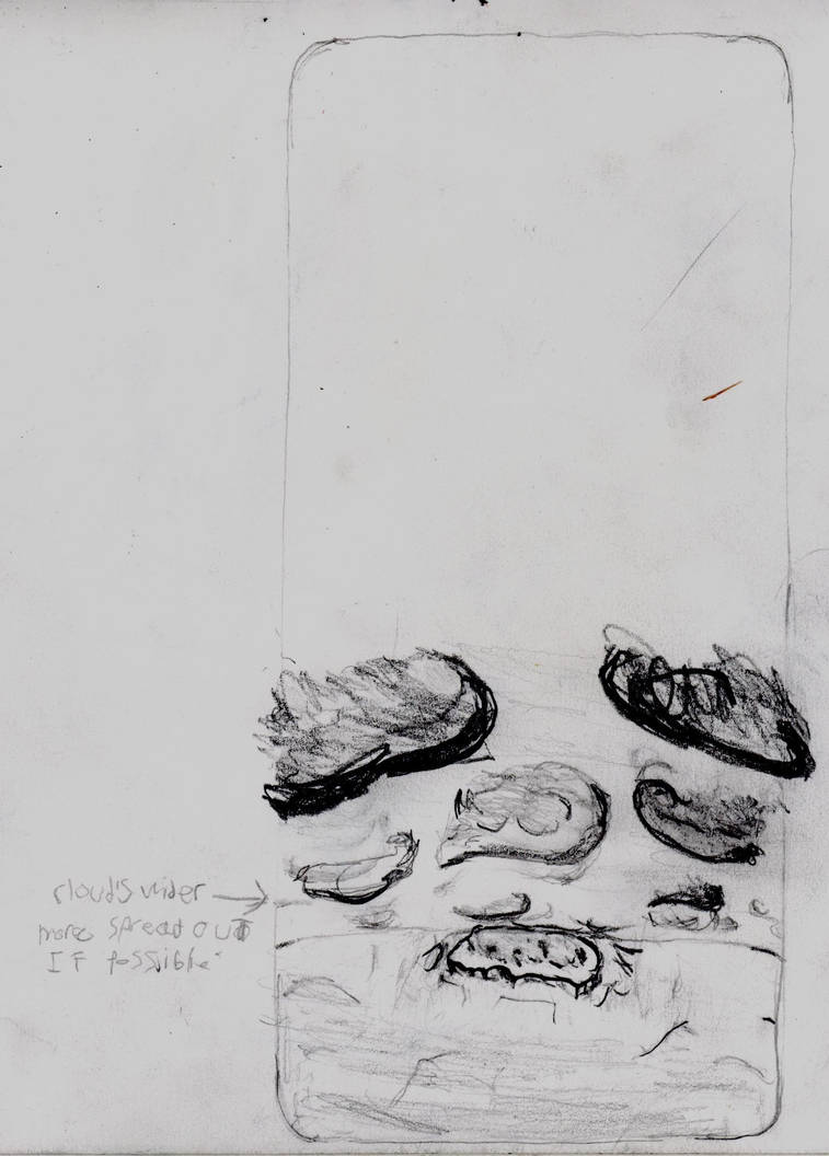
Taken with scanner. Also good. I think the fact the dark lines are lines I wanted to be dark helps a lot.
The Final Drawings
Then I started making bigger drawings to finalise the design, and then be coloured so I could finalise the colours as well.
I’d do them all with H pencils so the lines would be easier to rub out and leave less mess. I think this worked a little. Better than a B pencil would have. But nowhere near as well as it should have. Talk to Morgan about this.
For The New Eve I would draw her as a stick figure. Then make a person out of shapes. Rub that out, and add the coloured drawing over it.
First her legs in the stick figure stage.
You can barely see anything. The camera is not good for extremely light H pencil drawings.
Now here she is as a shape woman.
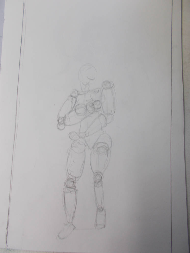
I think this one came out okay. The H pencil quality doesn’t matter as much if there’s more on the page.
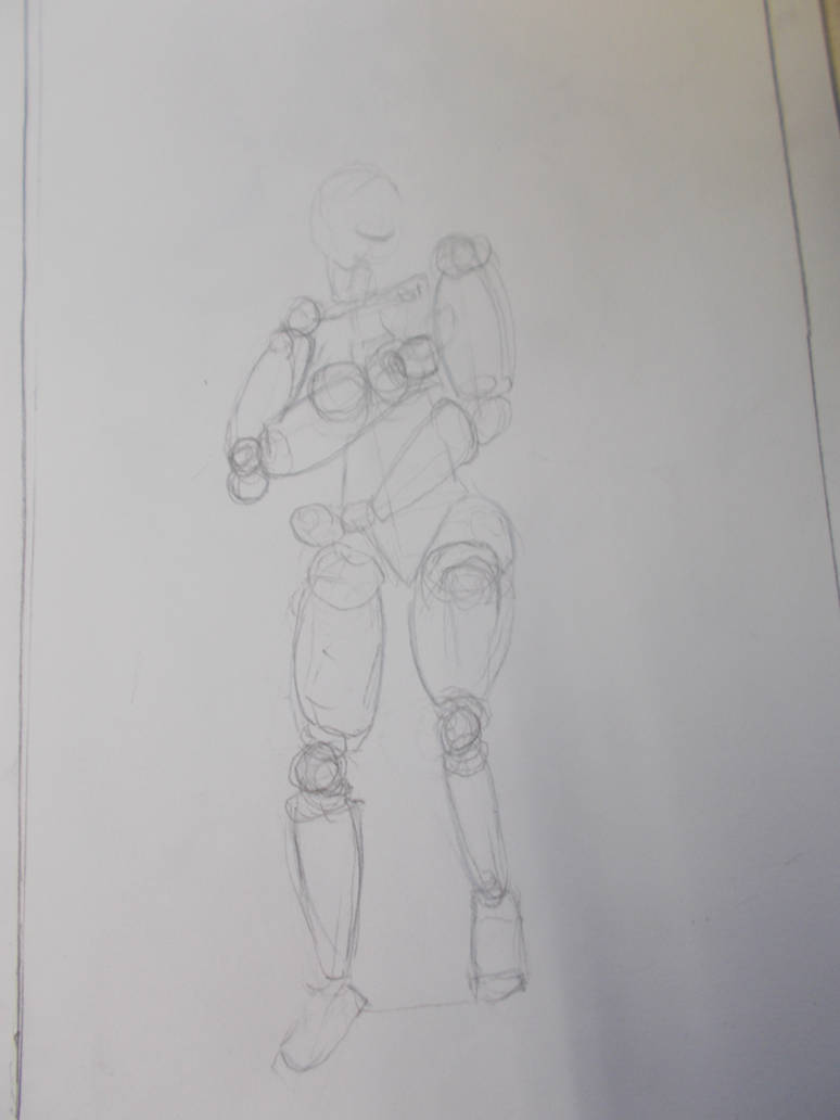
Taken with Camera. This time close up, showing nothing outside the paper. Seems good for H pencil work.
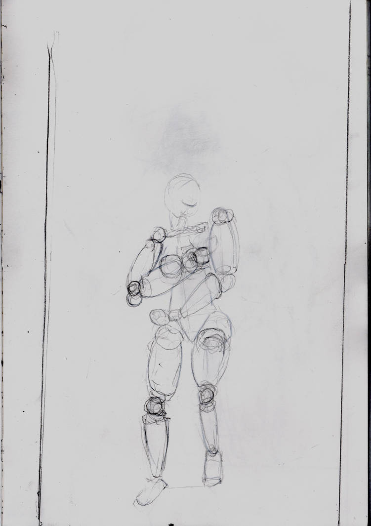
Taken with scanner. Darker lines look better. Has more weight to it. But it feels less cohesive.
I then started colouring over the shape figure. Something I’d read in the Acrylic colouring book must have carried over to my coloured pencil technique because the legs came out far more subtle and clear than any of the pieces I’d done before.
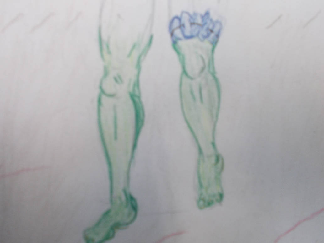
I was so surprised by the quality of the work I had to stop to record it. Just in case the rest wasn’t as good.
I took it from the same distance. But taken from a portrait angle instead of landscape. Somehow it came out a lot blurrier. But I must have done something differnt for the next one, which was also portrait. And the detail looks great.
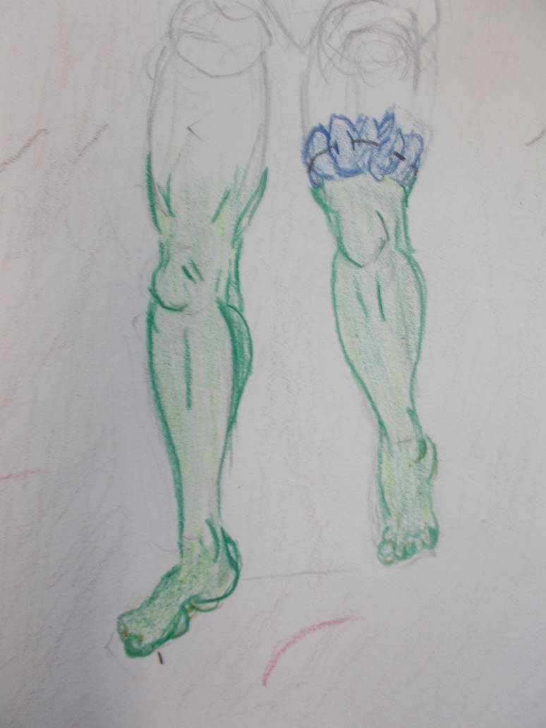
The colour is just right. How did this happen?
I got the whole then done and it looked like a drawing. Not scribled junk
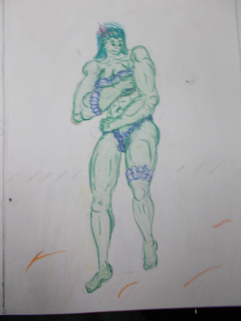
For some reason the top half of this photograph is a lot blurrier than the bottom half.
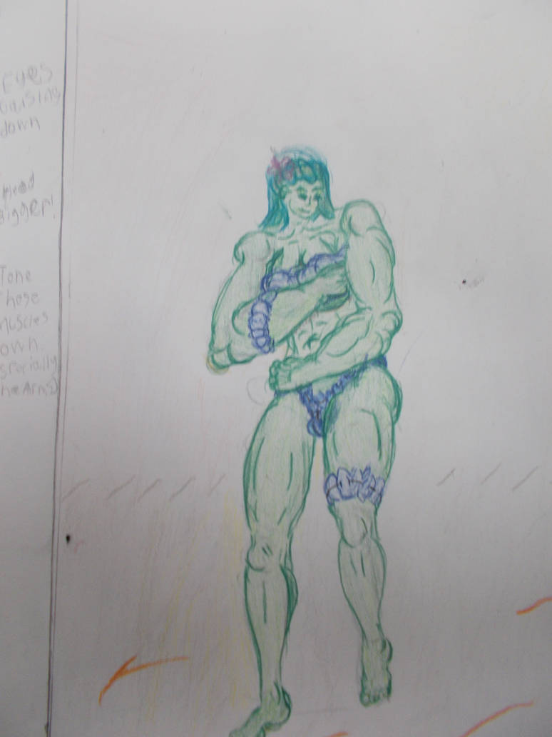
This one is lot better. I think the top being blurrier must have something to do with the hair being redrawn a few times. I went a bit overboard on the arm muscles though. Must tone that down for the final image.
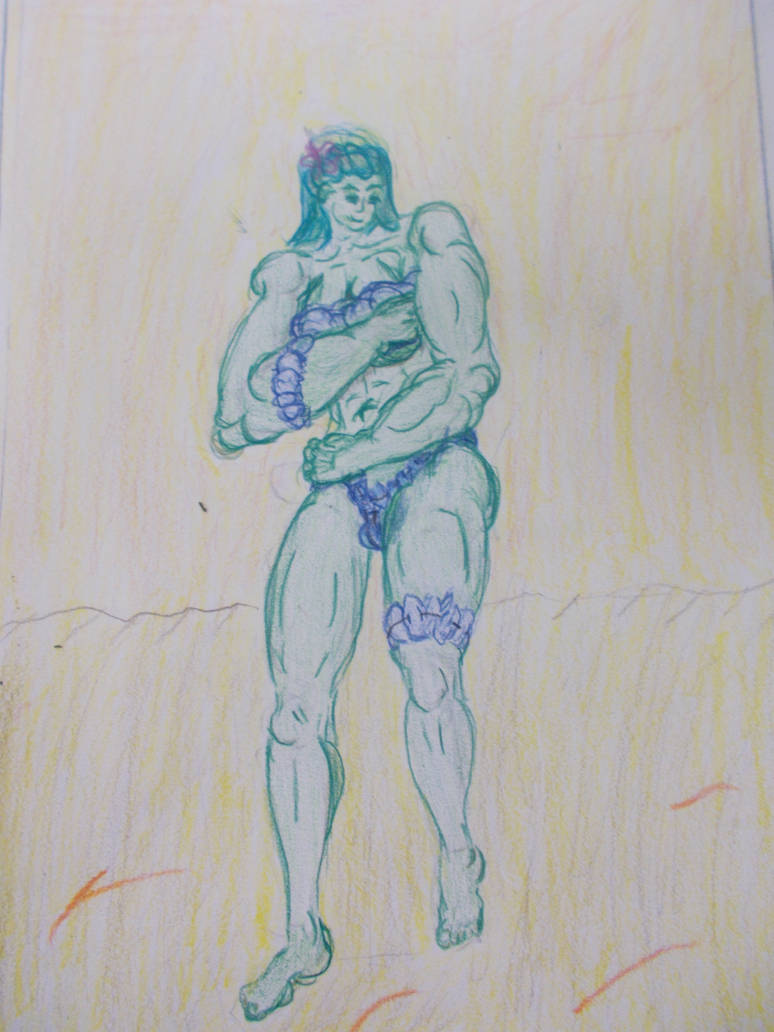
Now the background is fully coloured (And it somehow has a slight blue tint the other photographs didn’t have That’s my only issue with it). The expression on her came out good on the first try. So good I didn’t want to do a second attempt for fear of spoiling it. I’ve never done so well at my first attempt at an expression. Am I… Possibly…. getting better at this?
Well. For contrast. Here’s a coloured pencil drawing I did for animation in the spring of this year. 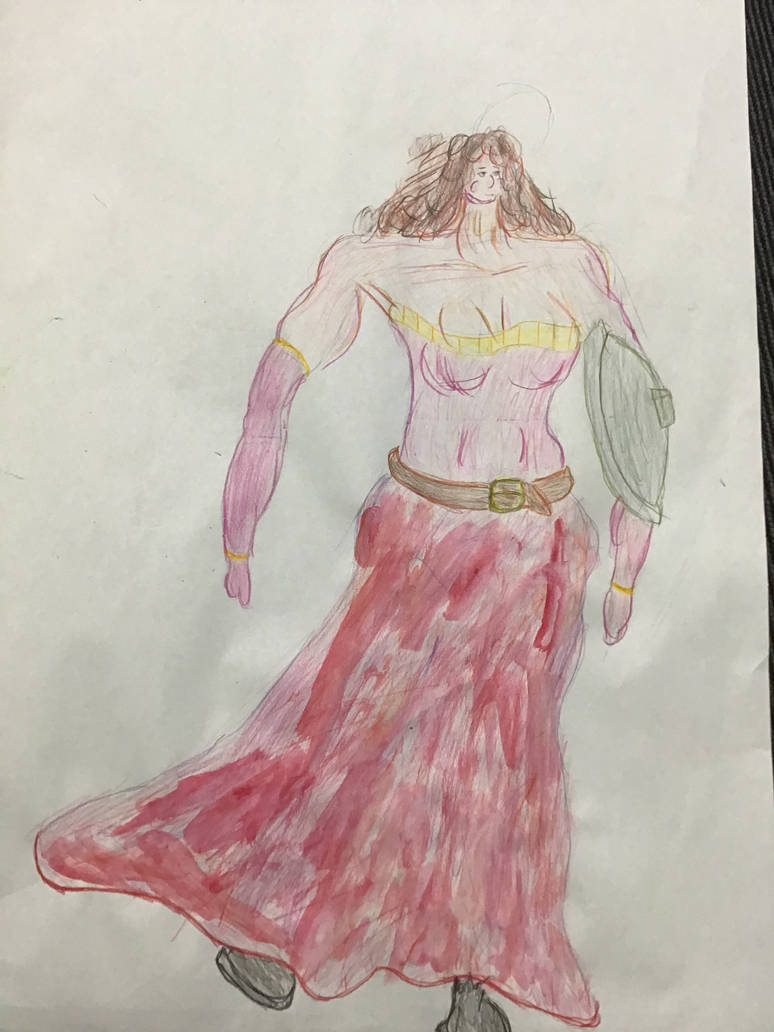
Maybe I’m getting a little better.
Here it is again. Now done with the scanner
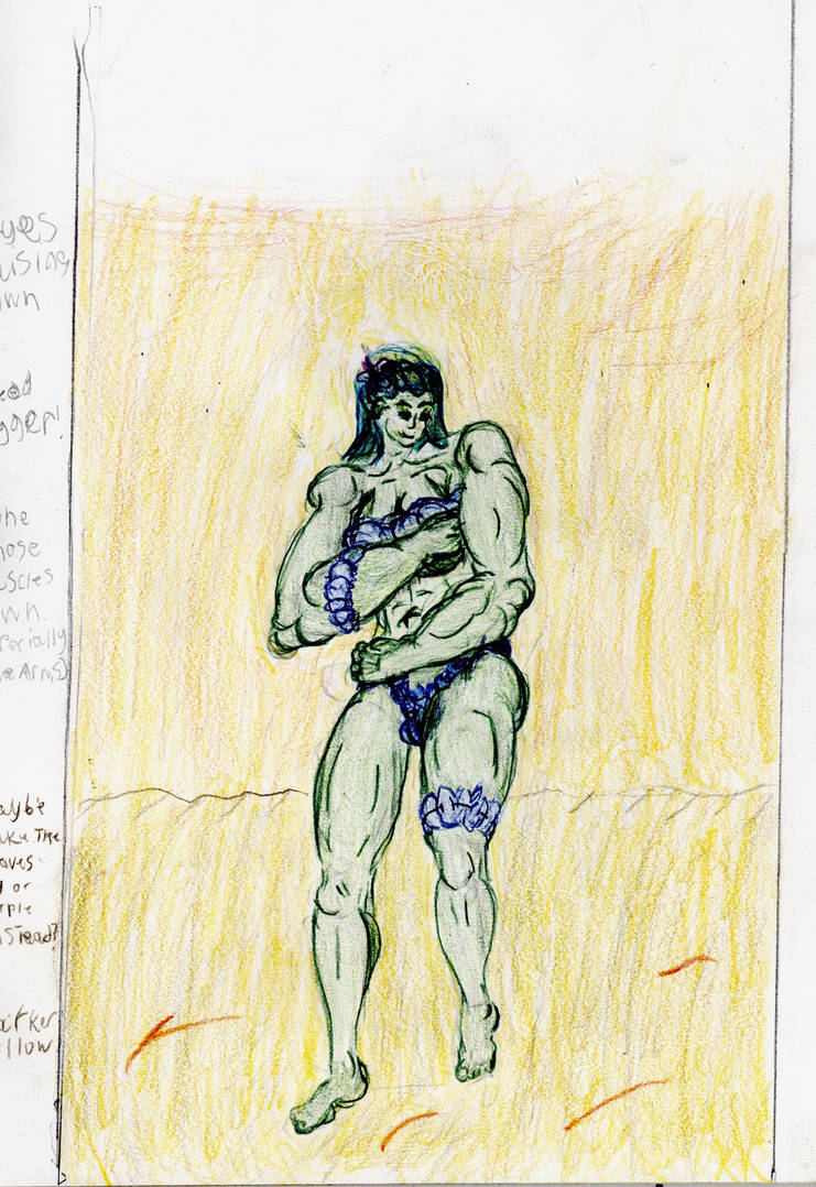
The whole thing is too dark and the colours look off. The greens are all smooshed together, For once I think the photograph might be better.
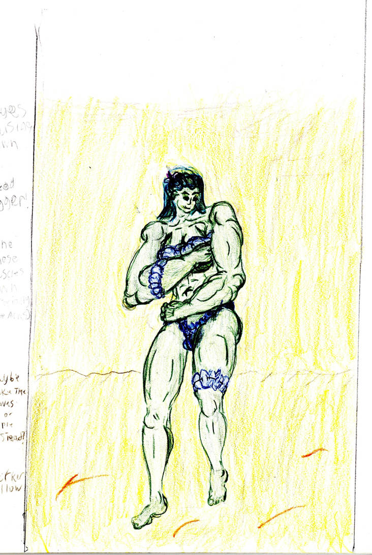
Taken with scanner with the brightness turned up. The woman looks nicer. But now all the browns are missing from the background.
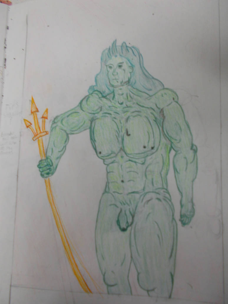
I originally had the clothes made of leaves red. To contrast with her skin. But as I made the plant life on the island blue (to contrast with the yellow sky) I thought I’d try blue leaf clothes here. Honestly, it doesn’t quite work. Maybe Red just reads far more easily to us as plant material than blue does. Either way, in the final version I’ll make the clothes either read or purple.
I began doing The New Adam.
With him I would draw the whole thing out. Stick figure, shape man, then full man. I’d then rub out bits of the full man and draw with colours on top of it. I didn’t photograph the stick figure or shape man this time.
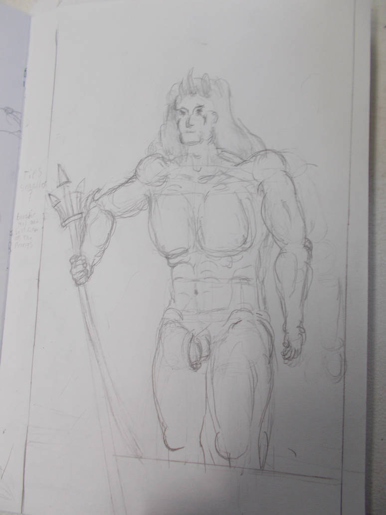
Taken with camera. Decent quality. Even got in some detail despite being all done in H pencil.
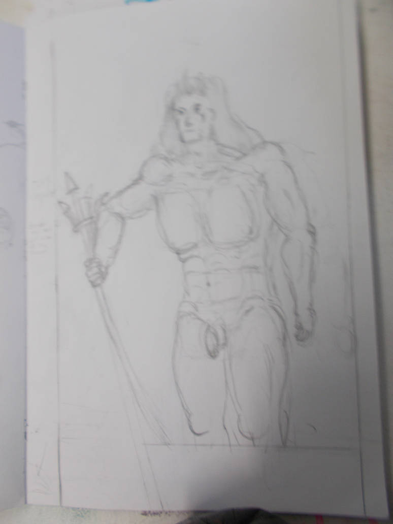
Taken with camera. Far blurrier. And for too much shadow.
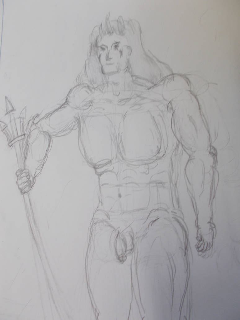
Taken with Camera. This time close up, showing nothing outside the paper. Better light balance and focus. Looks okay.
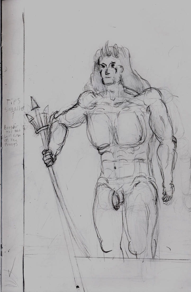
Taken with scanner, Looks better. But with too much of the erased details showing.
Then I started doing the colours. This time working over my old linework rather than drawing new lines. It also came out well it seems both techniques are valid. I will have to learn which is better or which is better for what later.
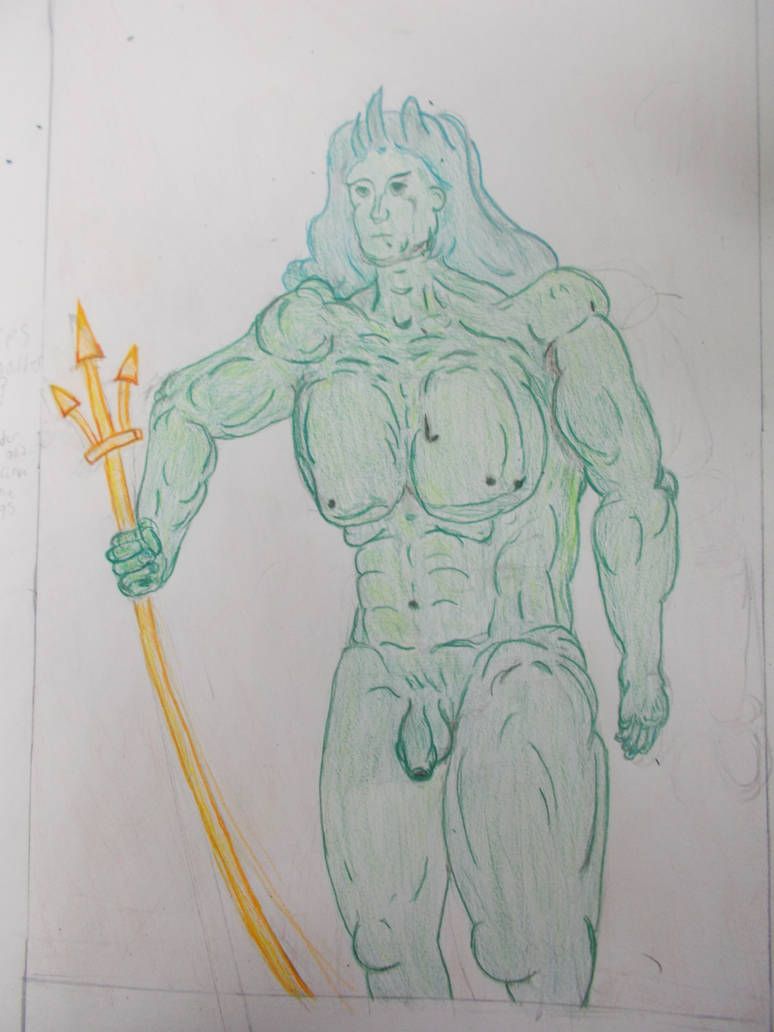
This is the best colorwork I’ve ever done, and I don’t know how I did it. Again. The expression also came out good rather quickly.
I even tried some the the colour techniques I read up on in the acrylic book. Using brown for the shadows rather than just darker green or black. I think it sorta works. Must look into this further.
Photographed again with the camera further out and (accidentally) more shadow on the piece. Face seems blurrier. Shadows make the colours pop more but take away from the subtlety of the linework.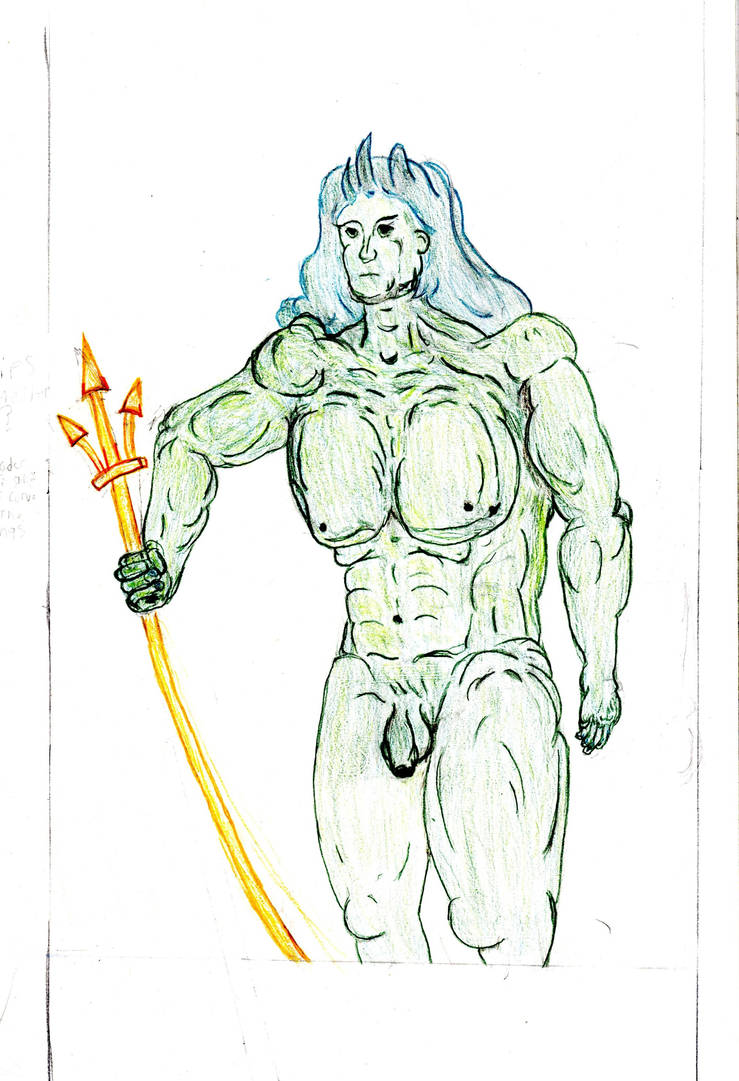
Taken with scanner A bit too white to be the best one of him. but the way it brings out the subtle greens and blues warms my heart. I think I could do great things with the scanner and coloured pencils given time.
For the next two I’d try the opposite tack. I’d make the wave a very detailed drawing and colour off that and make the fixed land as simple and light as I could with getting in the minimum details and see which gave me the better results.
The Wave
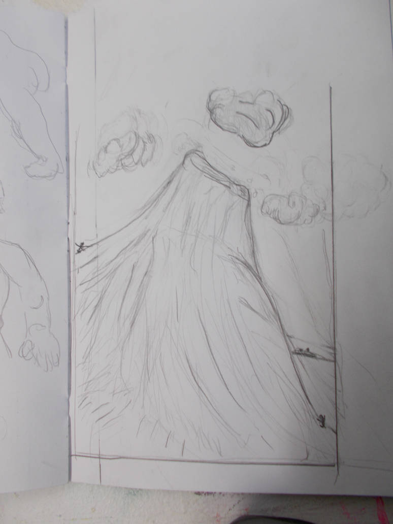
Nice focus. Far too much shadow.
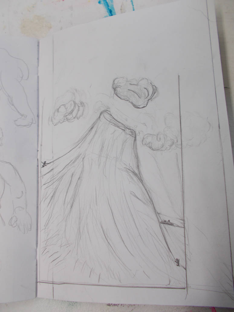
Taken with camera. Decent focus. Nice detail. Still more shadow.
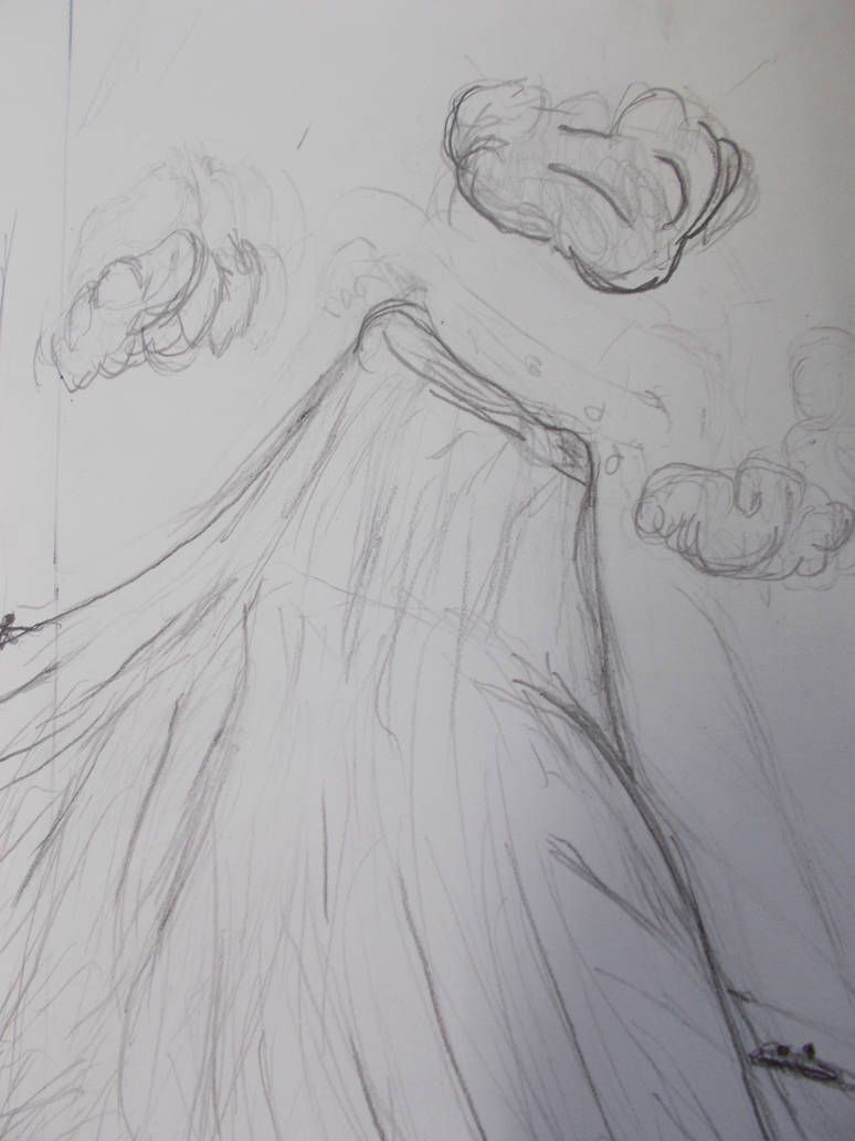
Taken with Camera again. This time close up, showing nothing outside the paper. Better light balance. But now there’s too much detail. You can see all bits i erased time and again. Making it look messy.
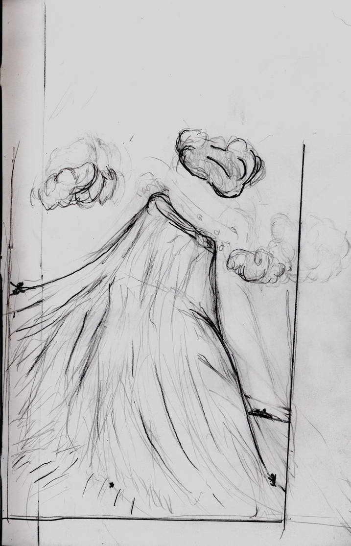
Taken with scanner. Shows off the best and worst of what I’ve mentioned about that scanner.
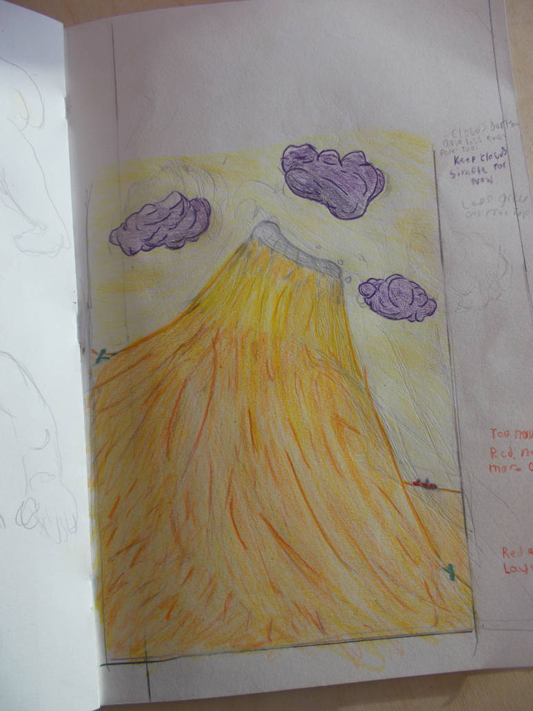
Taken with camera. This one really gets the textures and subtleties of the coloured pencils. specially in the sky
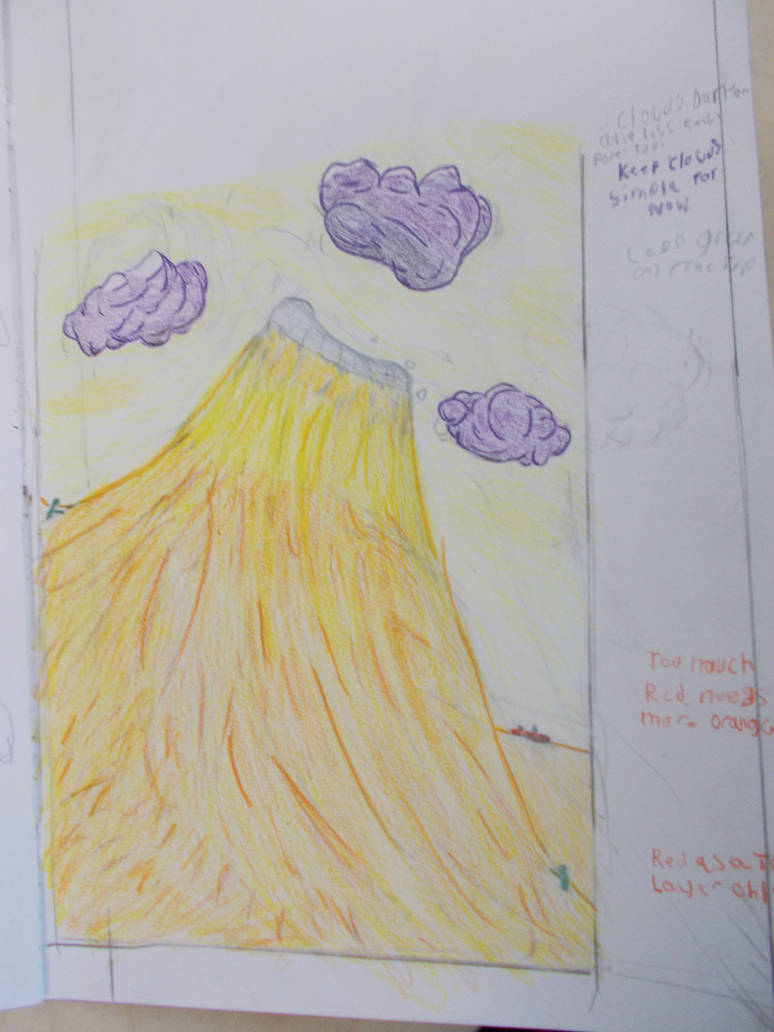
Taken with camera under differnt lighting. It does do a nice job of showing how the colours blend together. but sadly some of the colour details on the clouds are missing.
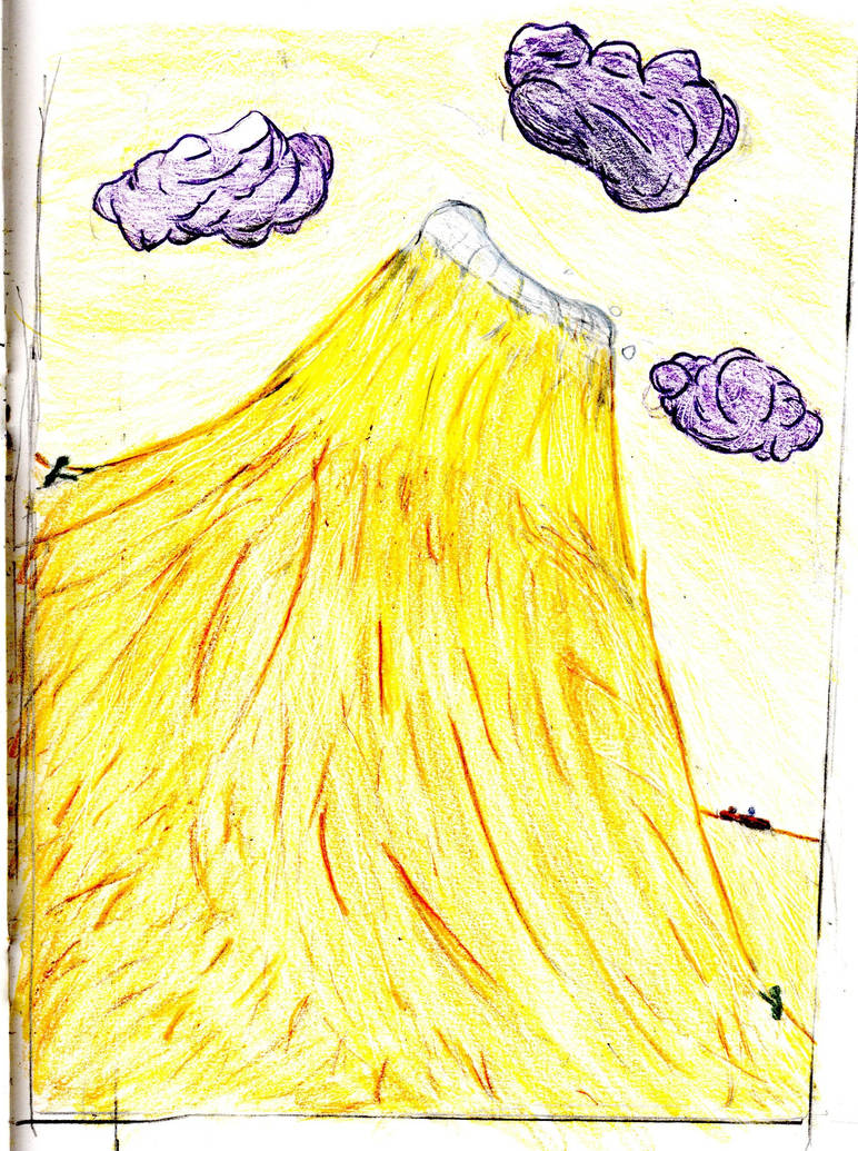
Taken with the scanner. I hate this.
The Fixed Land
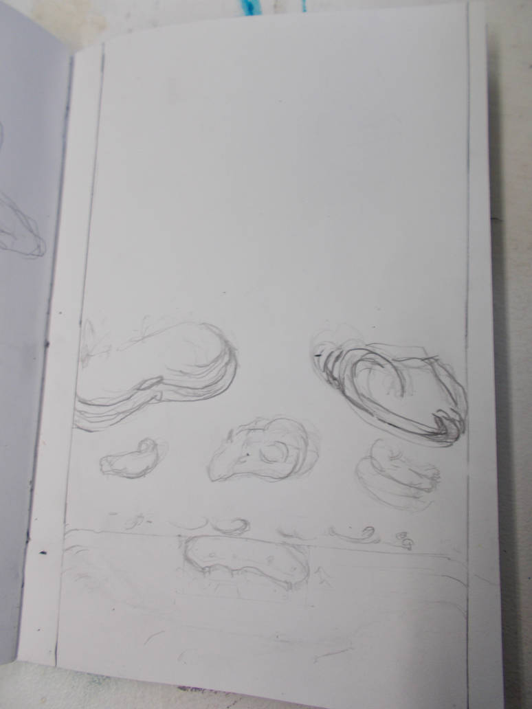
Taken with camera, Not great.
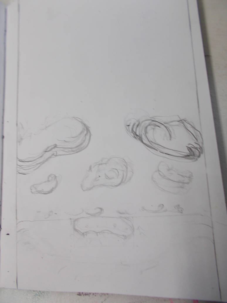
Taken with camera. Just not feeling it.

Taken with Camera. This time close up, showing nothing outside the paper. Still doesn’t help with the light pencil work not showing up. Does at least bring the perspective out.
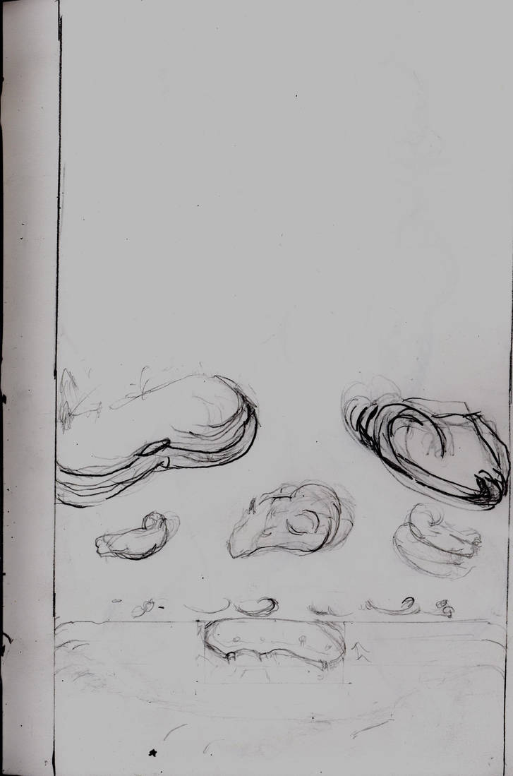
Taken with scanner. It’s better. Still not good.
It seems in general when there is little on a lot of paper bothe the scanner and the camera struggle. But I suspect the camera will usually struggle more.
I still haven’t colour the fixed land (This journal took 2 days to write!) so my experiments end here for now.
I also did some life drawing in the same drawing book. And recorded that for the hell of it.
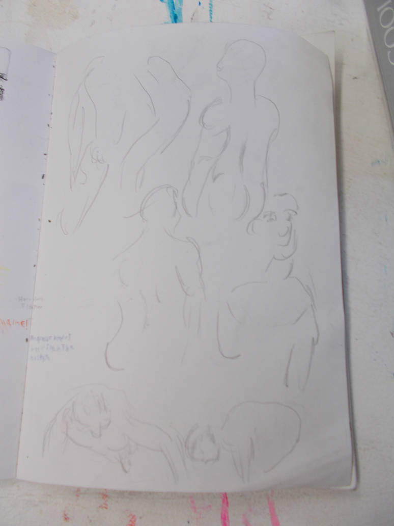
Taken with camera. It’s fine.
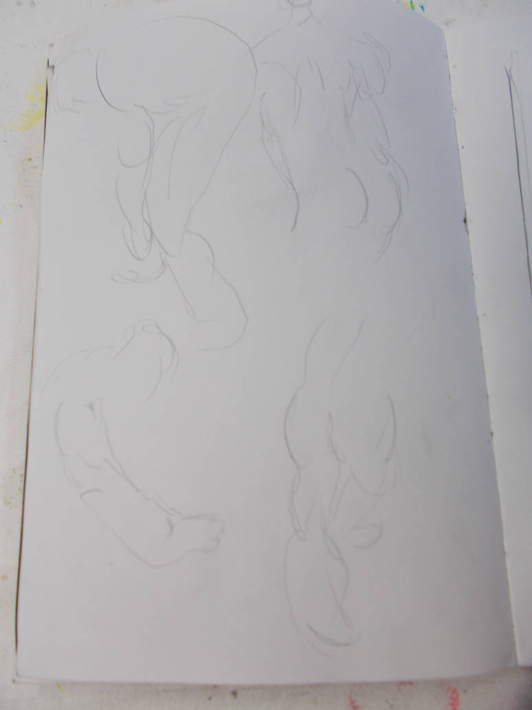
Taken with Camera. I think I might just need a better camera.
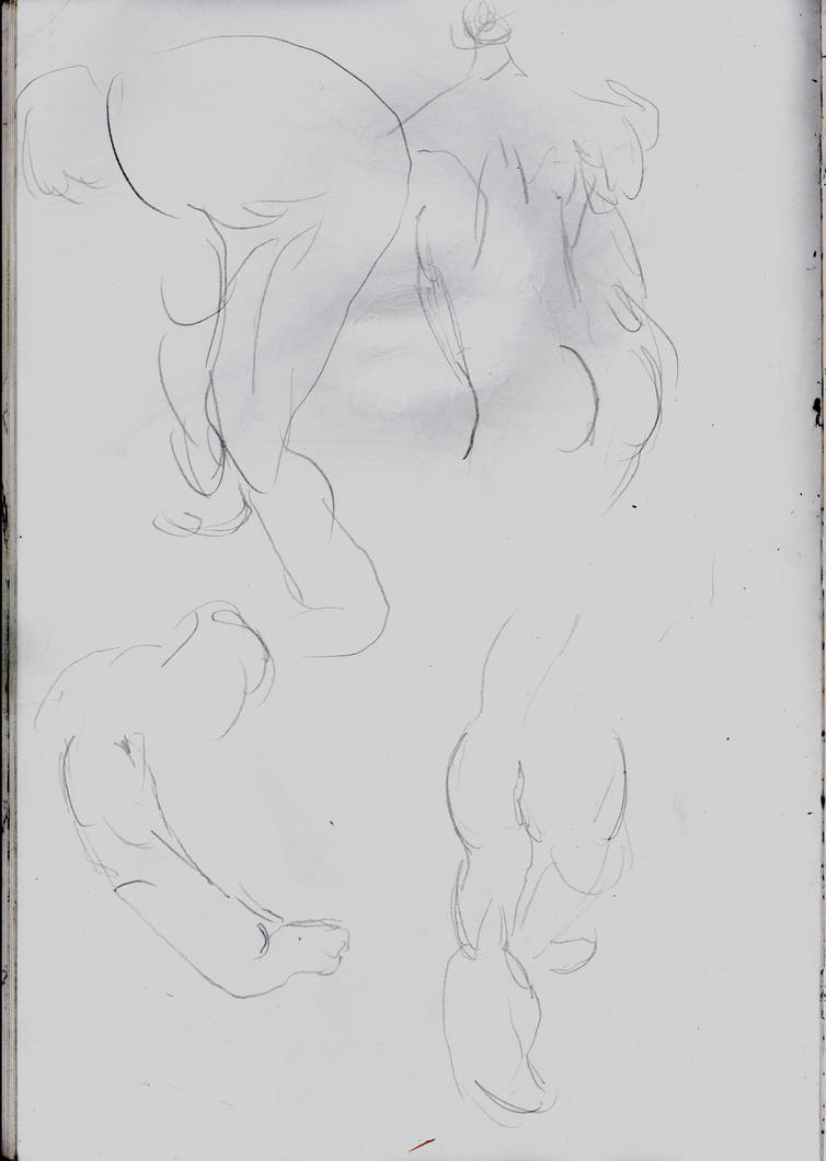
Taken with scanner. A lot better.
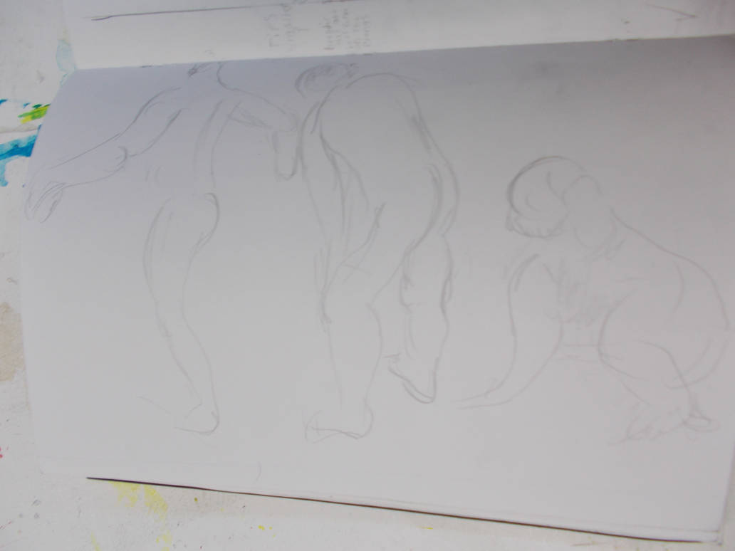
Camera. Tried to take this one from an angle. Didn’t work with the light marks with the H pencil.
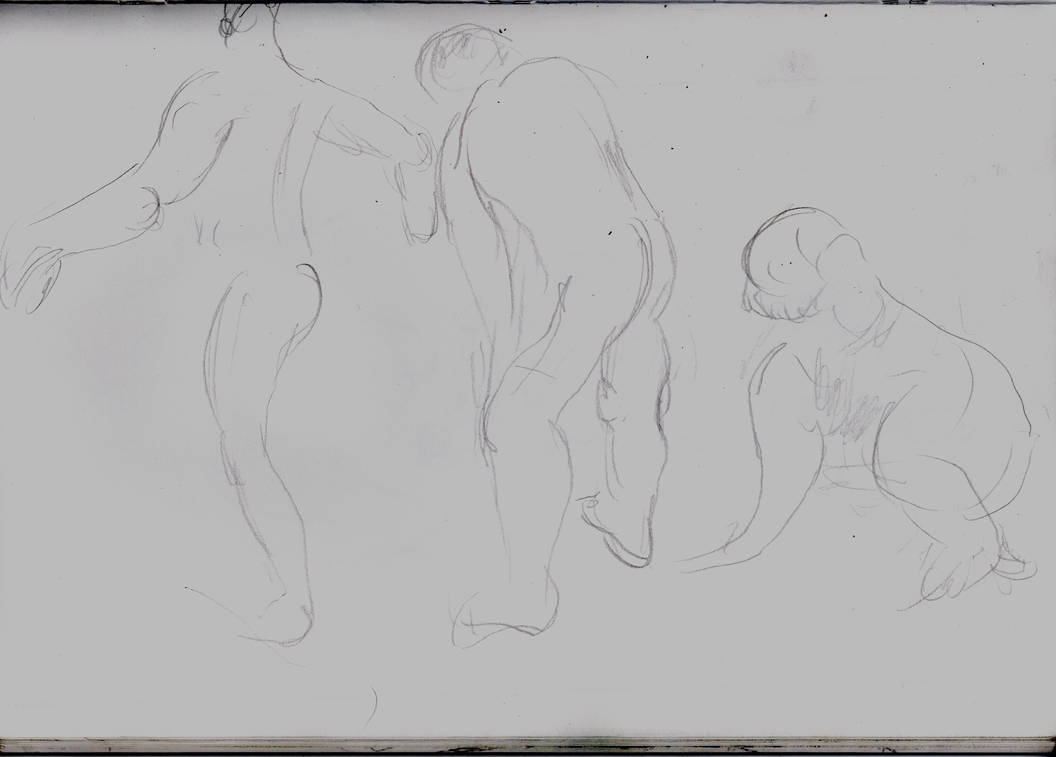
Scanner. Still looks not great, But a lot better.
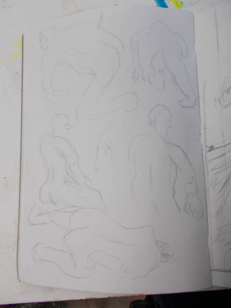
Camera. A little better.
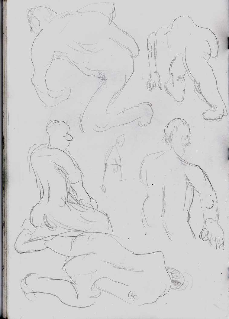
Scanner. Best B&W image I got from the scanner.
Taken with camera. Awful.
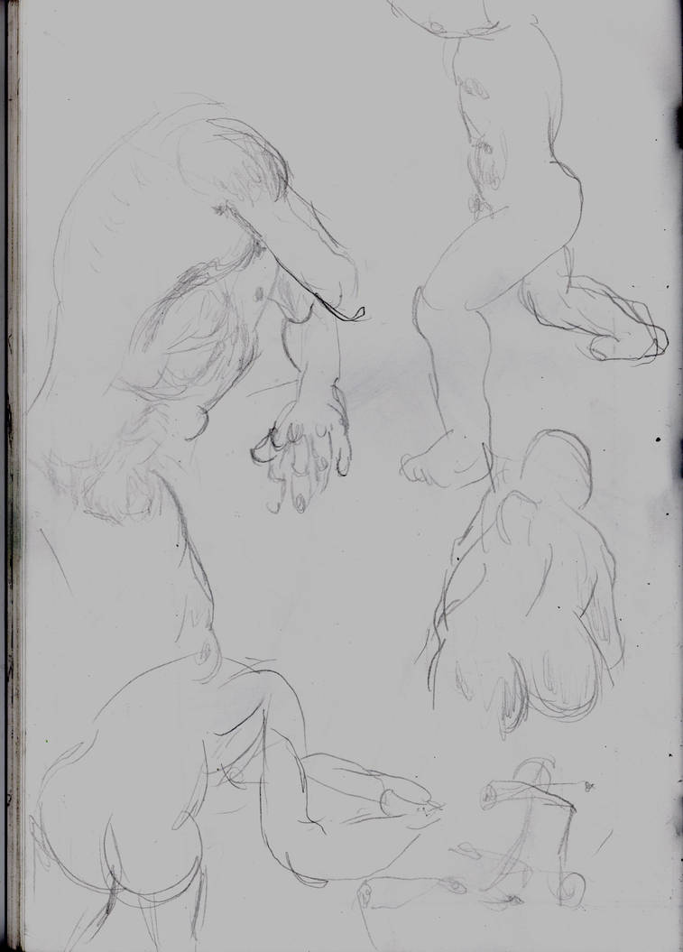
Scanner. Decient.
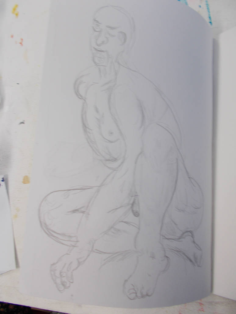
Taken with Camera. Again, H pencil drawings seem to be easier to capture with a camera if they’re large and have more detail.
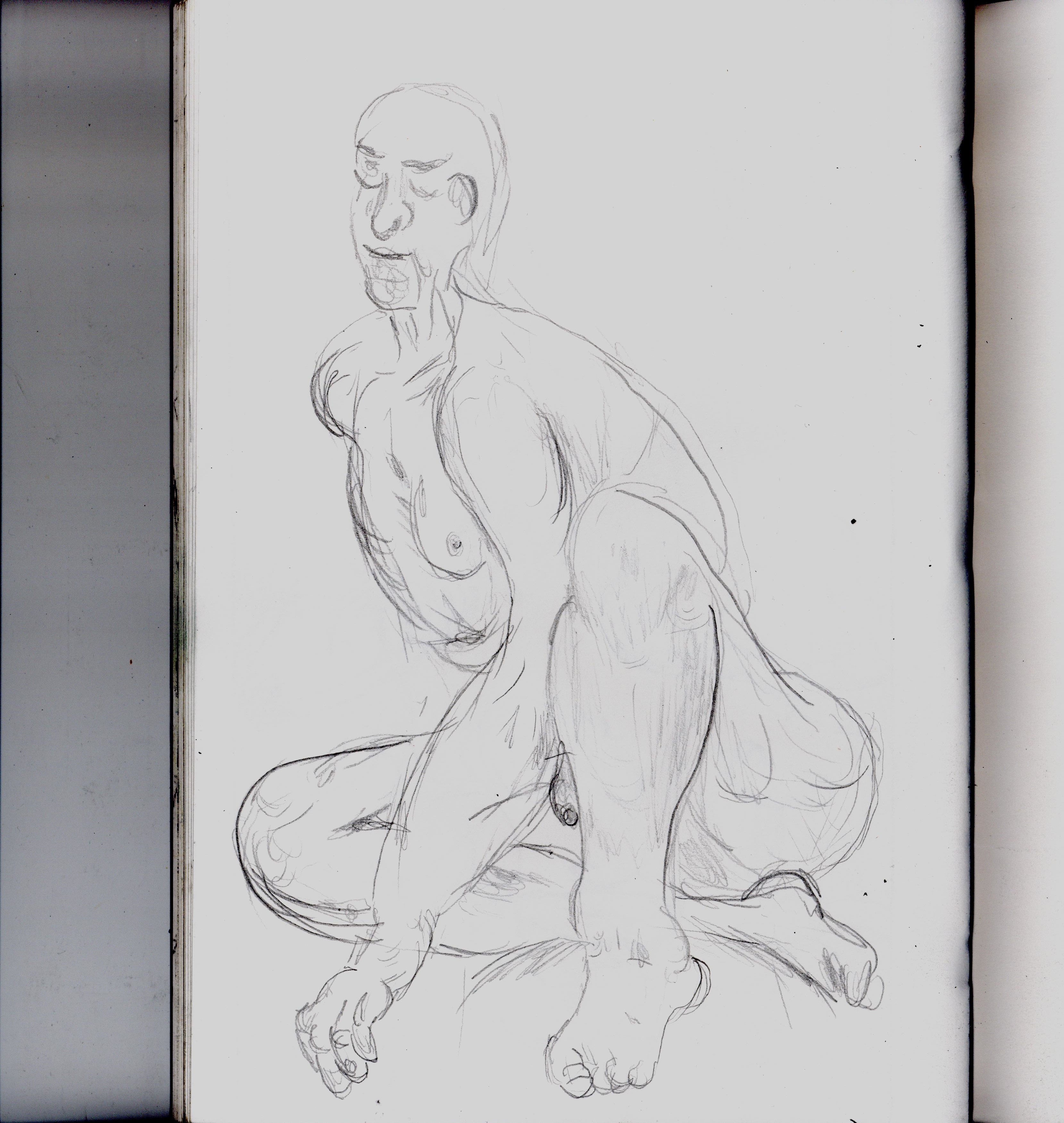
Taken with Scanner. A lot better. But missing something organic.
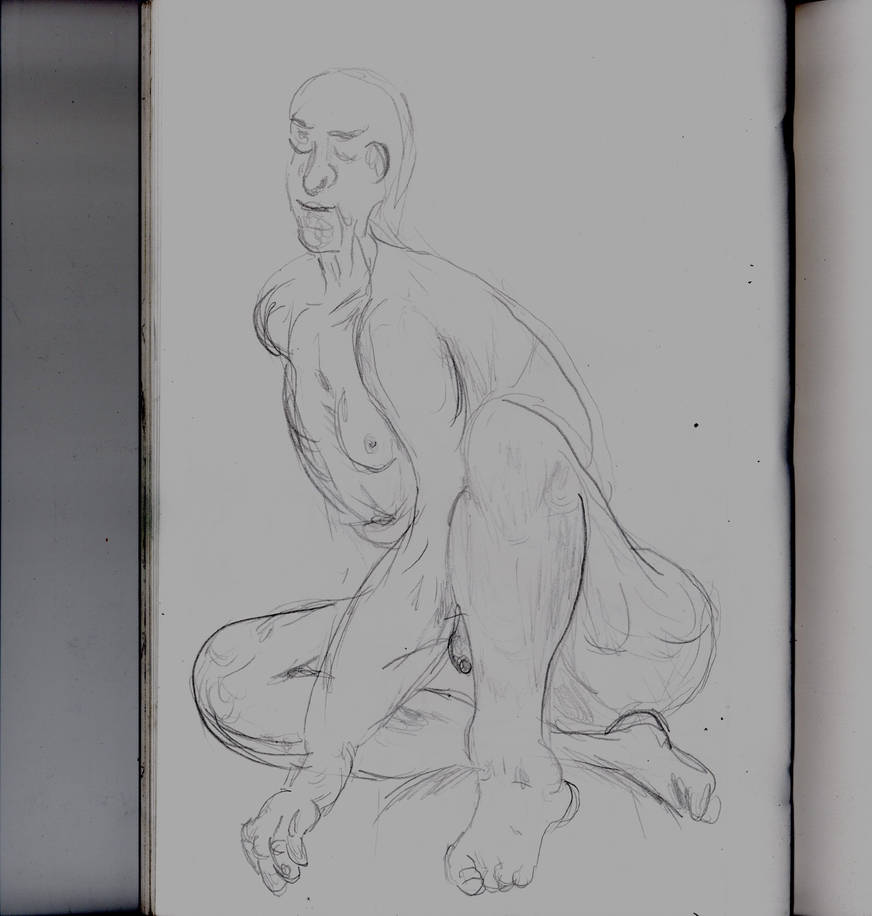
Taken with the scanner at a darker setting. apart from being darker and a little dismal I see no downside. It just looks better this way.
And that’s all I have right now. I will try to build on what I’ve learned here (if I have learned anything that is?). My next update will have less photographs. But hopefully better ones.
****
Afterwards
Sometimes the photographs look better. But normally the scans look better. The scans take a lot more time to do. The Photographs normally look better or the same I have a large, solid object or image to shoot. Which is lucky for things like my painting which is too large to scan.
Thankfully even the photographs (Even the less good ones) are all I need to evidence my work for the university. So I can keep doing them for now. Maybe doing scans if it’s important to get the fine details of something. But sticking to the photographs will save me a lot of time.
Strangely, photographs tend to look better if they’re focuses in rather than showing the space outside the drawing. At least if it’s a big drawing. Thumbnails and doodles not so much.
But I know I can get better results with both camera and scanning. Specially for the extreme closeups
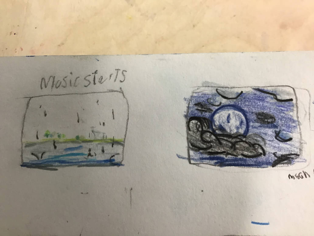
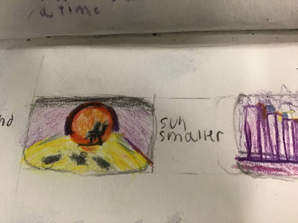
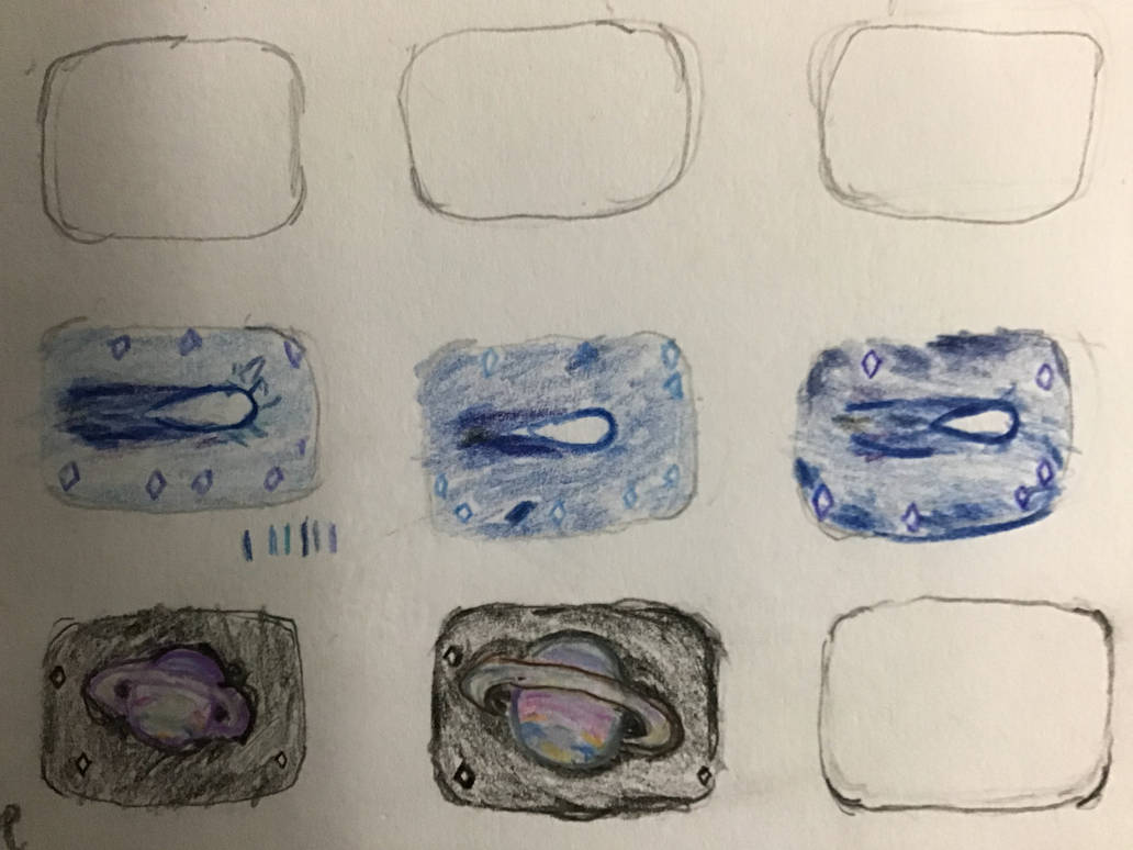
These were taken with an Ipad camera and are so much better than any of the close-ups I took with my own camera. Remember this?
And here are the scans of my thumbnails as scanned my Morgan (Done on a program That I don’t know how to use). Look at the detail. Look at how nice the colours are. Nothing is ever too dark, or washed out. The linework is just right.
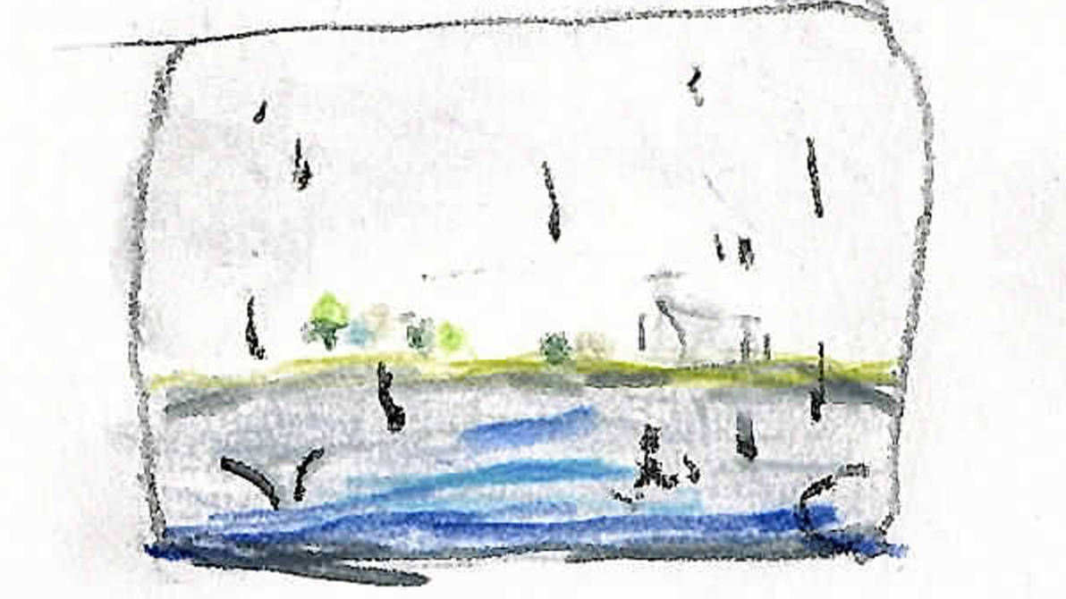
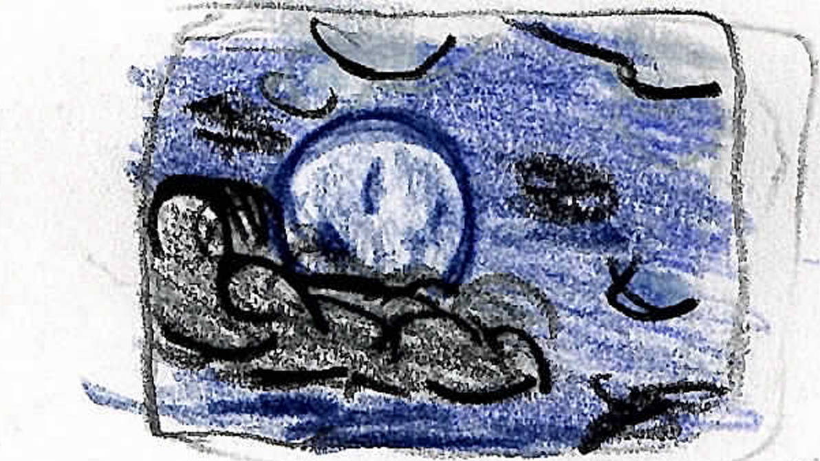
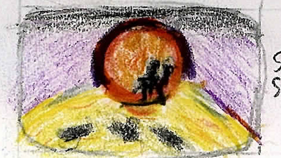
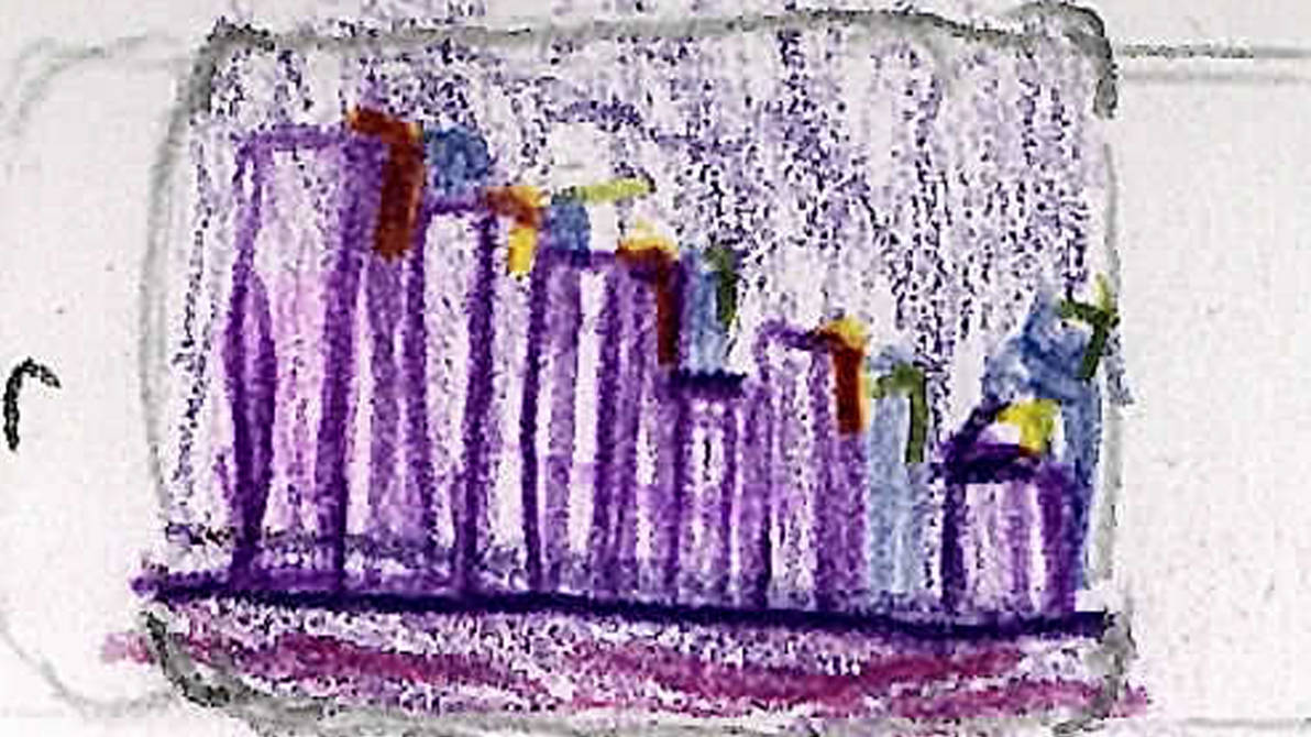
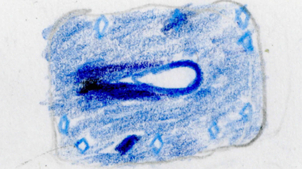
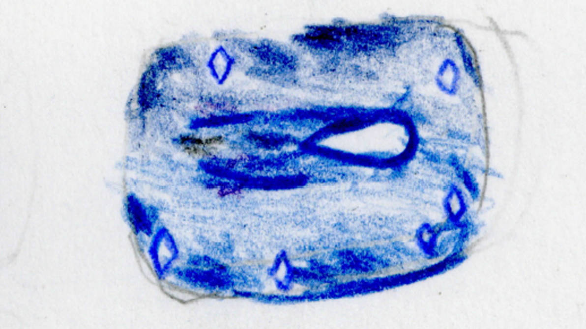
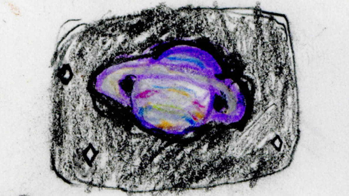
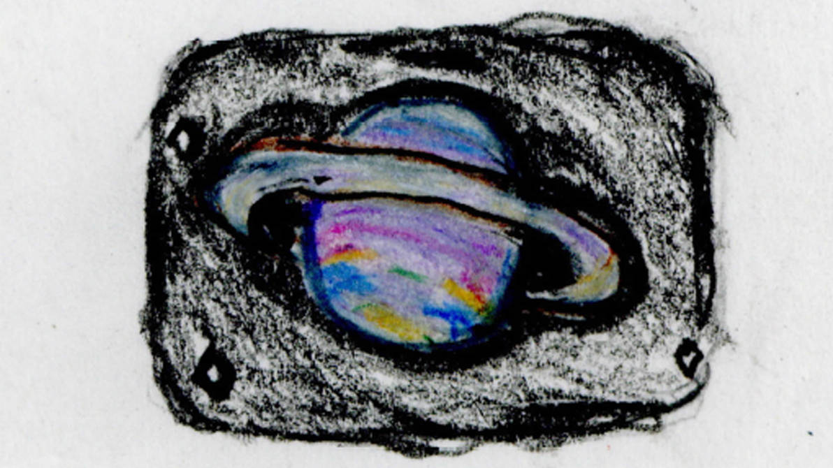
Now take a look at my best scans.
Now look at my worst ones.
Again. Why don’t mine look like Morgan’s?
I must learn. In fact. It’s time I learned more about photography in general. I can’t make animation if I can’t film it.
I will have a journal about my experiments in film and photography soon.
I will show this journal to others to get feedback on how I can record better. I hope by starting to learn this i can eventually learn the perfect way to record my work recording and my animation.
Well. Back to making actual work now.
 John's Learning Journal