Things aren’t going as well as I’d like. It’s not awful but it’s not good.
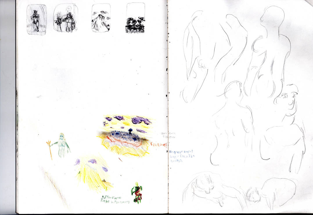
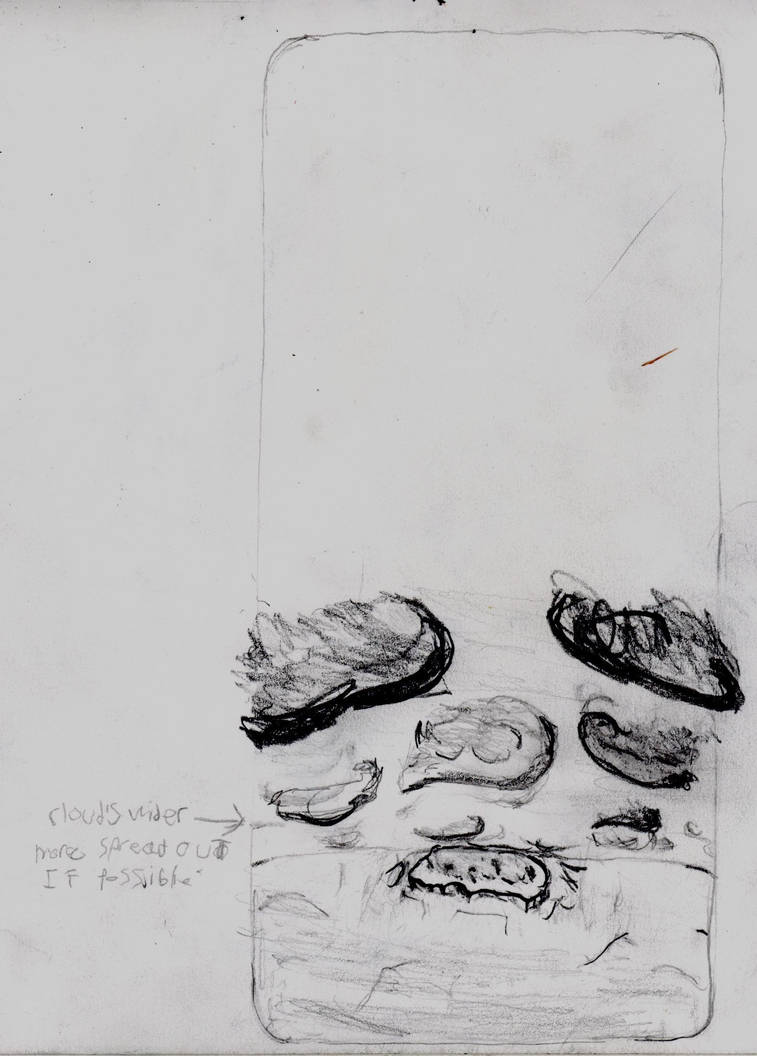
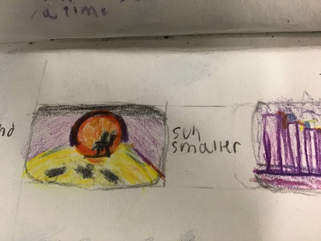
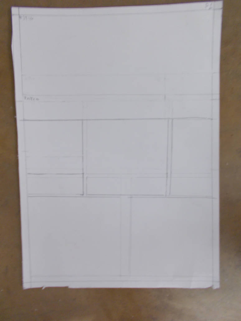
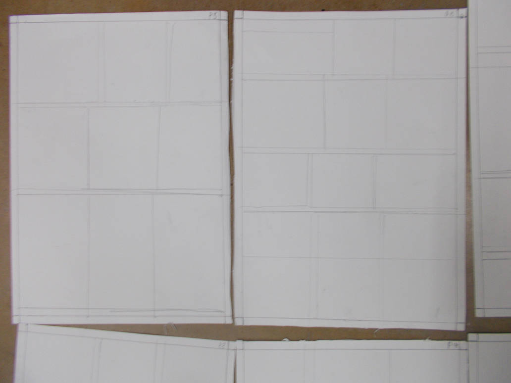
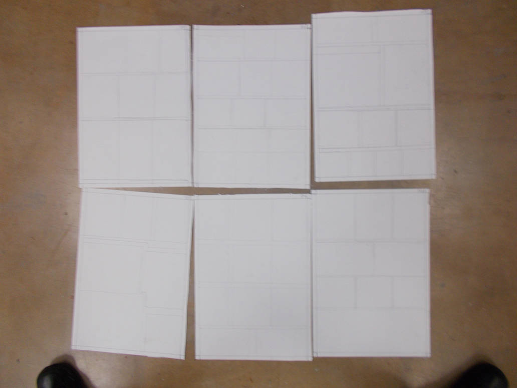
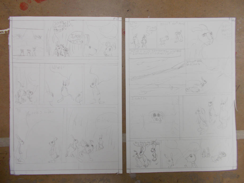
On Tuesday I got to work making my pages as instructed. I then read through my script and started figuring out the panel layouts. It was surprisingly hard. Thankfully I’d recently ordered a large collection of “Tales from the Crypt” to take inspiration from. I noticed EC’s comics tended to use a three-by-three layout as opposed to the three-by-two layout James suggested. Given I had a lot of story the more panels the better right? Well yes and no. More panels gives you more frames to put story and images into, but it gives you less space to but them in, and drawing small is hard. And you need more space for text, and counter intuitively the more story have the more panels you need the less space you have for text tat you need for the extra story.
For whatever reason we like our pictures landscape. For a landscape format you need something like three-by-two or four-by-three at the least, which isn’t always optimal. Sometimes portrait style panels are easier to make. But they are good for standing humans and tall buildings and not much else. Thankfully EC had the answer. Their panels tended towards the portrait style, but they use the extra space for the text. Letting the pictures have something closer to a landscape format. Buying that “Tales From the Crypt” collection proved to be a very smart move.
I’ve come to think of panel arrangements on a comic page like notes on sheet music. Three-by-three is your “Doe, Ray, Me” Three-by-two is like a slow piece of music. Four-by-four is more like complex but fast music like heavy metal. And just like real music you mix-up these combinations to give your work pace, variety, tone, and emphasis.
I think I’ve done a good job
I would not have thought just selecting and arranging the panels would be that hard. To think there are people who do this every month.
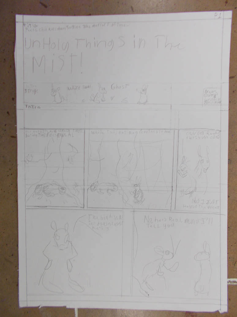
That done I started drawing. I want for the simplest drawings I could. Very cartoony, very simple. No or very little backgrounds. i can’t say I like it. But it keeps me moving forward.
I will hopefully redraw all of this with drawings that don’t suck. No idea how I’m going to add in the dialogue.
There are moments when I when I feel I could really get to like making comics. it feels very rewarding. Then there are other moments where I can’t stand it. I’m having a lot of trouble getting into a flow. Barely working for more than two minutes. I think the problem is I’m constantly moving onto new images, having to jump back into the pure creative part of the brain. Drawing new poses, new angles, and new effects each time. I don’t get the feeling of continuum and building that I do with animation or painting. Whether I can get over that remains to be seen
Once again this journal is late. It can’t be helped. Most of last week gave me precious little to do and I was not feeling very well anyway. I came in for the minimum about of time and no longer.
Orientation was fun. It’s hard not to enjoy hearing James talk about comics for three hours. Though I can’t say I enjoyed the comics he himself made. Too gross for me. And given it’s me that’s saying a lot. I am looking forward to reading more stuff in this medium as research though.
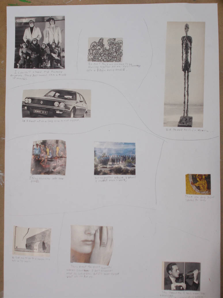
Our first exercise was to cut and paste things out of books and stick them onto sheet of A1 paper to make an impromptu, college comic.
For reasons I can’t explain, possibly relating to some forgotten childhood trauma, I hate even the thought of cutting pasting. Part of me wanted to duck out and runaway. Say that I was ill. I certainly didn’t feel all that well. But i resolved to go ahead and at least do what was asked of me.
When I had ten random pieces I looked through them to see what story I could tell with them. I settled on a story about a man who is no longer happy in his family and leaves them to try and find happiness with others. After years of fruitless searching Jesus comes to him in a vision and tells him to visit a mysterious house. There he meets a beautiful woman who shows him that he was meant to be a musician. and he finds contentment.
I did the bare minimum that was needed. After cutting and pasting all the images in order I added in some text and drew some panel borders. I could have added in my own drawings. But I did not feel invested enough. And I don’t even know what I would have put there anyway.
Anyhow. Here’s the comic
Not great. But James seemed to like it well enough.
After that I had to come up with an idea for a real comic. Written and drawn by yours truly.
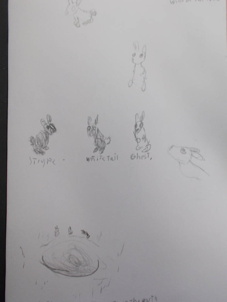
Having been feeling deep sense of loss recently my mind turned to a line from Watership Down The Animated Series, “Kehaar not sure he can fly. Heart so heavy”. In this line Kehaar the gull is morning a long dead love before taking off on a mission. I felt a lot like Kehaar. So my mind returned, as it so often does, to Watership Down. That was where I would take my inspiration from. Watership Down, home.
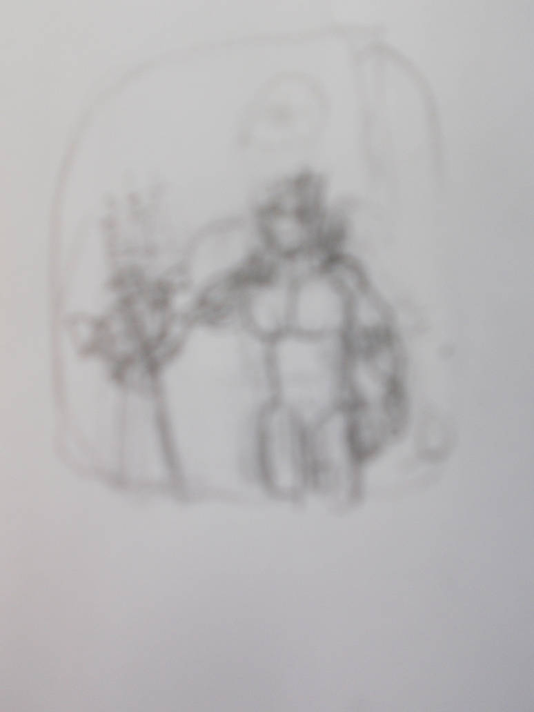
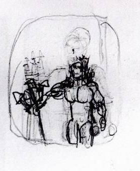
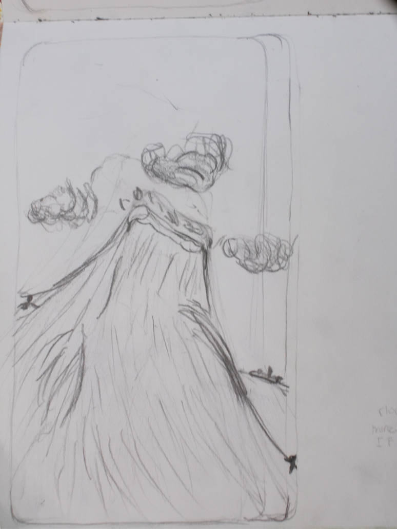
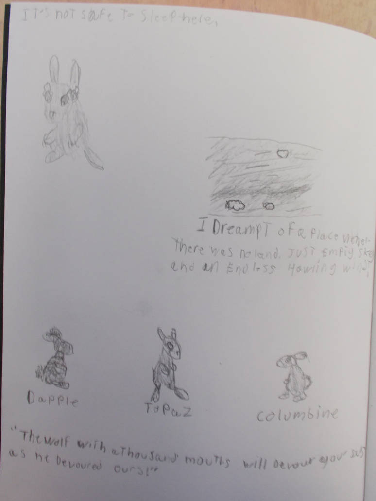
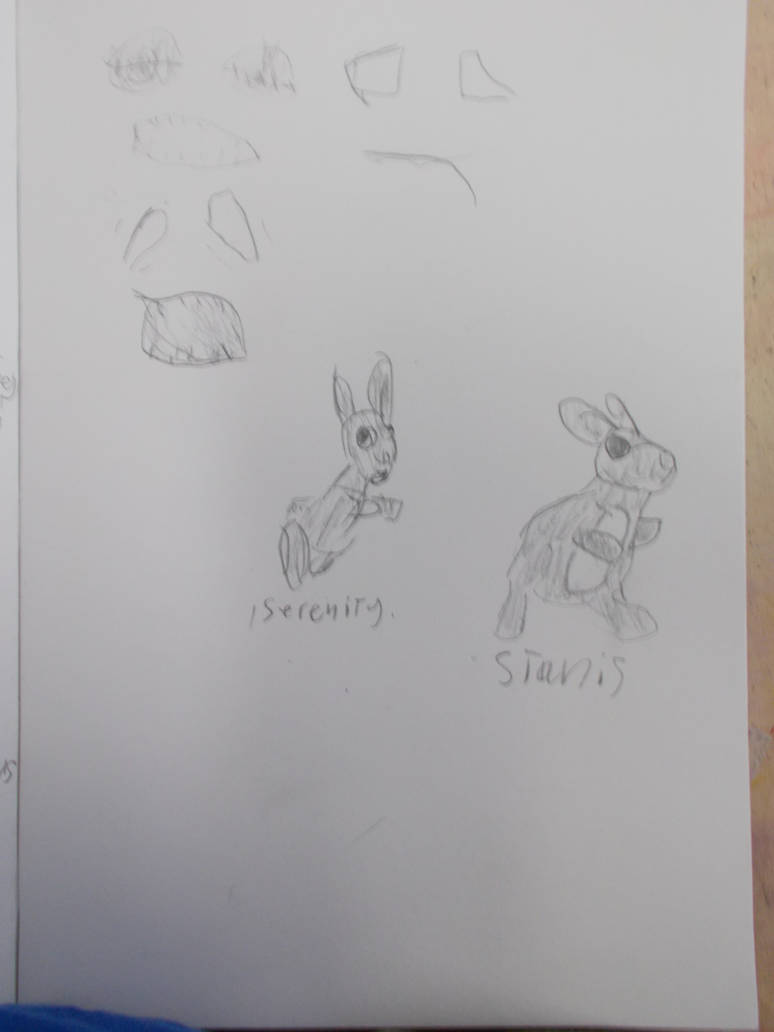
I started drawing rabbits and writing bits of text. And soon I had three heroes. Strype, White Tail, and Ghost.
I knew I had made a choice I could get invested in.
It was clear from my crude, ugly drawings and my mind wondering to creating the three rabbits staring into a black void that apparently leads to the centre of the earth that this would be fantasy horror. My favourite genre.
I drew some more and soon I had a story. This would be about my three rabbits fighting three demon rabbits in forms of dead loved ones.
I had my premise. So I then wrote down a story. I think it’s good one. All my love of horror, fantasy, and animal stories deeply present in it.
For my research I looked through my Marvel collections to see how long a good done-in-one story is. While the results varied they averaged out to 20 pages. Considering the page number for this project has to be a multiple of 4 twenty seems like a good number.
On Friday I started writing a script. Given I’d never written a script before James is still forcing me to push boundaries. How ever I did genuinely become ill and had to leave early.
I tried writing a bit more over the weekend. But I still wasn’t able to get much done.
As of this I have two versions of the script done. One that breaks down what happens on each page and one for the dialogue on each page. I’d like to go through it one more time to figure out the panel arrangements. It’s a task that scares me. But I’m just going have to start winging it and figure out the panel arrangement as I draw. If I don’t get started now I’m not going to until it’s too late. There’s a lot I’d like to do. Finalise the character designs. Do some thumbnails. Study real world rabbits. But there’s no time.
My plan is to draw the comic twice. Once with simple pencil drawings. That way if I choke I’ll still have something to show. Then draw over the existing comic with either coloured pencils or better, stronger black and white pencil drawings. Hopefully this will give me a little time to improve the drawings and designs of the rabbits.
My experiments with my camera have got me thinking. What good as an animator with no camera? Animation is meant to be filmed. And clearly there is a right way and a wrong way to do it. And if there is a right way then it follows there must be a better and a best way to do it. And I do want my animation to look the best it can. To perfectly capture the colours and details I create. Heaven knows I don’t want to put up with any of that colour correcting nonsense that’s been making mainstream films look awful for over decade. I want the camera to perfectly capture what I see or possibly see it even better. Whether that can be done I don’t know. But I’ll start investigating. I’ll start reading some books on cameras and photography when I can.
But another thing that crossed my mind. My films are all analogue. Pencils, paper, crayons the works. Made me wonder. How much sense does it make to then film it all digitally? Yes it’s more convenient. But when has that ever stopped me? I like taking the hard road if it makes the art better. And normally it does.
I’ve decided to look into film photography. Might as well try to bring back two dead art forms at once. I will look into making my movies with film to see if that gives me results closer to what i want.
I went down to the photo guys room and asked if we had the tech needed on campus. They both had trouble understanding the idea i was pitching and seemed to think I was mad (I’ve gotten that look before. For many reasons) But they gave me a film camera and some B&W film. I was given a brief tutorial on how to use it and left to my own devices.
Since then I’ve been using it as a companion to my main camera. It’s a bulky thing and the textures and smell of the thing remind me the the cameras my Dad always had on him in the 90s. But working with it does really make me consider every shot. I think working with film, even if it turns out to be dead end, will make me a better photographer.
On Tuesday (Yes I did all this parallel to my current project and making my final piece. And maybe i’d have gotten more done if I hadn’t But I did finish it and I’m thinking about my future here) I brought the film into be developed. Working in the dark room was a strange, magical experience. It’s more like magic than science making real photographs.s Specially the early bits. But boy it does feel wonderful.
I don’t have much to show yet. But I have my film
A picture sheet (Or whatever it’s called) and at least one B&W photograph. It’s been very interesting. And I hope to learn more soon.
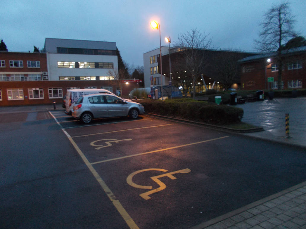
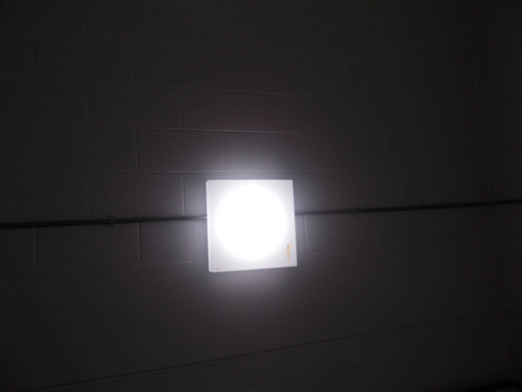
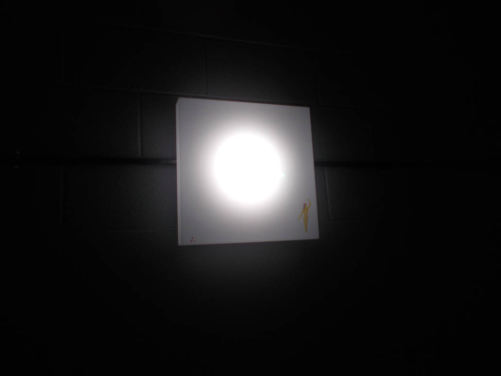
I think all this time around the camera (and weeks of stress-induced trauma) are making me soft in the head. I noticed the lights on campus where looking really beautiful in the dusk gloom on night. So I photographed it.
And as if that wasn’t silly enough I noticed just playing with the camera on the stairs it would do odd things with the lights. It would turn the space around them darker the closer in they were. bring them in real close and it would make it look like a single light in the darkness
Grovey. And honestly kind of beautiful.
Another thing that’s made me think about my future was something quite unlikely. The release of new TV series based on the Book ‘Green Eggs and Ham‘ by Theodor Geisel. Better know the the world as Dr Seuss.
All attempts to adapt Dr Seuss’s books into film (Barring a few entries he worked on personally) have been underwhelming and best and horrifying at worst. So I expected nothing out of this. But It blew my mind. It’s the best animated anything I’ve seen in years. But more importantly it’s all done in real, traditional, 2D animation. And the best that’s ever been put into a TV series at that too.
Just take a look
To say it blew my mind was an understatement. It’s made me rethink my future. It might be that hand-drawn 2D animation isn’t dead after all.
I’m still going to pursue a career in the indie scene so I can make totally analogue animations. But when the next Green Eggs and Ham comes around I want to be a part of it. I want to help MAKE things like this.
But the animators who made this didn’t use pencil and paper. It was done with a digital easel and digipens. So I’m going to swallow my pride and learn how to do this the modern way. I want to be someone they call when they need something like this made. A pro.
So I’ve talked to Morgan to see if He’ll give me some one-on-on lessons in TV paint. That way i can learn the program and get some classical animations lessons at the same time.
Morgan’s down for it. And he says he’ll talk to Owen about it.
The future is going to be very interesting indeed.
There’s not much left to go over. I’ve been extremely in depth in this. Probably more than anything else. But I might as well tie together the last few pieces.
I came in in Tuesday just wanting to die. But I had another very productive day. I can’t say how. But yes. I did the drawing and most of the undercoat. It was good work. My camera battery died again so I have nothing to show. But I did well and the I noticed while my inner doubts do eat at me a lot It’s not just a case of living with it and numbinging myself with small abouts of reading (or the internet). My inner monologue can change to more positive things. Maybe I should have less or no monologue. But at least I no I’m not just trapped with my own angst. My mind goes to odd places when I’m working well on art. When I’m in deep my mind starts playing long clips form old Thomas the Tank Engine and The Simpsons. In quite a lot of detail too. I don’t know why. But I’ve had this happen to me before in long life drawing classes. I think it must involve some deep part of my mind coming to the surface.
I wasn’t back on schedule. But I was doing good.
On Wednesday I felt like I want to be dead. But I still came in. In didn’t work as hard. I’m sad to say I slept a little in the middle of the day. Something that often happens when I’m stressed. And my output wasn’t as strong. But just when I felt like giving up I realised something. When I feel like something is too hard I shut down. But all I really need to do is think about what needs to be done next, or what can be done next, and maybe rest a little (though I’m hoping to cut that stage out) and I CAN do it. I can go on and do the thing that seemed impossible or too advanced or stressful for me. I could do it all along.
Everybody has times in their life when their hearts are filled with doubt
Frustration builds up inside, still makes you want shout
But if you take that first step, the next one will appear, then I find I can walk, and run, and fly
I left tired. But ready to do do the thing I most scared of. The faces.c Feeling almost confent.
Here’s how it looked at the time
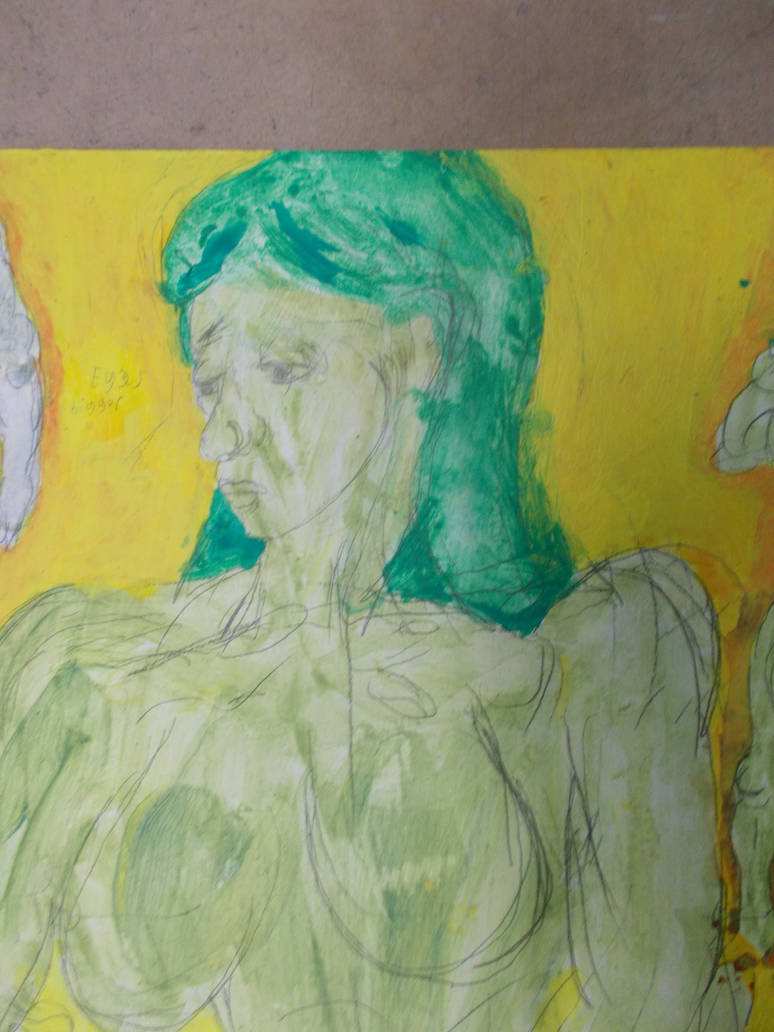
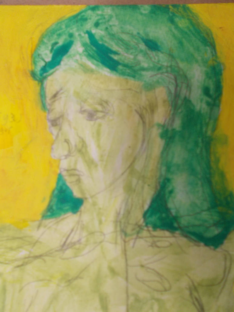
I was pretty happy with e drawn version of face. I not only looked like a real person’s face. It looked like a woman’s face. That’s so rare for me it hurts.
Probably the best human face and expression I’ve ever done. Though I did have some real help from James.
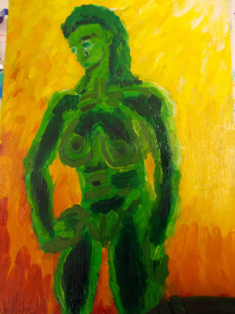
Well today I came in and appield the oils. And her face didn’t get worse, it got better. The whole thing got better. I think I’m currently better with acrylics than oils. But damn to oils feel nice.
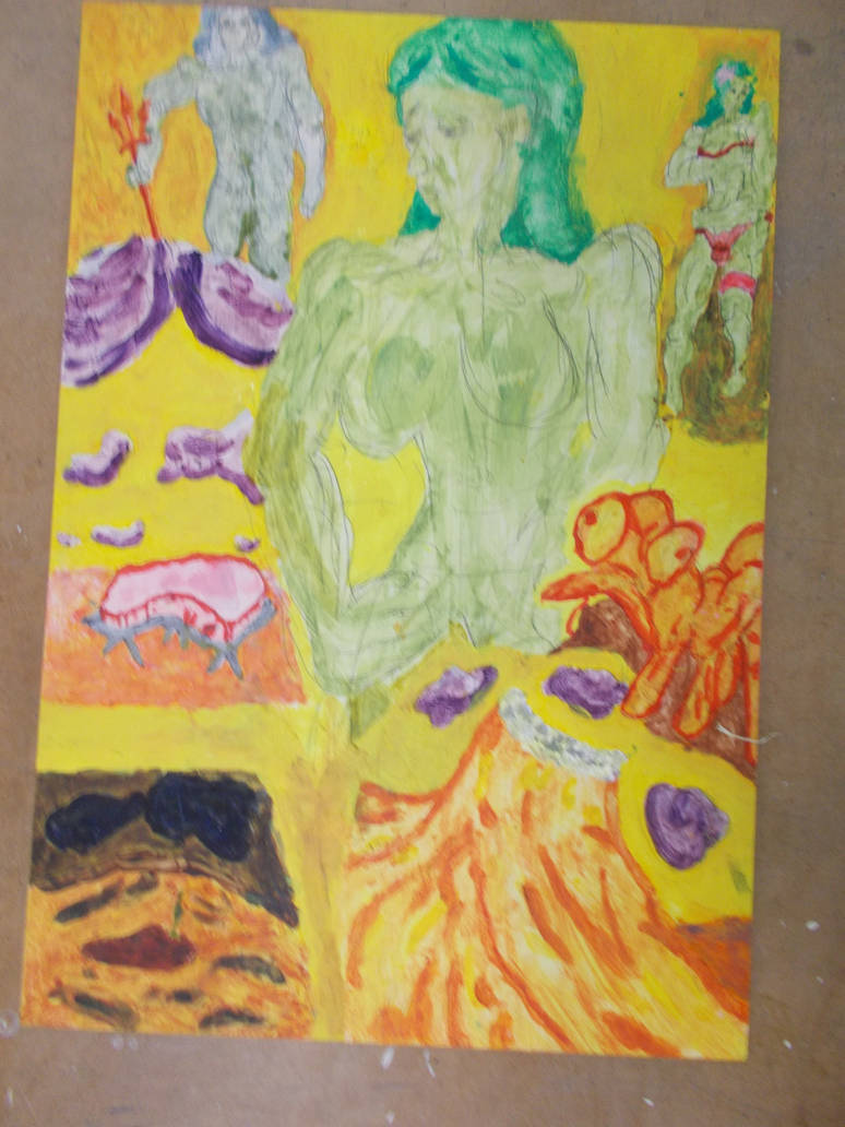
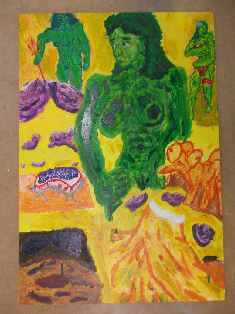
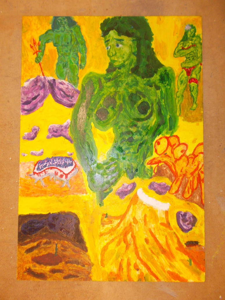
I I painted the three figures in oils and added some details the rest of the piece. Then I realised something I was done. Sure there’s more I could do. The thing was very messy with rogue bits of green splattered all over the place. But Everything that needed to be there, was there.
I did it. I actually finished something. By myself.
I hadn’t truly finished a project since 2015 at least. I think i’d believed I’d never be able to. The enormity of this moment made me want to cry. Whether from all the years of failure or breaking through that cycle I don’t know.
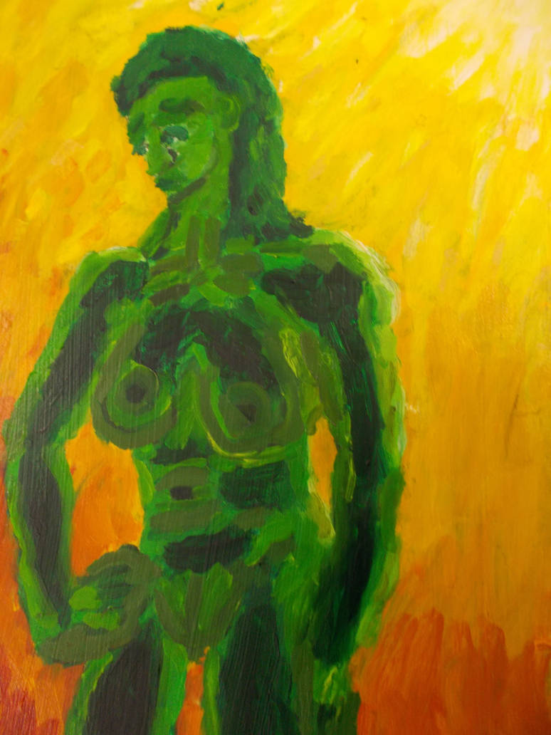
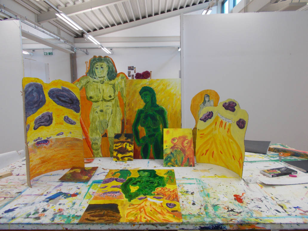
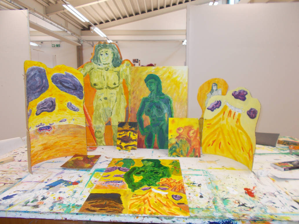
Here’s all my pieces together.
And here is the final piece
Wow
I cleaned up. Gave my presentation and wrote this up.
I feel like I’ve had a lot of limits and boundaries pushed these past few weeks. I may have even learned a few things. i just hope I can carry some of it. Any of it into new year.
At least I will be working with James again.
I’ve also talked to Morgan about my interest in photography and learning a bit about digital 2D. He’s onboard. Awesome.
This has been one hell of a module. I can’t remember the last time I had to learn so fast on my feet or worked so hard. It’s been draining and more than a little scary. But I think I’m maybe a little better for it.
At the start of the project I was feeling very cynical. Last year’s field was a total joke and I didn’t expect much to be different. But I was hoping I could at least refine my drawing technique a little and maybe prep myself for trying to do painted-on-glass animation. So I was vaguely hopeful I’d get to improve something about myself.
My skills with prep-work and organization have sky-rocketed. In no other piece have I planned so carefully or made such good prep work. I’ve even been on a sort of schedule for once. I think my drawing, or at least my confidence in doing so has improved. And my use of colored pencils I’m sure has gone up in quality. I think I’m finally getting the hang of this underpainting thing. And I’m learning to use washes more effectively. I’ve re-learned just how useful extra reading is. I’ve also made some dents in the mental barriers and bad habits that either stop me working or make me quit early. I’ve even found flashes of my old motivation.
So I’ve done well there.
I haven’t had many new ideas to speak of. This module has been more about refining old ones. I did most of my great discovery of art years ago. But working so intimately with the ideas from Peralandra has made me think about the story and how much choice is a theme in it and how it is shown so differently from how choice is shown in the book as in Kierkegaard. Kierkegaard views choice as a burden, almost a curse. But Lewis shows the greatest of choices done in innocence. Would Kierkegaard approve? Would he even consider the new Eve’s choice a choice at all? Can see be free if she doesn’t feel angst about her choice?
I don’t know if that has any relevance here. But it might blood into something interesting later.
I’m not sure if I can go into any depth about how these developments might impact my work. All of this will impact on my work if I capitalize on it. I feel like a breakthrough were I could become a real artist is within my grasp if I just have the courage to take it. And that scares me. But the most immediate one is I’d way readier for the comic book module next year. The thought of that much original drawing would have terrified me before. And it still does. But I now at least believe I can do it. There was a time when I would never have believed I could. And I’ve become motivated to learn how to really use a camera. That is going to change my animation work completely. I’m sure of it.
This has been quite a week. I feel very tired. But I think I’ve done well. I think I may have even learned a bit about how I work. I’ve certainly been able to work for longer periods than I was last week. I think for the first time in ages I might even be on time for once (fingers crossed)
This is pretty surprising considering my slow start.
On Monday I was finishing off my photography journal and that was a pain. But I did it. And I think it will have long term consequences.
On Tuesday I didn’t come in. I had to get some Christmas presents from town and sort out some personal stuff. I know that sounds very unprofessional but sometimes life outside uni takes presence.
On Wednesday I did not feel great. I had not felt so behind in a long time. I had turn four blank cardboard canvases into paintings that could be turned into cutouts and a few days. It sounded impossible. But unbelievably, something clicked. I started working hard and fast and I wasn’t even thinking about stopping.
I started with a stick figure
Then I made a shape woman
And I decided I’d go the opposite route to watch I did making the coloured pencil drawings. I’d do a complete drawing for the new Eve and paint over it. But only make a shape man for the new Adam and paint over that. In coloured pencils I’d gotten almost equal (if different) results, with the Adam one being better (Though that might just be because it was a better drawing). Would history repeat itself here? We’d find out.
So I made an actial drawing over the shape woman. Putting the leg on the right in a different angle to see if it would look better and have more gravity. it didn’t. And I think the anatomy is broken. But it doesn’t look too bad unless you’re looking for it.
I liked the drawing so much is photographed it four times, to see which setting would give me the best results (Something I’ve been struggling with for a while).
Taken with the Portrait setting
Taken with the Smart Portrait setting.
Taken with Auto mode
Taken with Auto Selector.
There isn’t much difference between the four of them. But I do think the Portrait one is the best one. I I think it has the best lighting and does the linework the best.
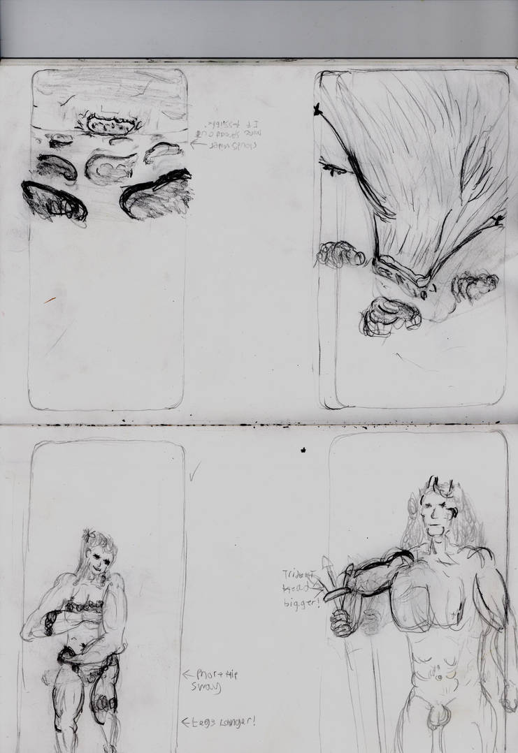
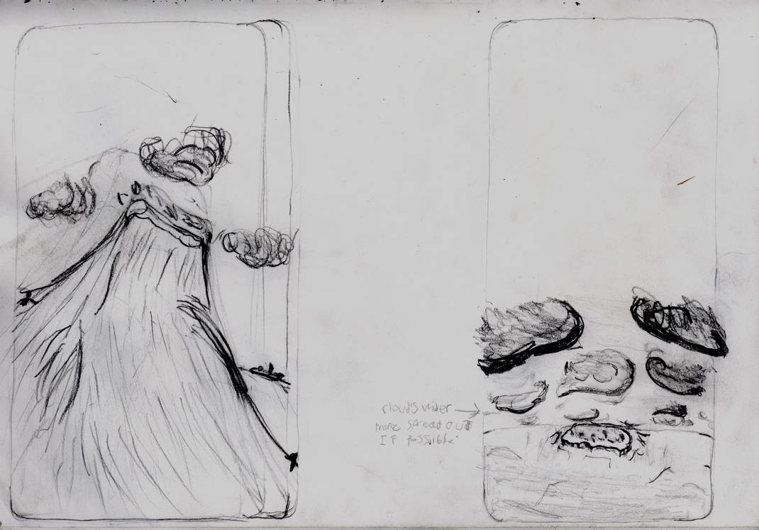
In the scene from Perlandra this piece is inspired by the Un-Man gives the new Eve clothes made of leaves. This does not cause her to fall from grace (That can only happen if she walks on the fixed land) But it does help her to discover vanity. I feel this image really gets over that feeling of discovering pleasure in one’s self for the first time. Vain, sexual, but still very innocent. And the expression I did here captured that idea better than any of my other attempts so far. It’s also the best attempt at her hair I’ve done.
I like it so much that I photographed it in close up just so this rare good face and expression would still exist even after I’d finished painting over it.
I went over the pencils with gentle washes of paint.
And the face still looked good.
Thankfully when I showed it to James he said it was fit for purpose as a cutout. Meaning I could leave it as it was. I got to work on cutting it out.
I then got to work paintinf the full background. It’s fine I guess. I’m trying to come to terms with this whole undercoat idea. I gave the sky an orange undercoat and the land a brown undercoat but painted them the same yellow. Does it work? you tell me.
Her it is take with different focuses and lightings.
It’s not great.
I then started work on the new Adam. I had trouble translating this won to the cardboard and keeping it small. In the end I just ran with it and let him take up the whole canvas. Even going over the canvas and putting his knees on a small, extra piece of canvas. Part of being experience is knowing when to give up and go with the flow.
I made a very boxy shape man
But the picture wasn’t very clear no matter what I did. So It tried something new and fiddled with the light settings on my camera to see if making the pick darker would make it clearer.
Not really?…. So it tried a third time. This time at half darkness.
Maybe this helps a little?
I think zooming in a bit so their was less border helped more.
I was able to get the undercoat of colours done
I think it looks goofy as all hell. And the background is more orange than I wanted it to be. But James seemed to like it. He suggested I could add in the fine details with pastels. I was reluctant at first. But knowing I was short on time I accepted. James gave me the pastels the next day.
Bare in mind this was all in one day. A crazy amount of work for me. But the craziest part was when I got round to drawing the great wave I did the drawing in 20 minutes! With no redraws! Normally this would take me an hour
And it’s better than any of the other versions I did too.
I even wrote “How the hell did this happen!?” in the margins.
I also tried darkening the camera image again. A little
I think it can kinda help.
unable to believe my progress I started drawing the fixed land. And again in came out as I wanted it on a first try. Even if it took a little longer.
Yes. Zooming in does help.
Thursday was an even bigger challenge.
I started off doing the painting for the great wave.
I know it doesn’t look like much. But this feels like the most accomplished painting I’ve ever done. Everything just fell into place. The colours are right. The line work is right. The textures are right. And that grey-yellow sky is perfect. It’s not that it’s a good painting. It’s not. But it looks like what I wanted it to look like. And that feels strange.
Here are some other photos of it.
Nice warm colours.
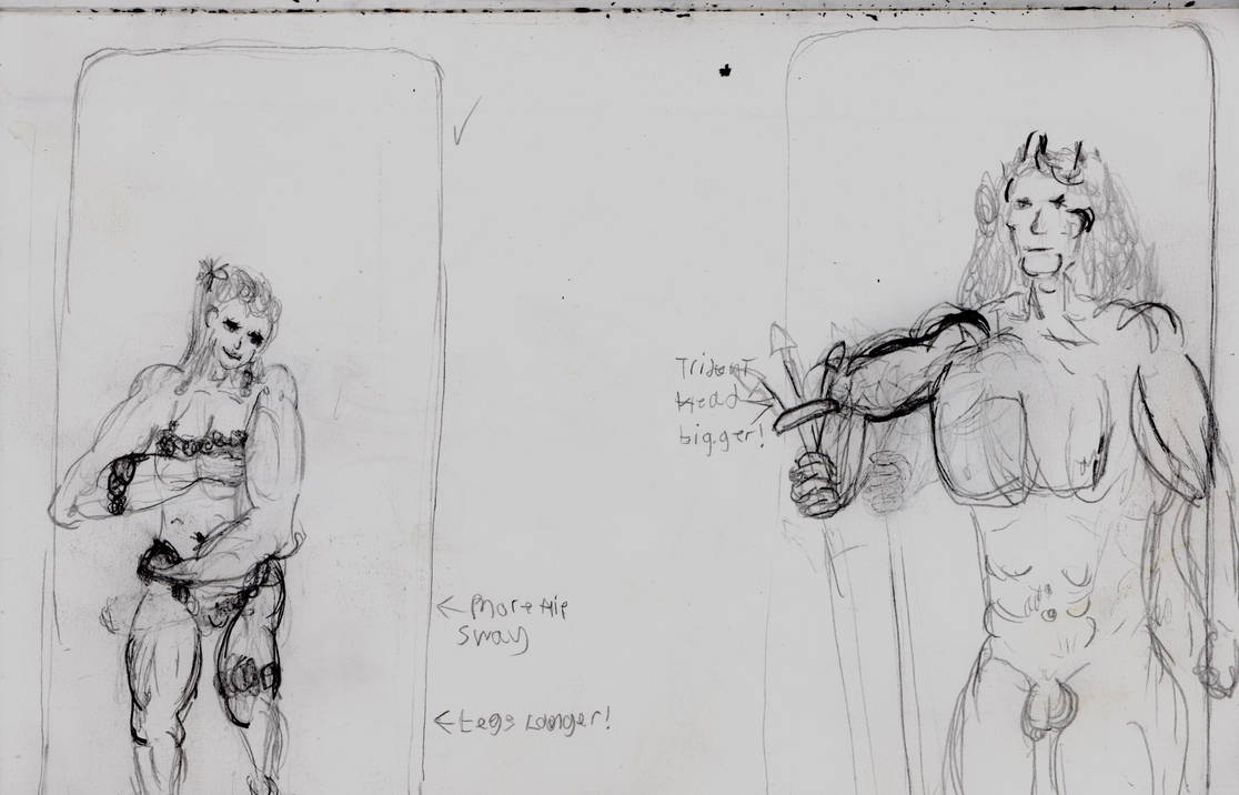
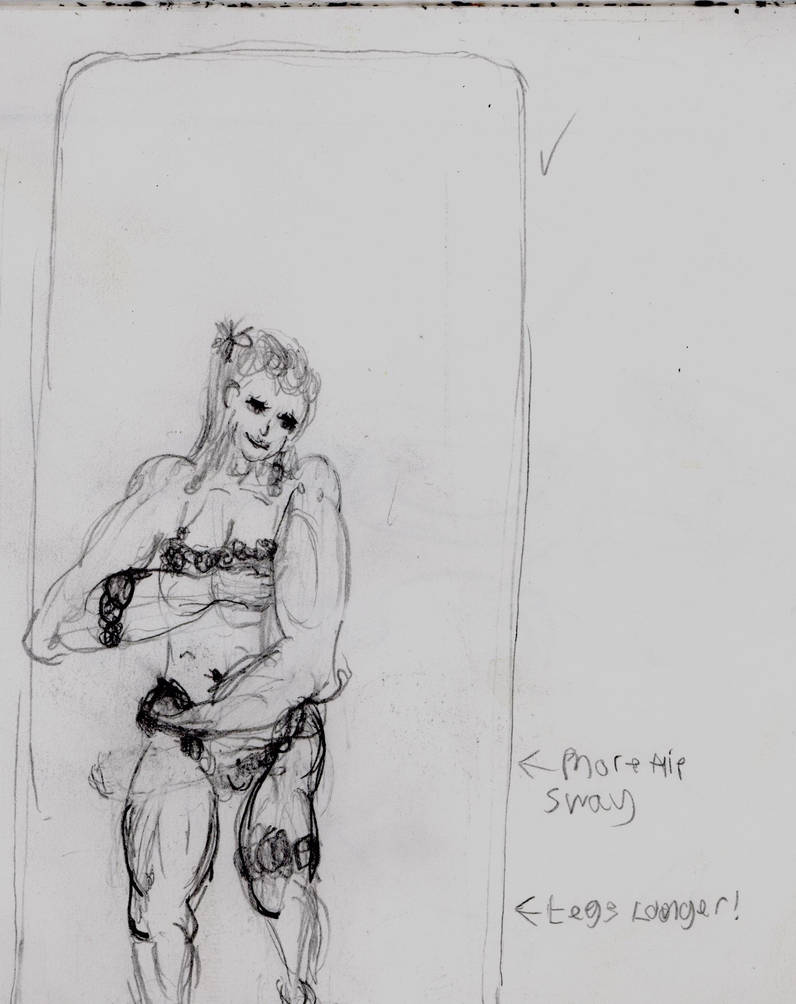
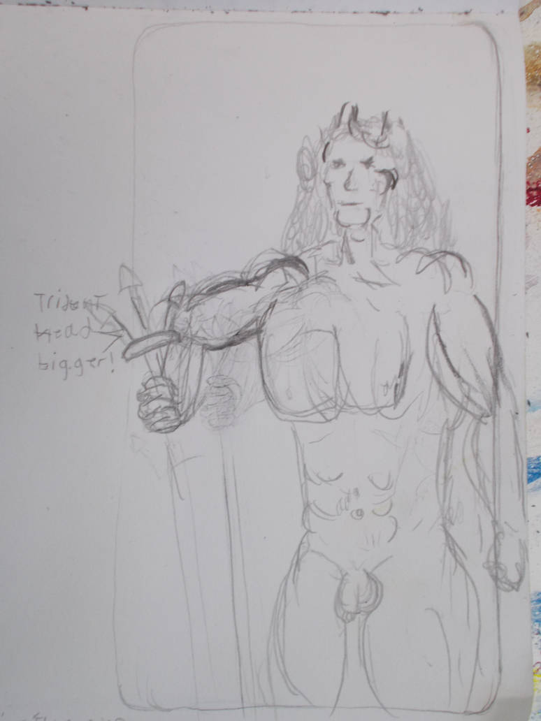
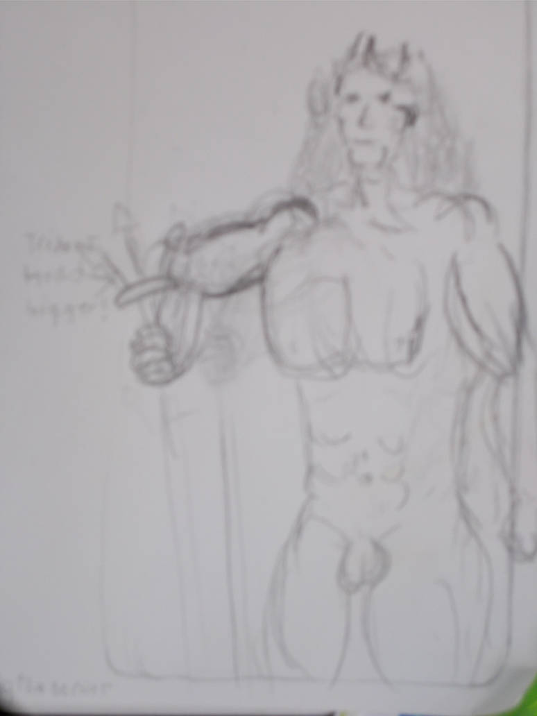
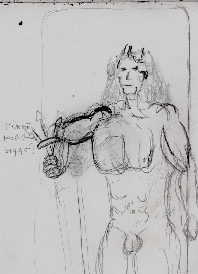
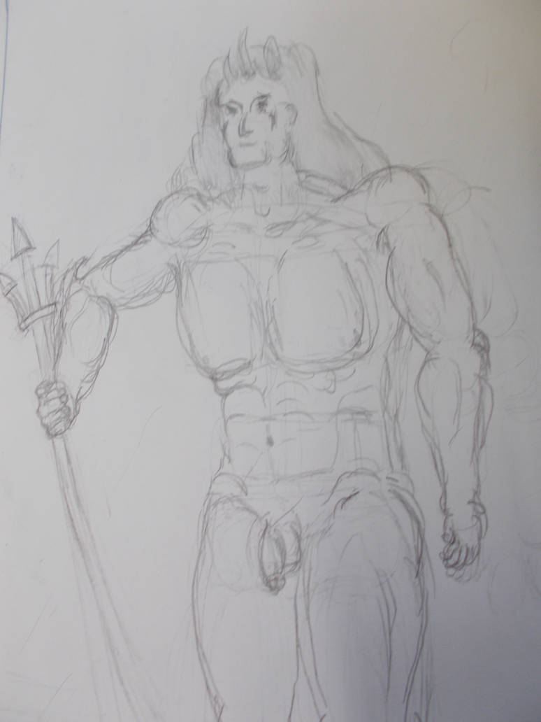
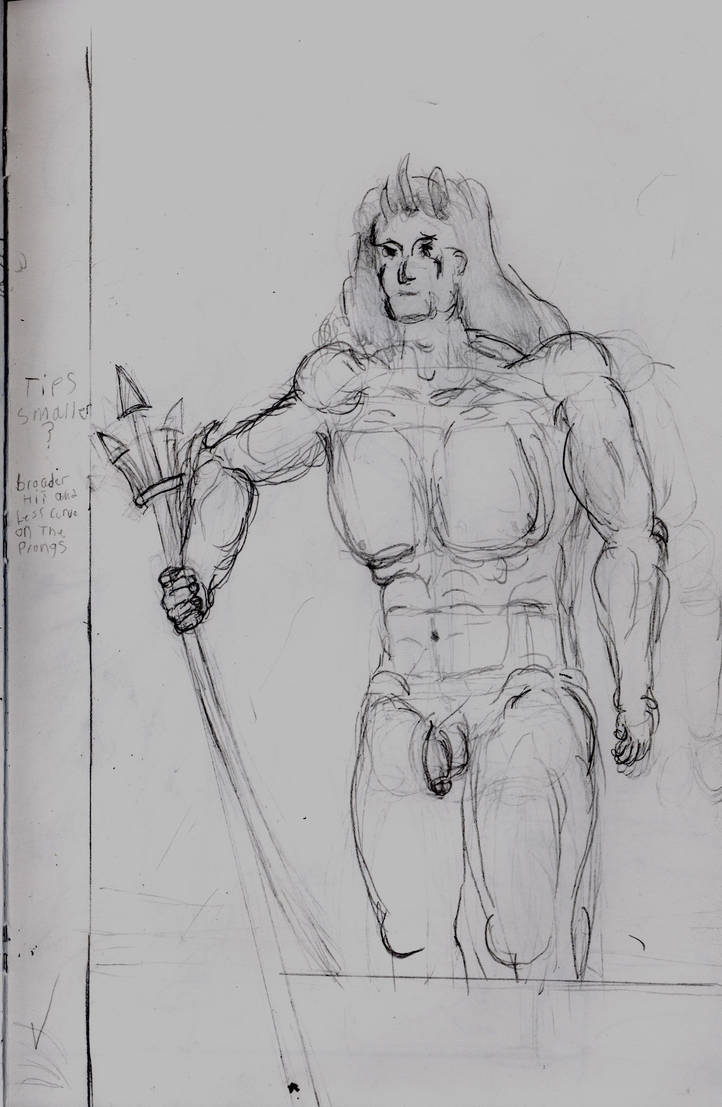
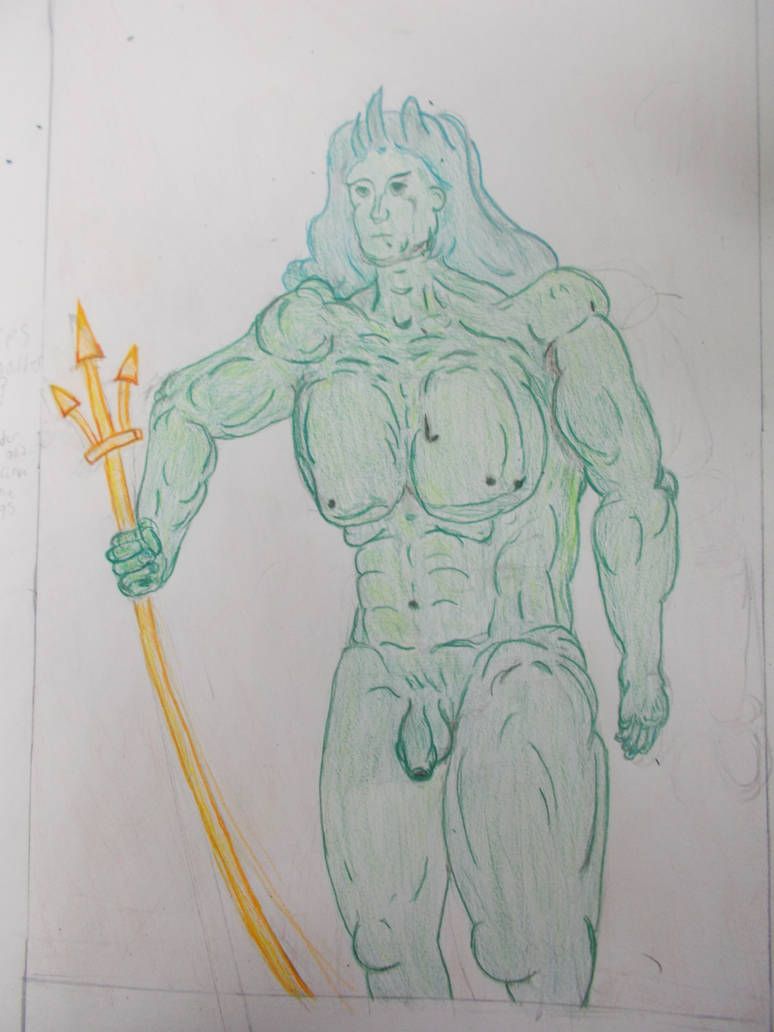
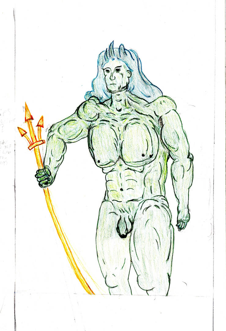
I went back to the new Adam. First adding some extra layers and shading to his trident, which I do think looks better for it. I then used the remaining orange to alter his posture so he didn’t look so hunched over.
I then realised I still hadn’t given him his maleness. I whipped up some green (Sidenote. I’ve been trying to do all this the proper way. Just using Blue, red yellow and black and white. Mixing them together as needed) and painted in a penis and testicals. I think they look good for not having lines to trace around. Possibly better for it. But they are slightly in thee wrong place. Maybe I should include the genitalia in the prime drawing in the future.
I had enough green left over to add in most of the fine details. Just look at the difference between the two.
Pecs, abs, knees, fingers, lighting, shading, better hair, and even some facial features. All using the extra green.
I then added in eyes, a nose, a mouth, eyebrows, and some ear bits using the pastels. not only did it look better than I thought it would. But again i got a good expression out of it. The dependability of which I’ve been doing that is starting to scare me.
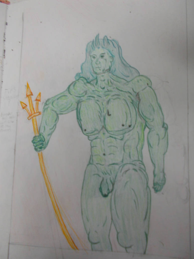
Again both the full drawing and the working over a shape person have given me interesting results with possible strengths. But I think this one is the stronger painting
Here it is in extra detail,
—-
With that done I got to work on cutting the things out as best I could. Like I said, these were probably meant to be miniatures to put in front of the painting. But between my main painting being portrait-style and my having trouble scaling these down that wasn’t really an option. I’d have to put my “Cutouts” to the side or slightly behind or in front like some kind of polyptych or shrine. But I could still cut out all the empty space that had noting in it and make them cutout like. Maybe that makes colouring the entire sky pointless? I don’t mind. It was good for experimenting with undercoats and for adding variation to make the skies look real, for lack of a better word.
Here’s the Wave as a cutout
Looks good to me.
And here’s how the new Adam painting looks as a cut out.
Probably looks a little better as a cut out.
The New Eve in her leaf clothes was the only one I’d been able to make small. So it would probably look good as a cut out.
It’s fine. It also looks like a head when viewed from the back.
After that my Camera died (I took these photos later). And I decided to go home for the evening. Feeling that I was on time for the first time since…. I first came to Cardiff Met probably, I decided to celebrate with a large Domino’s pizza with all my favorite toppings. That, was a big mistake.
I have a rule against ordering pizzas like that for a reason. Something I’d forgotten about.
I arrived in on Friday feeling ill. I did not feel able to do anything. So I let myself go to the computer and started writing this journal. Yes. This has taken four days to write. But that’s because I’ve been altinating it with doing small bits of work. Even while typing on Friday I did some drawing. Remer how I had drawing of the fixed land but no coloured version?
Nor did i paint the cardboard version?
Well what had happened was on the day I was going to do the coloured pencil version I forgot to bring them in. D’oh! So I made the painted versions instead. In truth it was probably a godsend. It made me push forward and tries my best. I could have just painted the pencil version raw with no coloured pencil version to work off of. But that didn’t feel right either. So I finished the cutouts instead. It was tempting to just move forwards and make the final piece. But it should be clear I don’t like to walk away from things. And I didn’t feel ready for the big challenge yet. So I doodled in my sketchbook. Slowly adding colour to the final drawing.
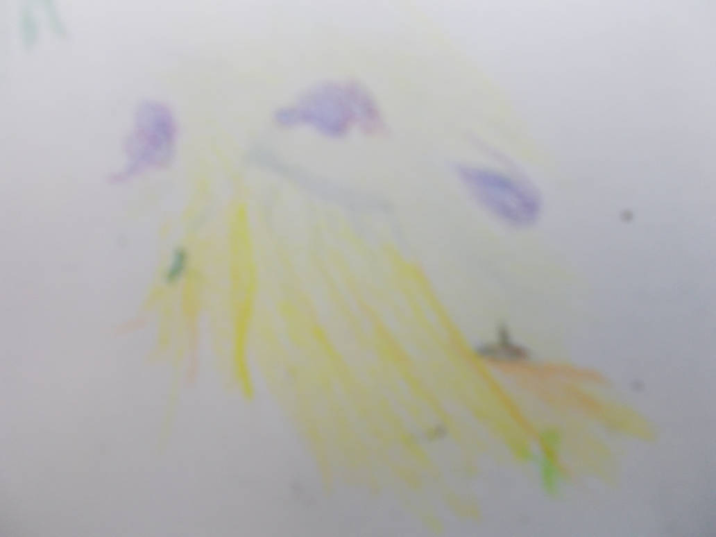
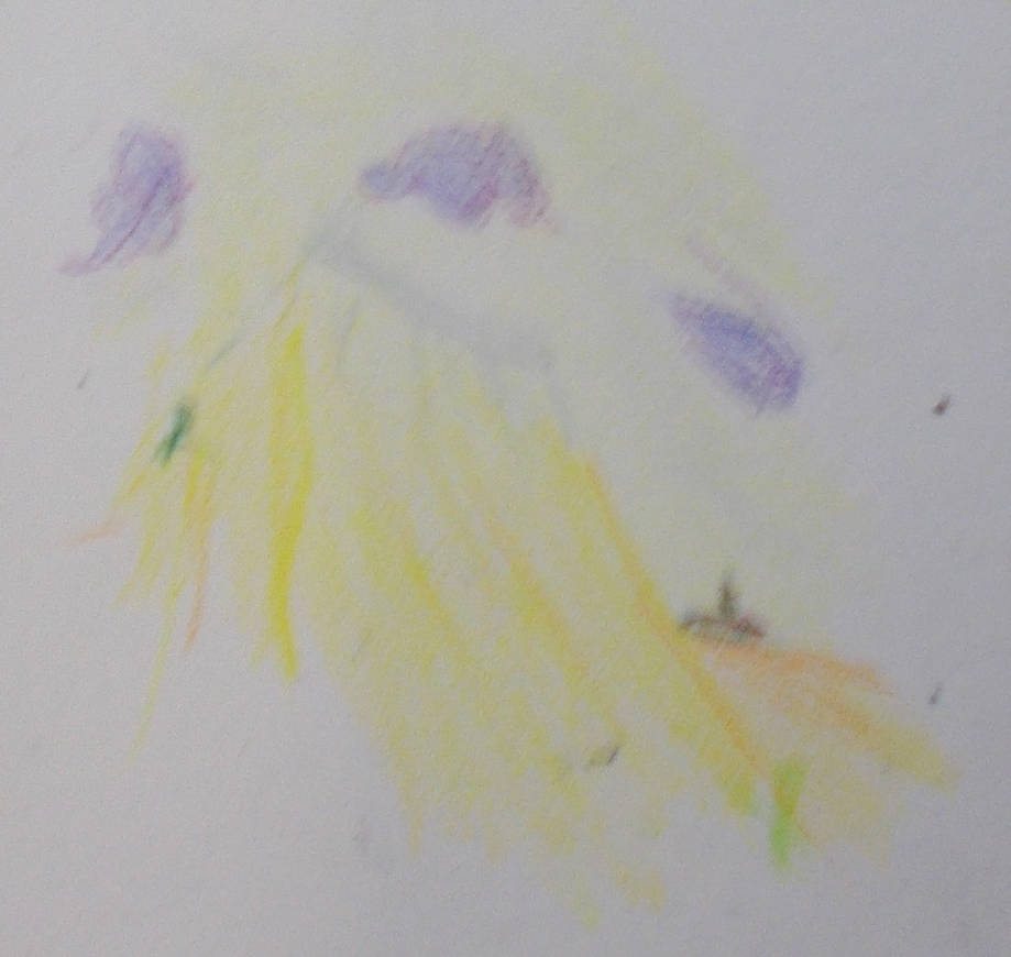
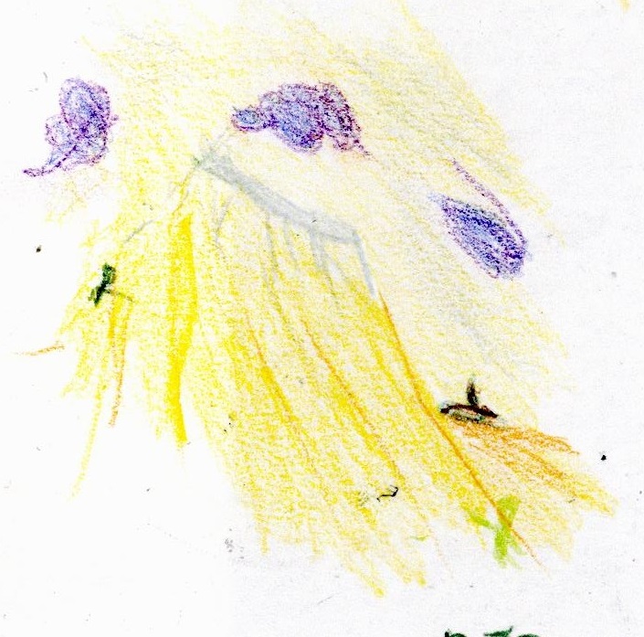
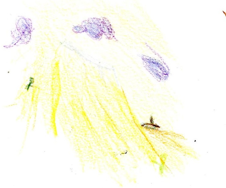
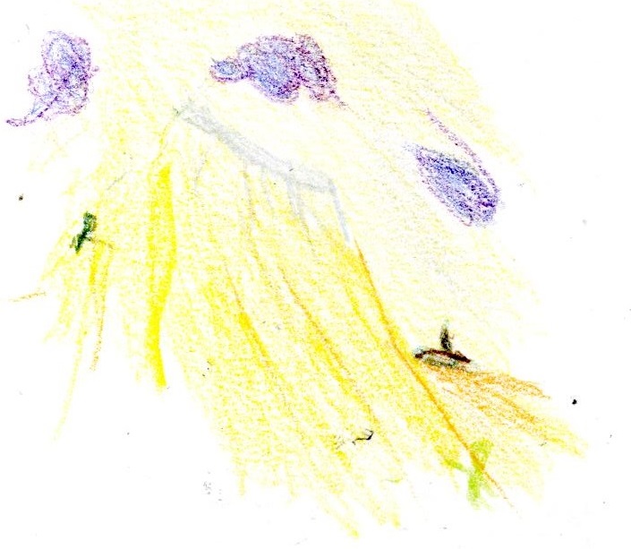
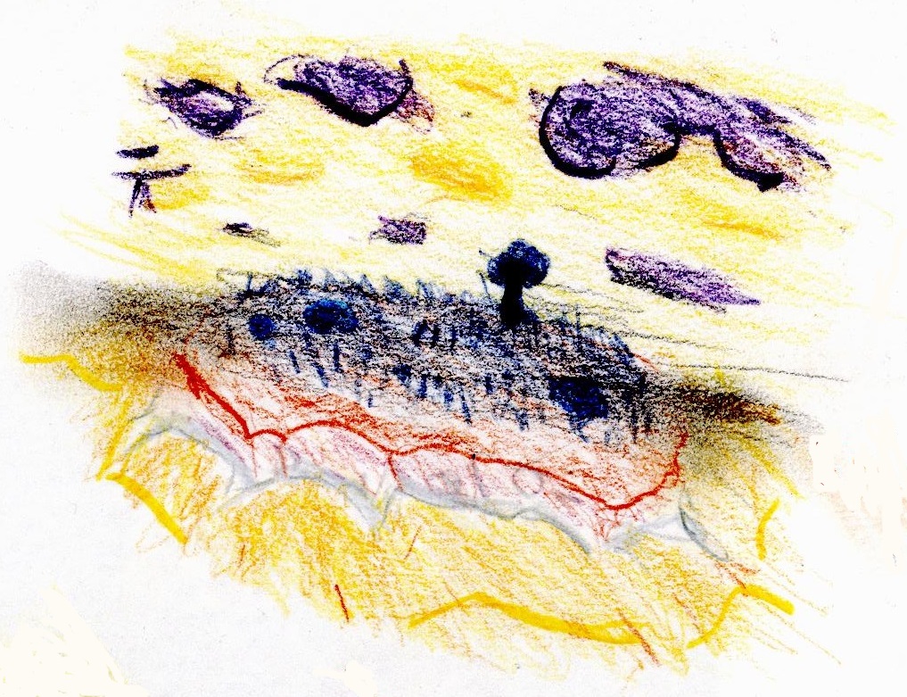
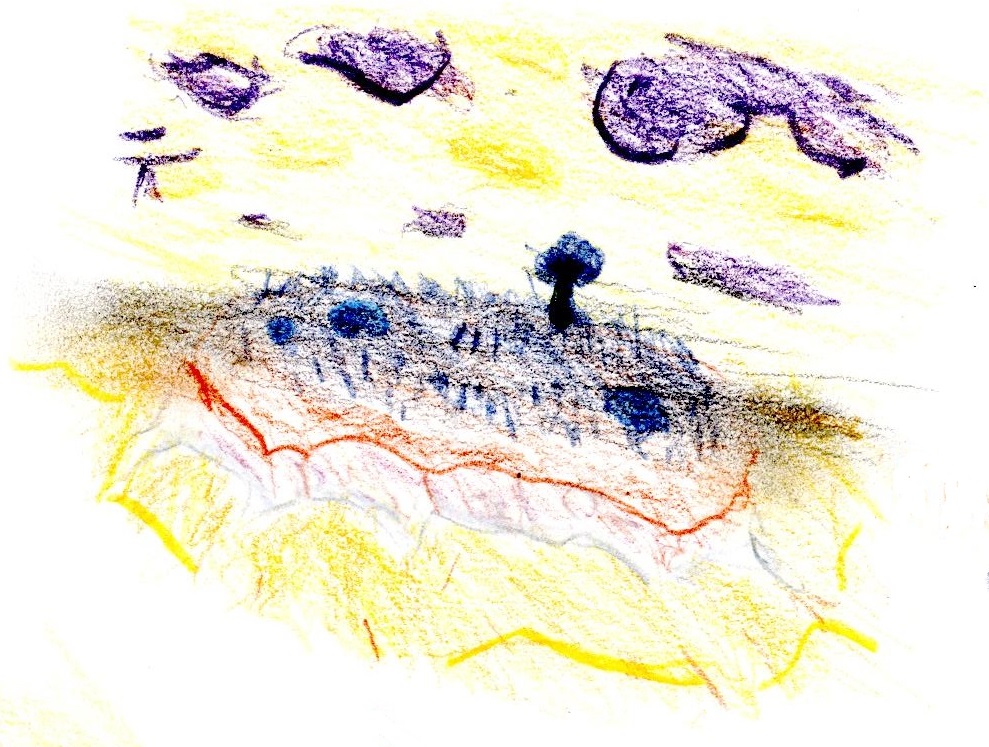
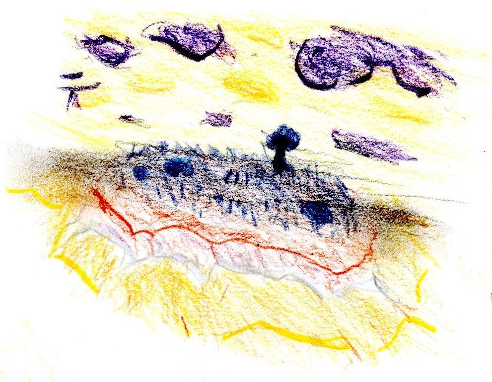
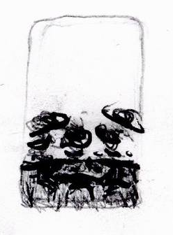
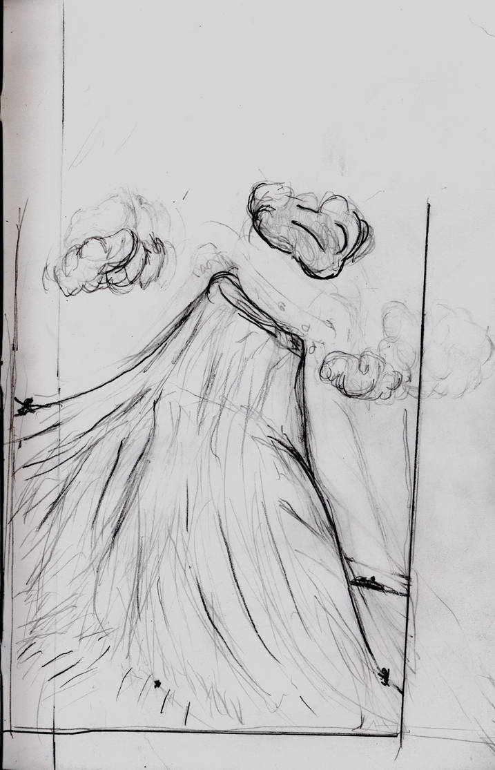
The purple clouds were nice opportunity to start experimenting with different colour mixes and techniques. I know I’m tempting fate. But I feel I really have improved in the past few months. Here’s were I was in September
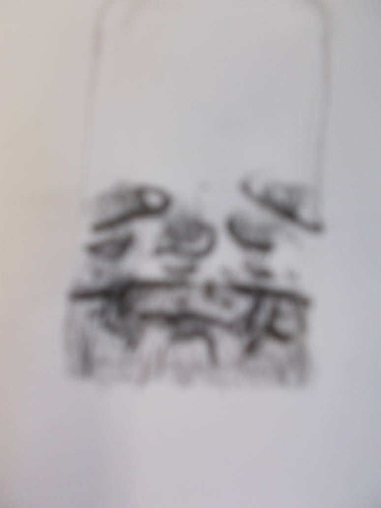
And here are two scans and a photograph of the central purple cloud.
The detail. The tonal variation. It’s getting close to professional level.
Having not come in on Tuesday I decided I’d do something I’d never done before, and come in on Saturday. Yes. They let you do that.
On Saturday. I was feeling terrible. I wasn’t unwell anymore. I just felt trapped in my head. All the time away from the net was making me aware of somethings I was suppressing. Still. It’s best I come to terms with mty issues. Hopefully this will help.
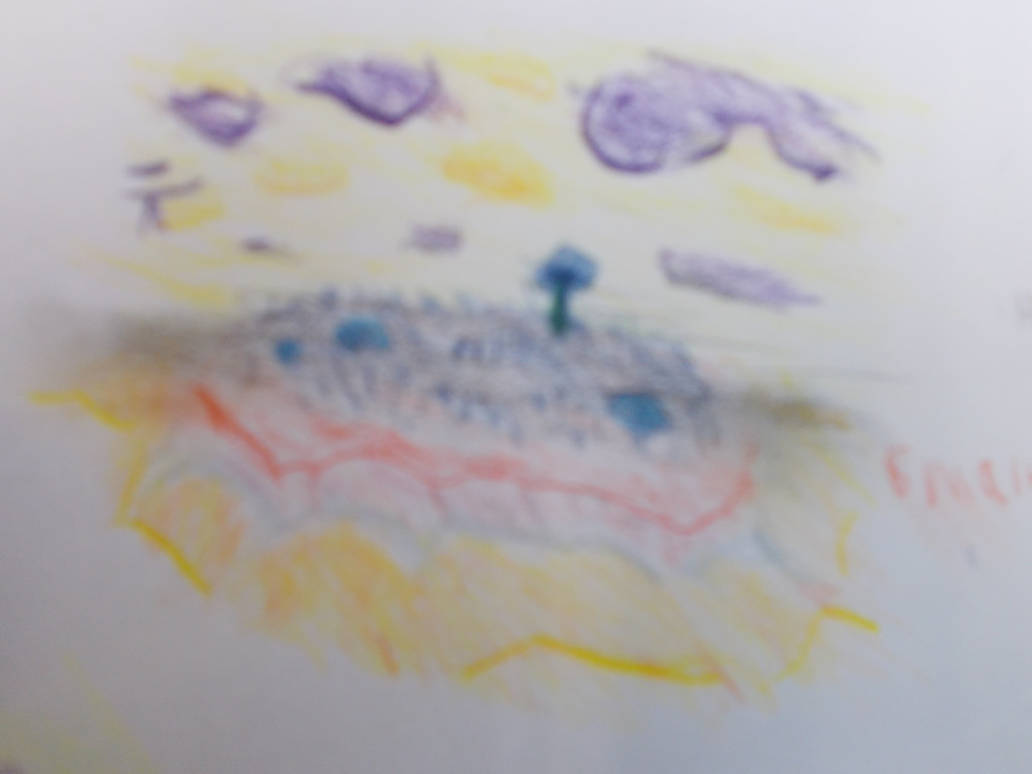
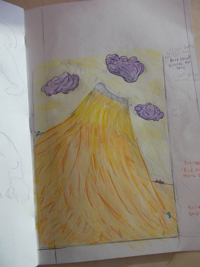
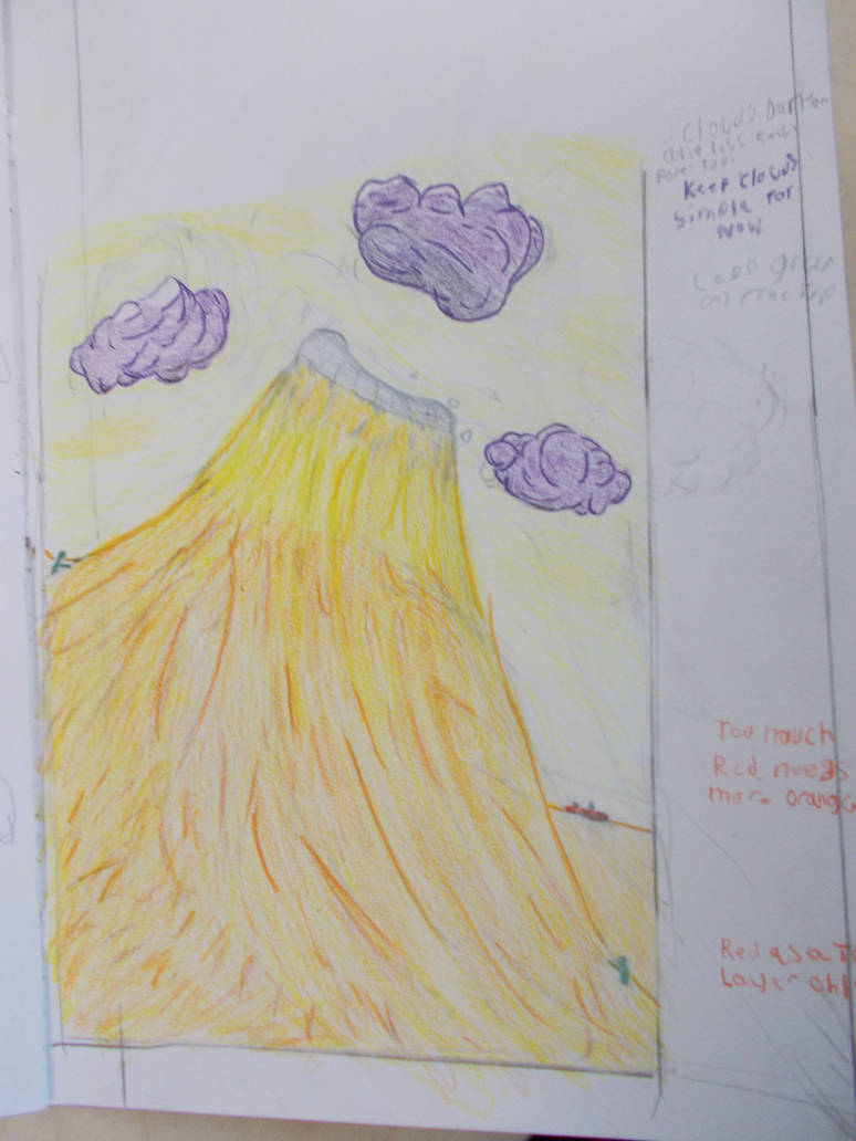
But taking it easy, planning ahead. And letting myself stop to read every now and then, I finished the Coloured pencil version
It. Looks. Good.
Not professional level. But it looks like an actual drawing. Like I think I might be good at this some day.
Even if I don’t finish the final piece, I’m not sad. My painting and drawing skills have advanced since this module started. It was only just the start of November. It’s crazy. It’s been years since one course had made me learn like this. I salute you James. For giving me a real challenge.
I chose this module because I hoped it would help me with my drawing. And these coloured pencil drawings and painting experiments, they’re my real final piece. The real works I poured my heart and soul into. The ones I tried to make as good as possible. And in that regard at least I’ve well and become better.
Don’t think I gave in though. I went straight ahead and started making the painted version (After cutting out the the extraneous bits). I even got half of it done.
I may have even discovered a new sgraffito technique (That’s when you scratch into wet paint to remove it and make lines and shapes with the negative space). I was trying to erase some pencil lines that had wet paint on them. The result was this soft, organic looking sgraffito
I think this could be used to some interesting effect by someone who knows what they’re doing. I showed it to James who was interested by it.
Sadly it turns out on Saturdays they kick us out at 5:00. If I’d know I would have worked harder.
Here’s where I was.
Not to be deterred, I did another thing I’d never done before. I took my work home with me.
I was too numb to do much. But on Sunday I went out to the winter fair and had a great time. Even if I was totally soaked in cold rain.
Getting home I did to a little. Not much. But I added in some texture to the sky and ocean. I made a dent in that mental barrier.
I also tried writing a bit of journal at home. Something I haven’t done in a long time. My Laptop is too slow. But maybe it’s time I fixed that So I can do both types of work at home and can spend less time on the internet here. Given that’s what the laptop is for seems kinda important.
I came in today wishing i could just skip the whole thing. Just give up. Or just curl up in a ball. But I did anyway.
I alternated between painting, writing this journal, and taking care of some important Constellation stuff that I had to take care of. It was a bit of a chore. Jumping between these three things made it hard to get into a groove. But in time the final cutout painting was almost done
Quite the improvement from Saturday wouldn’t you agree?
But I wanted to make some final additions. I wanted to add an extra layer to the fixed land itself. Go over it with a wash. Then paint the the fine details again in brighter colours.
Here’s how it looked at first.
And here’s how it looks now
I think it kinda looks better this way. But James felt the original was better. And that’s fair.
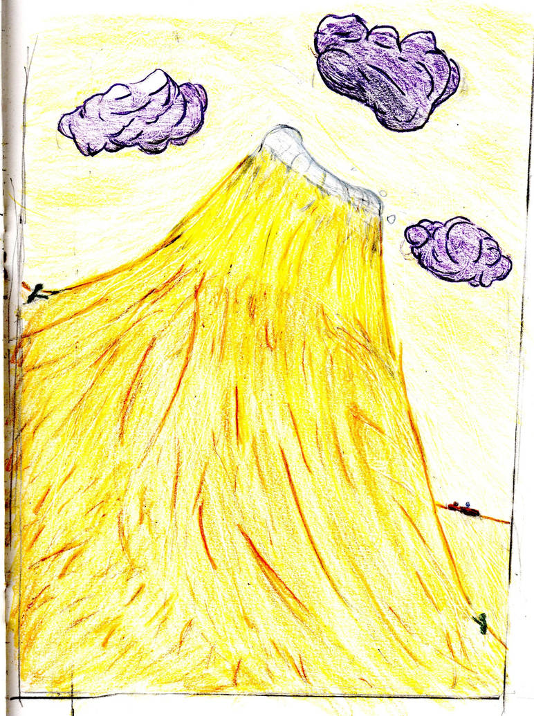
Here’s how the final version of it looks.
I painted in some waves (as best I could). But they were too bright. So I went over them with a white wash to dull the colours. It’d tried white on one side and grey on the other to dull the colours to give a sense of depth. (Seen above ^) I can’t say which I feel is better. Bet James said he like the white better so I went with that here.
And here’s how it looks now.
Taken without flash
Taken with flash
And now all that was left to do was arrange the cutouts and wax paintings around the main painting so I had all of them for easy reference when I make my final piece. I did so, and it really does look like a shrine of some sort.
Why can’t this just be my final piece!?
I’ve put all my materials and tools in order. There’s nothing left to do. No other jobs that need to be finished. I have two days to make my final painting.
This is one of the longest journals I’ve ever done. And I think it my represent a turning point in my work. Strap yourselves in. This is going to be a big one.
I have, as I have been trained, trying to record my working. It’s somethin teachers like, or that they at least say they like. I never seem to get praise or better marks for it.
Anyhow here is the work I made last week.
But rather than just show what I did and say how I feel about it. I want to use this journal to to show I’ve been working on trying to find the best way to record my drawings. Using both my camera and the art-block scanner in differnt ways to see what works. To show I have been experimenting, not just in drawing, but in my recording too.
For each drawing I will show the differnt versions, say what I took it on, and if I can remember, what i did to make them the way they are (There’s a lot I’ve forgotten).
I hope this will show that I am engaged with the project, and still trying out new things to improve my recording.
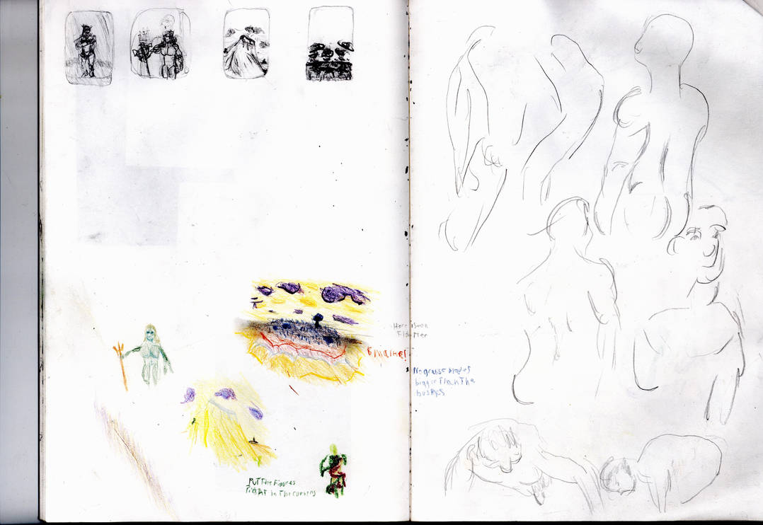
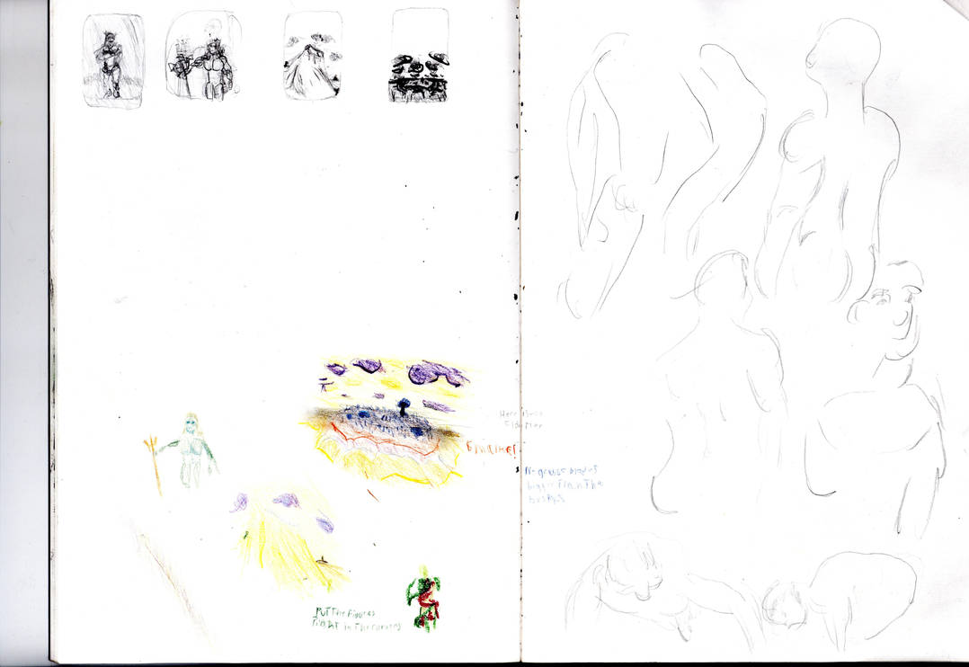
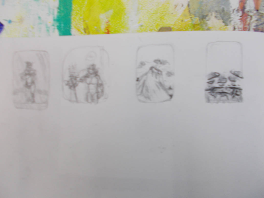
Firstly I start with just doodling what I imagined in my head using the coloured pencils. The results were surprisingly on point. I felt no need to correct them or try again.
I then followed them with simple thumbnails to figure out the actual composition and make the details a little stronger.
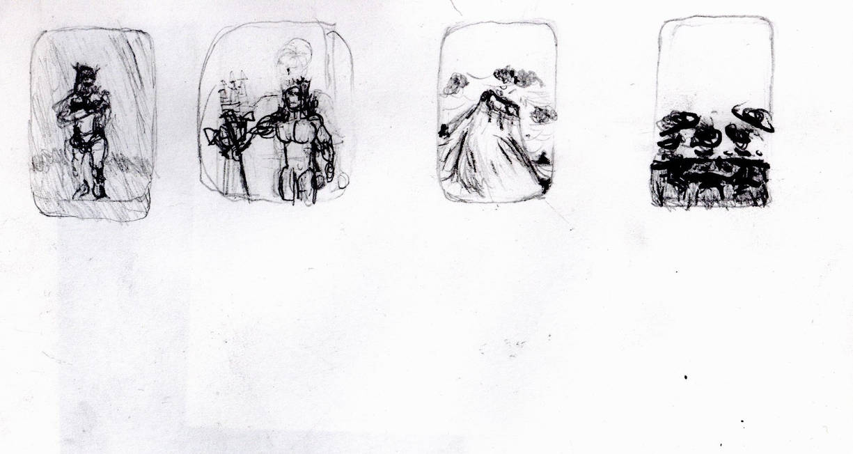
The doodles and thumbnails.
Taken with my camera
Taken with my camera from further away. No improvement.
Taken with scanner. Looks a lot better, But maybe too bright.
Taken with scanner. Way too bright.
Taken with scanner, trying to aim for a mid-point between the other two.
Individual doodles: The New Eve
Taken with my camera
Taken from my camera closer up.
Taken from my camera as close as I could get and with better focus.
Taken with scanner.
I love how the texture comes out. But the red and the main green are way too dark. And the light green doesn’t quite look right. The colours in the photos are in the dark and slightly washed out. But they look right and look how they do in the real world.
Taken with scanner at a brighter setting. Kinda better. But the colours are still wrong. Maybe it’s a contrast thing.
The New Adam
Taken with my camera. Forgetting to focus.
Taken with Camera. No better.
Taken with Camera. Focusing a little (I think)
Taken with scanner. Colours are good. But it’s too harsh. Like bits of it have been shaved off. It’s good. But It’s not right.
Taken with scanner at a brighter setting. Linework looks better but even more detail is missing. I don’t get this.
The Wave
Taken with my camera. Forgetting to focus
Taken with Camera. No better.
Taken with camera. More focus. Closer up. A little better.
Taken with scanner. At first it looks so much better. But the colours slightly off, The wave and sea are too close in colour. The figure on the right seems to be a bit too sickly. The island and figure on the left and too dark. And the colours in the clouds are too separated. It’s like the colours have been smooshed together and the fine details done with dark colours get extra darkened. I hope it doesn’t seem like I’m ungrateful. It just the scanning seems so good at first it makes the imperfections stand and so much more to me.
Taken with scanner. Waaaay too bright. It’s a sensitive tool.
Taken with scanner, trying to aim for a mid-point between the other two. The colurs are almost right now. But a lot of detail is still missing.
The Fixed Land
Taken with my camera. Forgetting to focus.
Taken with camera. No better.
Taken with camera. Actual focus. Slightly better.
Taken with scanner. The slight colours look great and the details come out so much stronger than in the photographs. But again the dark colours are too dark. So nearly perfect.
Taken with scanner at a brighter setting. It makes the colours less blocky, which I like. But it phases some of the lightest colours out and the dark parts are even darker. Urgh.
Taken with scanner, trying to aim for a mid-point between the other two. I guess it looks okay. It doesn’t hit a sweet spot though. The scanner really struggles when there is light and dark colours or shades on the page at once. It can do both very well. But it can’t do both at the same time. The fact it sometimes makes the darks darker really doesn’t help.
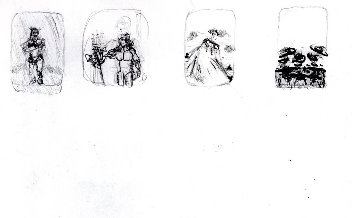
The Thumbnails
Taken with my camera
Taken with scanner. A lot better. But it makes the dark lines too dark. The wave (The one with the least dark lines) looks the best.
Taken with scanner at a brighter setting. For some reason it looks better here.
Individual Thumbnails: The New Eve
Taken with my camera. An awful lack of focus.
Taken with scanner. Again. great Focus. But the dark bits are too dark.
The New Eve
Taken with my camera. An awful lack of focus.
Taken with scanner. More focus. Dark bits still too dark.
The Wave
Taken with Camera. Awful lack of focus. But the black coloured pencil makes it stand out better.
Taken with scanner. This one also looks better and I don’t know why.
The Fixed Land
Taken with camera. My hands must have been shaking hard.
Taken with scanner. Both times this was the worst one. Why? Was it just the worst thumbnail? There must be some more technical reason?
With that done I started making test drawings, to iron out the kinks and figure out the details.
All taken with Scanner. Darkened compared to the scans of coloured drawings.
I think this process helped enormously. Yes the thumbnails gave me a lot to work with. But this let me understand how these would need to change to fit the greater detail of a larger scale.
They were also extremely useful for taking notes for my future self when making future versions of these. A trend I have and will keep using.
I started off with The New Eve
Taken with camera kinda blurry.
Taken with camera. Even worse.
Taken with scanner. Objectively better.
The New Adam
Take with camera. Pretty good.
Stronger lighting but Not as good.
Taken with the scanner. Best one. But I wonder if it over-dramatizes the difference between the light and the dark lines. Ironic considering how it smooshes colours together (As we’ll see later)
The Wave
Taken with camera. Little blurry.
Taken with camera. A lot better. Must have been using a better focus.
Taken with camera. Again, at some point my experiments with the camera made things worse.
Best one taken with the camera. Or at least the clearest. Not sure why.
Taken with scanner.more defined. And certainly has more weight to it. But the feeling of depth is lost a little.
The Fixed Land
Taken with Camera. Not too bad.
Taken with camera. So much better. Don’t know even know how I got a look this good.
Taken with scanner. Also good. I think the fact the dark lines are lines I wanted to be dark helps a lot.
The Final Drawings
Then I started making bigger drawings to finalise the design, and then be coloured so I could finalise the colours as well.
I’d do them all with H pencils so the lines would be easier to rub out and leave less mess. I think this worked a little. Better than a B pencil would have. But nowhere near as well as it should have. Talk to Morgan about this.
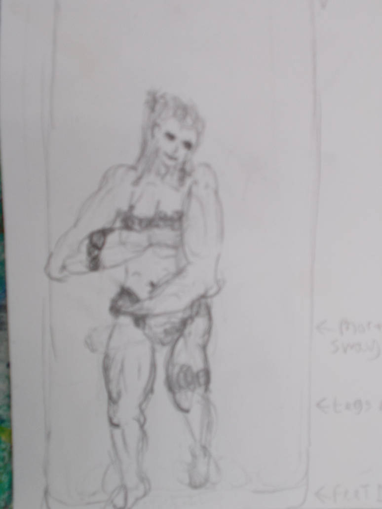
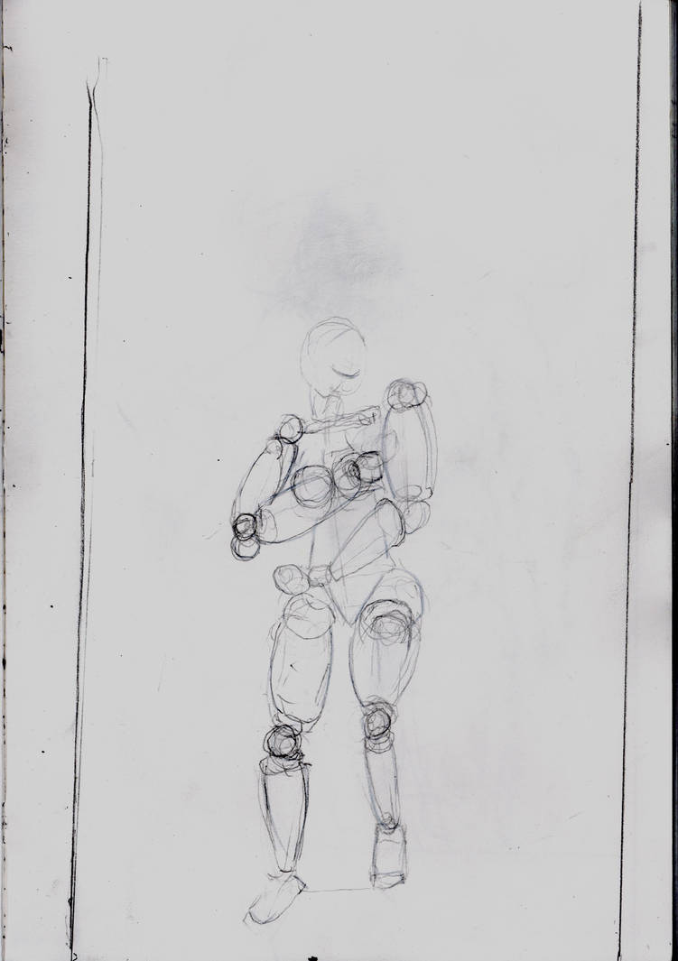
For The New Eve I would draw her as a stick figure. Then make a person out of shapes. Rub that out, and add the coloured drawing over it.
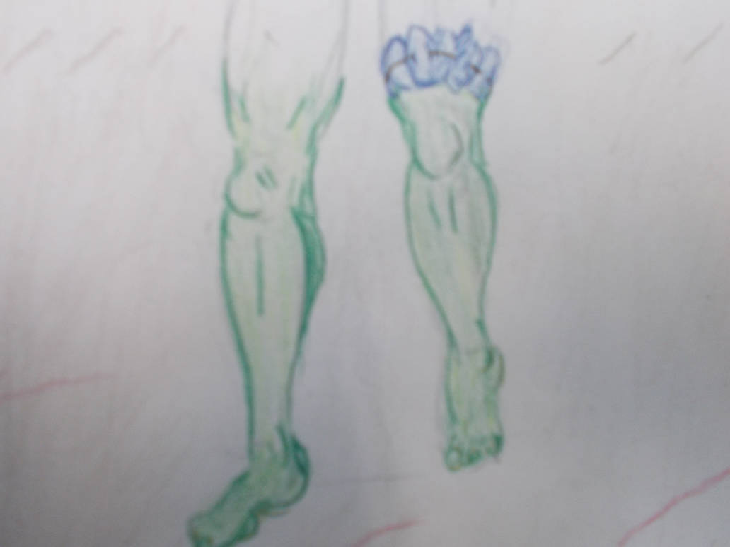
First her legs in the stick figure stage.
You can barely see anything. The camera is not good for extremely light H pencil drawings.
Now here she is as a shape woman.
I think this one came out okay. The H pencil quality doesn’t matter as much if there’s more on the page.
Taken with Camera. This time close up, showing nothing outside the paper. Seems good for H pencil work.
Taken with scanner. Darker lines look better. Has more weight to it. But it feels less cohesive.
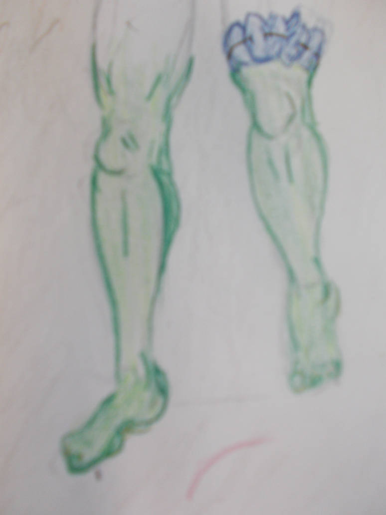
I then started colouring over the shape figure. Something I’d read in the Acrylic colouring book must have carried over to my coloured pencil technique because the legs came out far more subtle and clear than any of the pieces I’d done before.
I was so surprised by the quality of the work I had to stop to record it. Just in case the rest wasn’t as good.
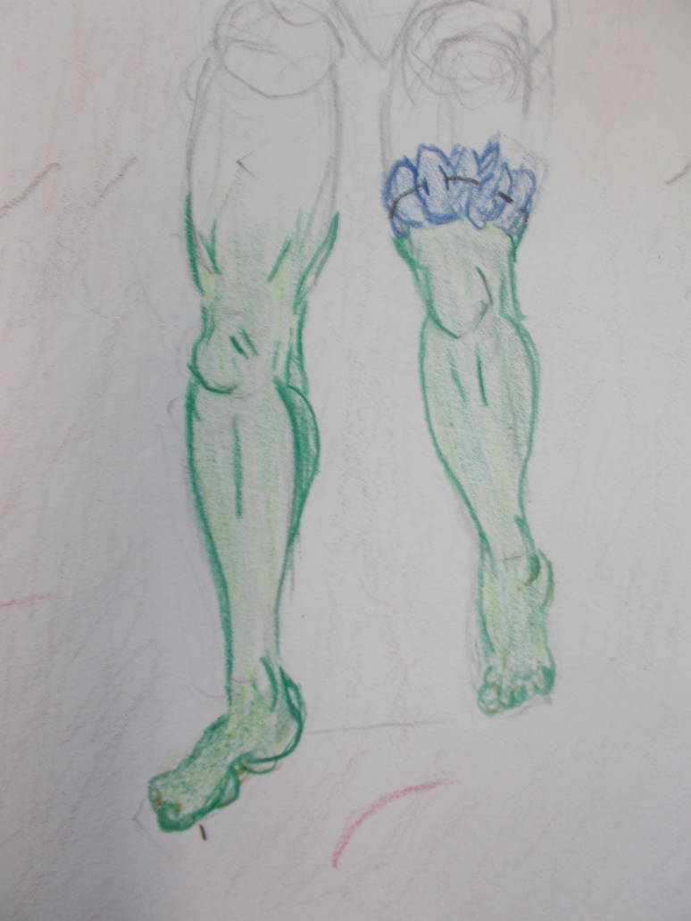
I took it from the same distance. But taken from a portrait angle instead of landscape. Somehow it came out a lot blurrier. But I must have done something differnt for the next one, which was also portrait. And the detail looks great.
The colour is just right. How did this happen?
I got the whole then done and it looked like a drawing. Not scribled junk
For some reason the top half of this photograph is a lot blurrier than the bottom half.
This one is lot better. I think the top being blurrier must have something to do with the hair being redrawn a few times. I went a bit overboard on the arm muscles though. Must tone that down for the final image.
Now the background is fully coloured (And it somehow has a slight blue tint the other photographs didn’t have That’s my only issue with it). The expression on her came out good on the first try. So good I didn’t want to do a second attempt for fear of spoiling it. I’ve never done so well at my first attempt at an expression. Am I… Possibly…. getting better at this?
Well. For contrast. Here’s a coloured pencil drawing I did for animation in the spring of this year.
Maybe I’m getting a little better.
Here it is again. Now done with the scanner
The whole thing is too dark and the colours look off. The greens are all smooshed together, For once I think the photograph might be better.
Taken with scanner with the brightness turned up. The woman looks nicer. But now all the browns are missing from the background.
I originally had the clothes made of leaves red. To contrast with her skin. But as I made the plant life on the island blue (to contrast with the yellow sky) I thought I’d try blue leaf clothes here. Honestly, it doesn’t quite work. Maybe Red just reads far more easily to us as plant material than blue does. Either way, in the final version I’ll make the clothes either read or purple.
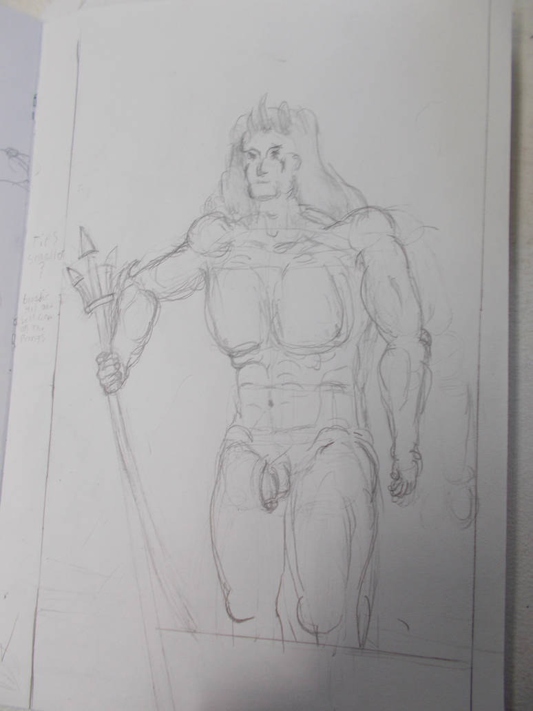
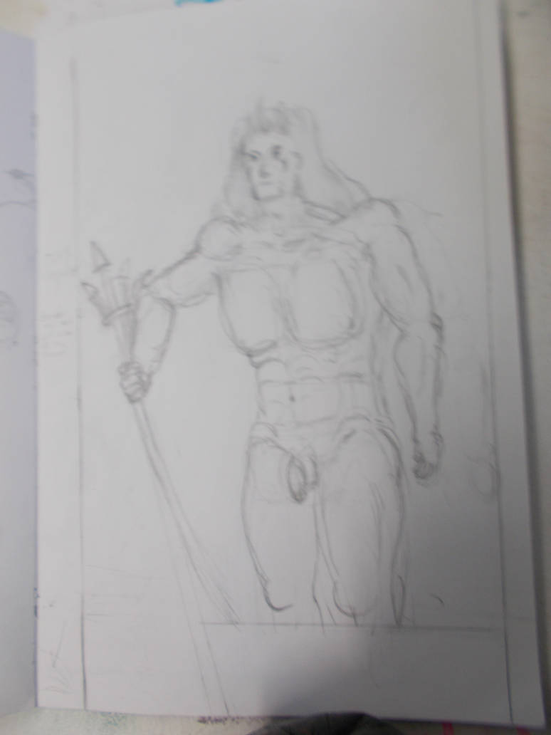
I began doing The NewAdam.
With him I would draw the whole thing out. Stick figure, shape man, then full man. I’d then rub out bits of the full man and draw with colours on top of it. I didn’t photograph the stick figure or shape man this time.
Taken with camera. Decent quality. Even got in some detail despite being all done in H pencil.
Taken with camera. Far blurrier. And for too much shadow.
Taken with Camera. This time close up, showing nothing outside the paper. Better light balance and focus. Looks okay.
Taken with scanner, Looks better. But with too much of the erased details showing.
Then I started doing the colours. This time working over my old linework rather than drawing new lines. It also came out well it seems both techniques are valid. I will have to learn which is better or which is better for what later.
This is the best colorwork I’ve ever done, and I don’t know how I did it. Again. The expression also came out good rather quickly.
I even tried some the the colour techniques I read up on in the acrylic book. Using brown for the shadows rather than just darker green or black. I think it sorta works. Must look into this further.
Photographed again with the camera further out and (accidentally) more shadow on the piece. Face seems blurrier. Shadows make the colours pop more but take away from the subtlety of the linework.
Taken with scanner A bit too white to be the best one of him. but the way it brings out the subtle greens and blues warms my heart. I think I could do great things with the scanner and coloured pencils given time.
For the next two I’d try the opposite tack. I’d make the wave a very detailed drawing and colour off that and make the fixed land as simple and light as I could with getting in the minimum details and see which gave me the better results.
The Wave
Nice focus. Far too much shadow.
Taken with camera. Decent focus. Nice detail. Still more shadow.
Taken with Camera again. This time close up, showing nothing outside the paper. Better light balance. But now there’s too much detail. You can see all bits i erased time and again. Making it look messy.
Taken with scanner. Shows off the best and worst of what I’ve mentioned about that scanner.
Taken with camera. This one really gets the textures and subtleties of the coloured pencils. specially in the sky
Taken with camera under differnt lighting. It does do a nice job of showing how the colours blend together. but sadly some of the colour details on the clouds are missing.
Taken with the scanner. I hate this.
The Fixed Land
Taken with camera, Not great.
Taken with camera. Just not feeling it.
Taken with Camera. This time close up, showing nothing outside the paper. Still doesn’t help with the light pencil work not showing up. Does at least bring the perspective out.
Taken with scanner. It’s better. Still not good.
It seems in general when there is little on a lot of paper bothe the scanner and the camera struggle. But I suspect the camera will usually struggle more.
I still haven’t colour the fixed land (This journal took 2 days to write!) so my experiments end here for now.
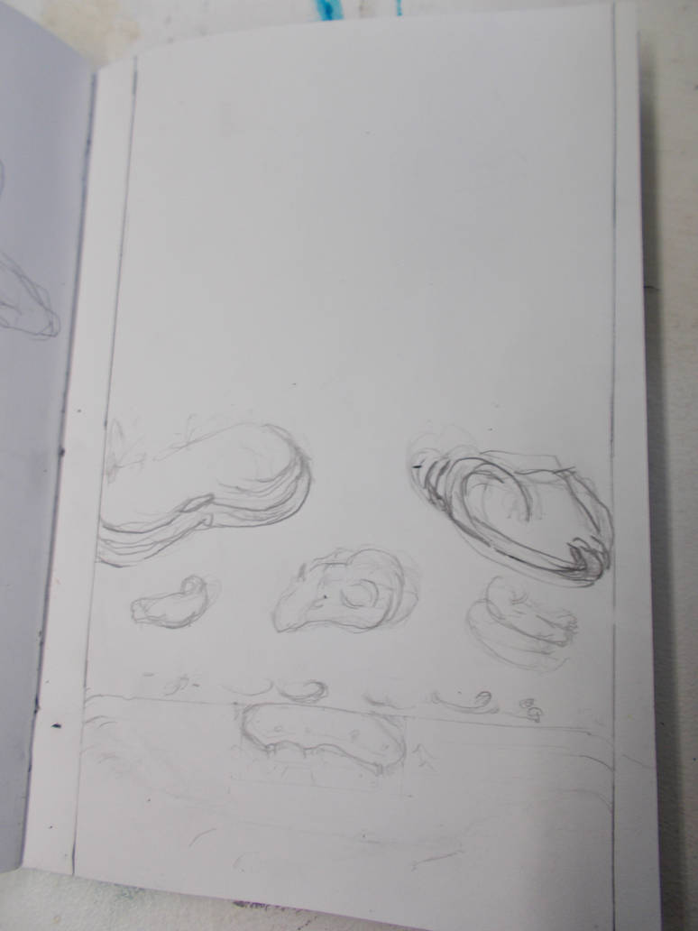
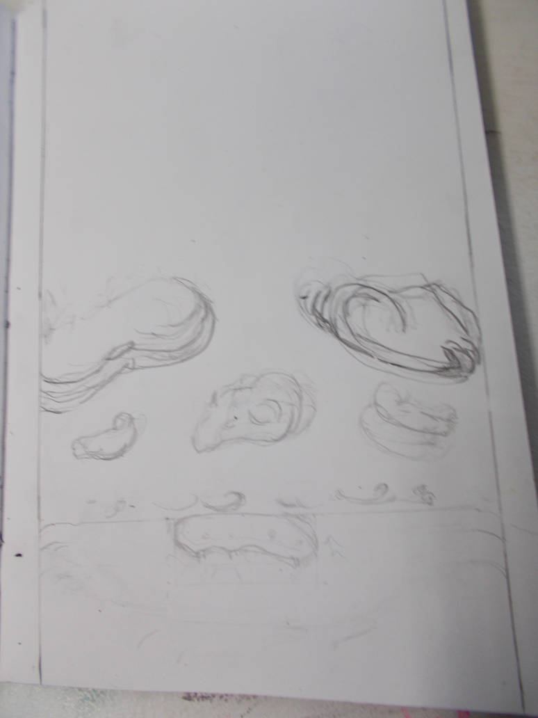
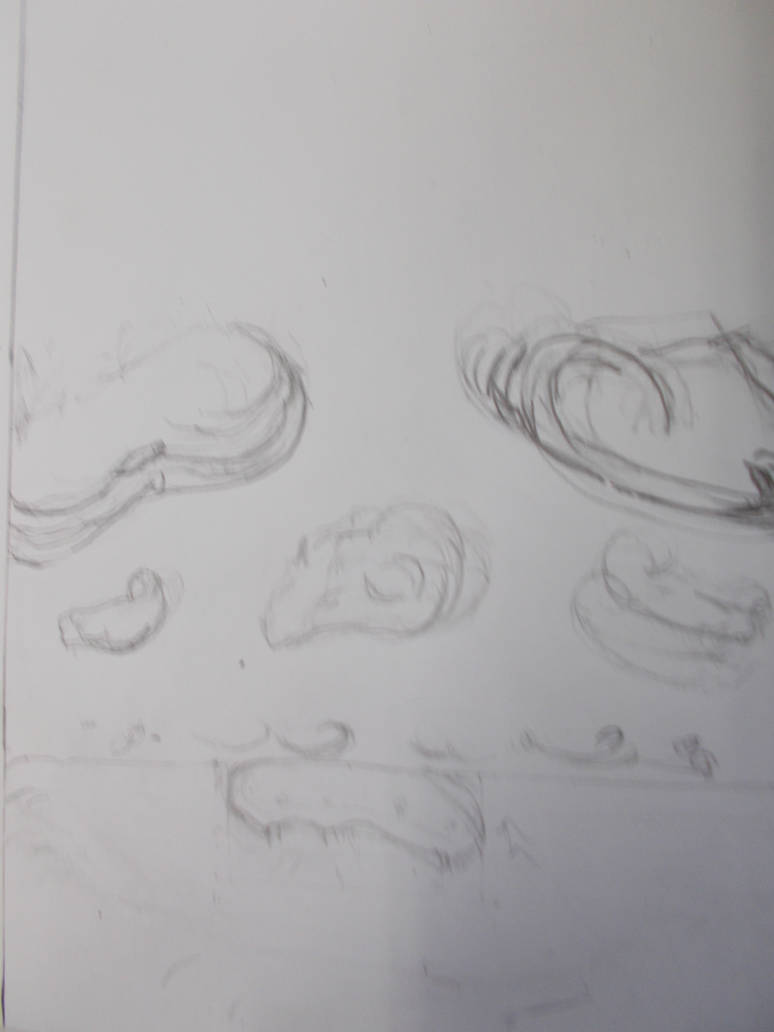
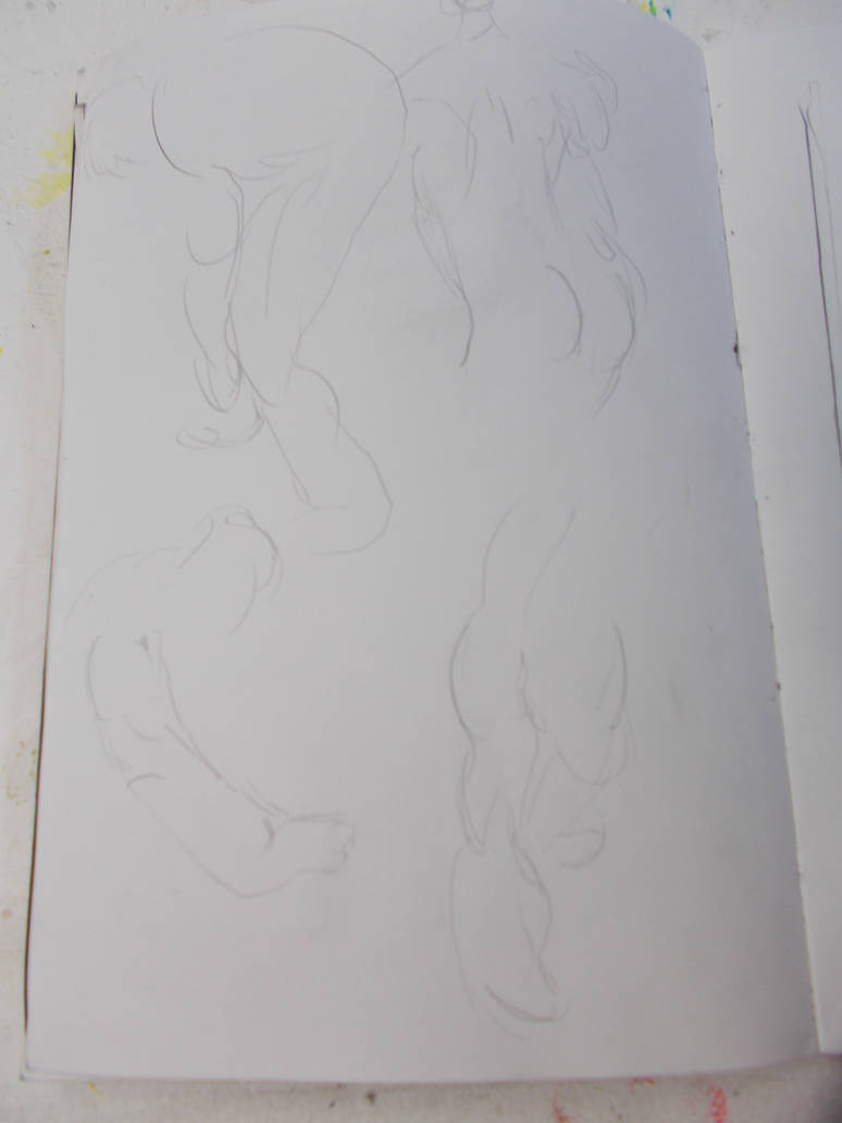
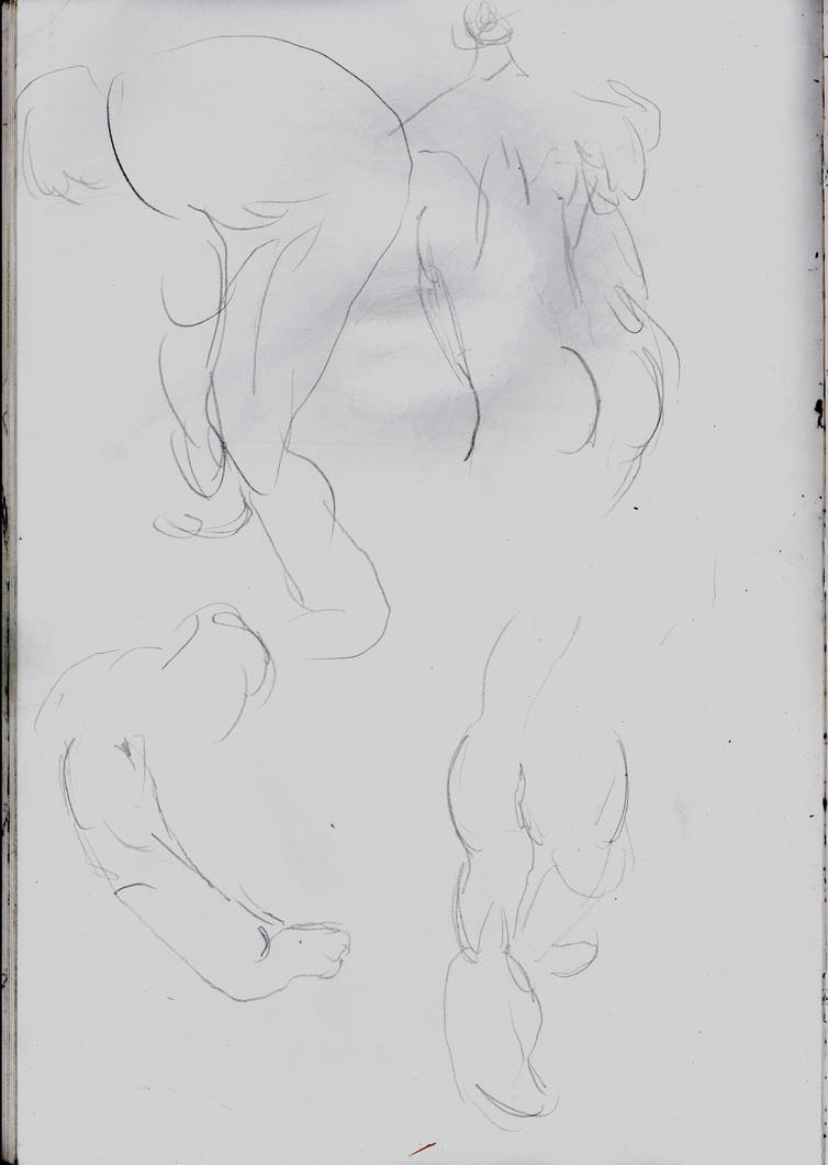
I also did some life drawing in the same drawing book. And recorded that for the hell of it.
Taken with camera. It’s fine.
Taken with Camera. I think I might just need a better camera.
Taken with scanner. A lot better.
Camera. Tried to take this one from an angle. Didn’t work with the light marks with the H pencil.
Scanner. Still looks not great, But a lot better.
Camera. A little better.
Scanner. Best B&W image I got from the scanner.
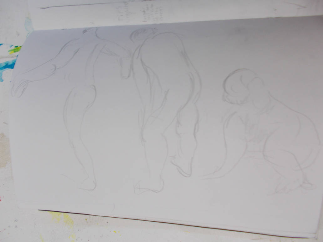
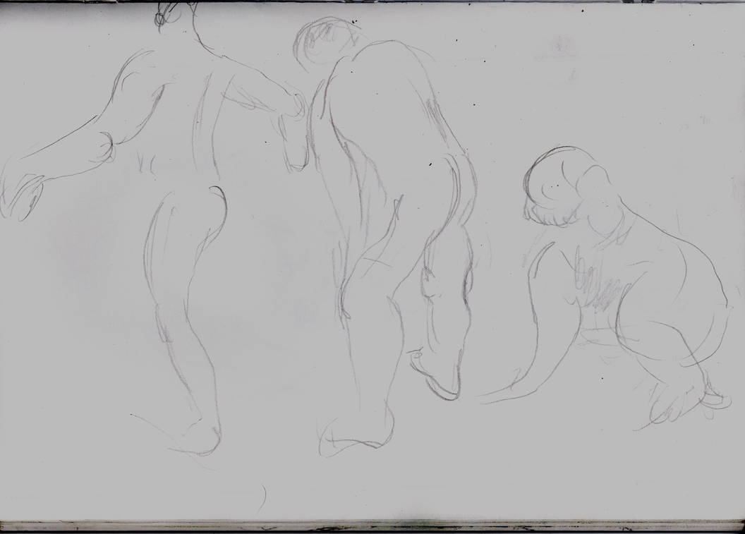
Taken with camera. Awful.
Scanner. Decient.
Taken with Camera. Again, H pencil drawings seem to be easier to capture with a camera if they’re large and have more detail.
Taken with Scanner. A lot better. But missing something organic.
Taken with the scanner at a darker setting. apart from being darker and a little dismal I see no downside. It just looks better this way.
And that’s all I have right now. I will try to build on what I’ve learned here (if I have learned anything that is?). My next update will have less photographs. But hopefully better ones.
****
Afterwards
Sometimes the photographs look better. But normally the scans look better. The scans take a lot more time to do. The Photographs normally look better or the same I have a large, solid object or image to shoot. Which is lucky for things like my painting which is too large to scan.
Thankfully even the photographs (Even the less good ones) are all I need to evidence my work for the university. So I can keep doing them for now. Maybe doing scans if it’s important to get the fine details of something. But sticking to the photographs will save me a lot of time.
Strangely, photographs tend to look better if they’re focuses in rather than showing the space outside the drawing. At least if it’s a big drawing. Thumbnails and doodles not so much.
But I know I can get better results with both camera and scanning. Specially for the extreme closeups
These were taken with an Ipad camera and are so much better than any of the close-ups I took with my own camera. Remember this?
And here are the scans of my thumbnails as scanned my Morgan (Done on a program That I don’t know how to use). Look at the detail. Look at how nice the colours are. Nothing is ever too dark, or washed out. The linework is just right.
Now take a look at my best scans.
Now look at my worst ones.
Again. Why don’t mine look like Morgan’s?
I must learn. In fact. It’s time I learned more about photography in general. I can’t make animation if I can’t film it.
I will have a journal about my experiments in film and photography soon.
I will show this journal to others to get feedback on how I can record better. I hope by starting to learn this i can eventually learn the perfect way to record my work recording and my animation.
Another week is over and I am horribly behind. I should have paintings ready to make cut outs for. I’m not even ready to start doing the under drawings for the paintings yet. I don’t know what I’m going to do to get by. I have two weeks to go. I’m going to have pull a lot of late night shifts.
Of course this would be easier if I could work for more ten minutes at a time.
I’m not sure if my output is going up or down. I’m staying in for longer, but I’m spending more time in the studio (And less time sleeping) but I’m also spending more time just lying about doing nothing or reading. I will say that reading books feels more fulfilling than just browsing the web. And I get over it and want to get back to work sooner. The problem is the downtime when I’m doing nothing and that my periods working I’m sure have gotten shorter. My energy still isn’t there. In fact I think it getting weaker. Maybe it’s just a reaction to finally being away from the net for hours at a time. But I want to keep working at it.
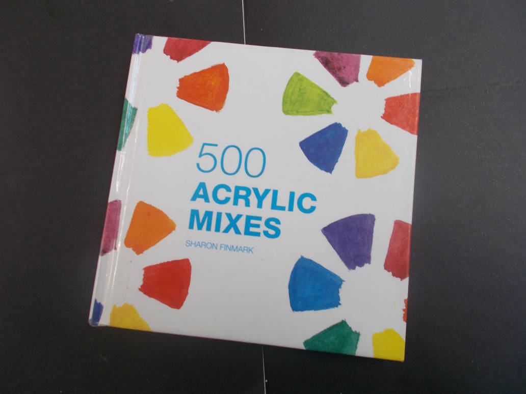
I will say reading books doesn’t throw me off my stride and break my drive the way that using the net was. When I come back after a bit of reading my focus is as good as it was and my quality of work is as good as it was. But it’s not motivating me, at least not much. I think I got better results when I was reading this book on Acrylic painting techniques
500 Acrylic Mixes by Sharon Finmark. A quick read but a fun one. And I think weirdly some of the techniques mentioned in here have helped me with my coloured pencil drawings. But we’ll get to that later.
When done with that I borrowed out two books of poetry. Which is strange for me as I don’t normally read poetry. But I borrowed out ‘Ted Hughes Collected Poems for Children’ because it was illustrated by Raymond Briggs. I was hoping seeing his work would help inspire me with my own coloured pencil work, ironically I ended up borrowing the black and white version. I also borrowed the collected poems of R S Thomas, being considered one the most best Welsh and Christian poets of the 20th century he’s been on my radidar for a while. And strangely I’ve been enjoying both enormously. I normally find poetry just bounces off me. But this really does work for me. Maybe I’m just growing into it. So is it inspiring me? A little but not really. I do find myself reminded of why I got into this line of work to begin with. All the hopes and dreams I had ten years ago. How excited art and making art used to make me feel. And thinking maybe I could feel that way again. But this nostalgia isn’t translating into actual work. I should look into re-engaging with this old drive at some point. And if reading poetry will help me with then then that’s a good thing. But for now I need something that will get more to do more work now.
Art books seem to have given me better results than poetry. And Poetry still doesn’t throw me off my game as being on the internet. But I think I’m just going to have to start being strict with myself. Say “John, you MUST work for this long. And you must only break for this long. And you must only break for THIS long”. I’ve tried improving my output through pure motivation. I must now try grinding as well. This ism going to hurt. Hopefully what I’ve learned about motivation will help and I can learn a bit more about it soon.
I will say that I notice I can go a bit longer when I feel more confident in what I’m doing or it takes less less brain power. Maybe that means I’ll be able to do more if I get better? Or at least I know I have some more energy than just the small bits I’ve been doing sometimes.
So I am at least trying to make things better. But what has happened this week?
I had to make some cutouts from paintings to put in front of my current painting for my final piece. Apparently we have to put all these disparate elements together for the final painting which will be the final piece. I think I know what I’m going to do. But I’ll talk about my plan in a later journal.
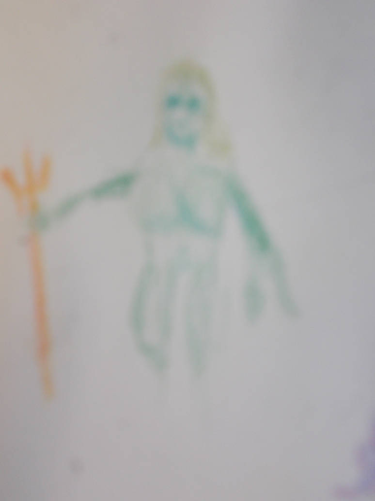
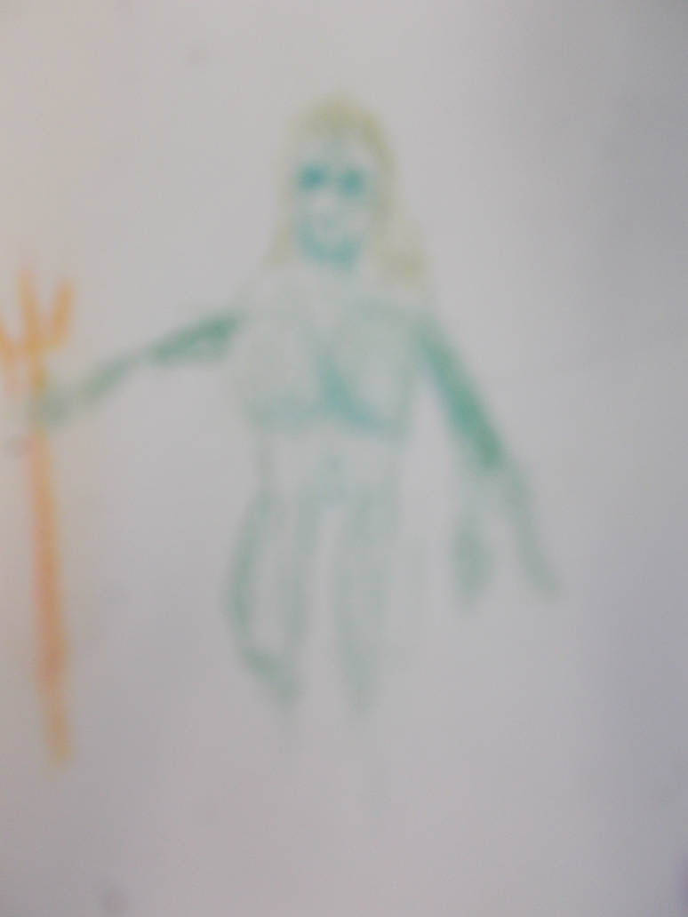
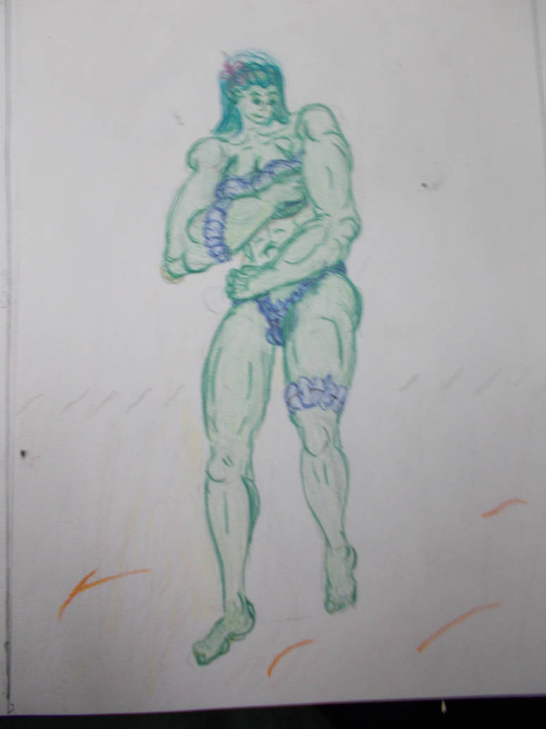
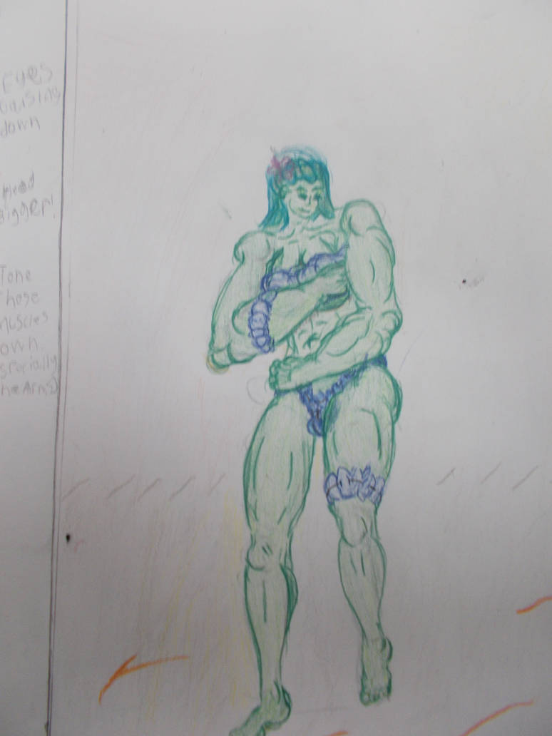
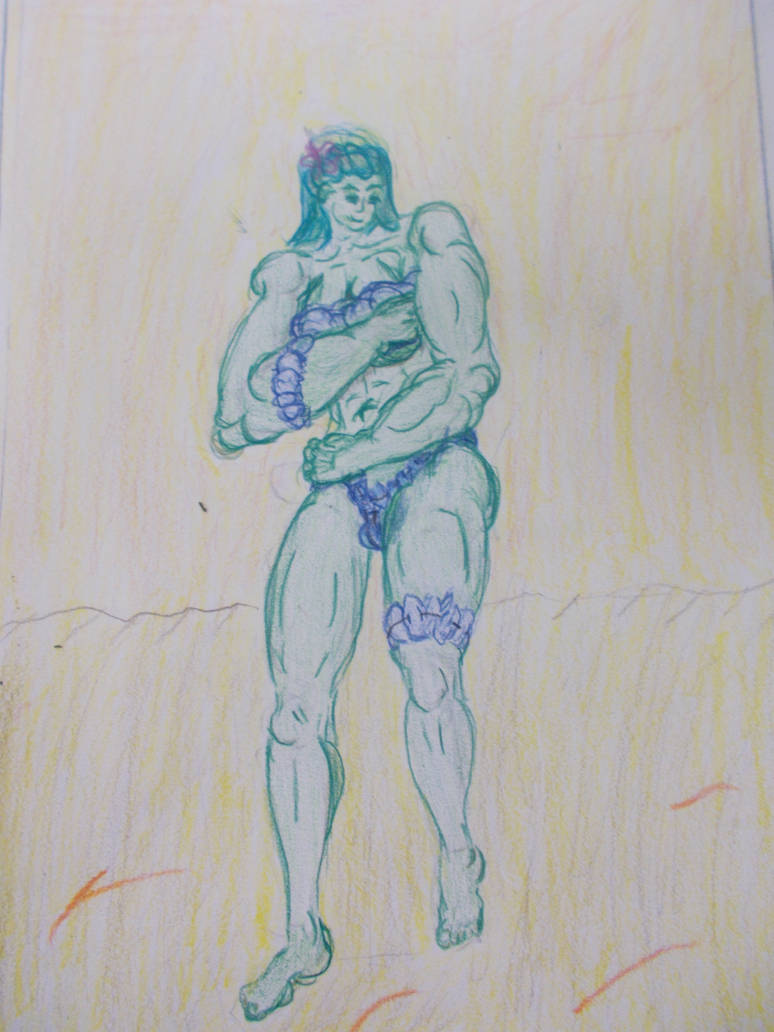
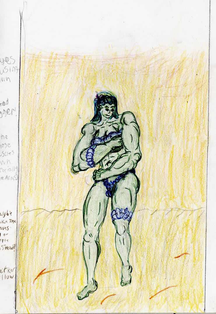
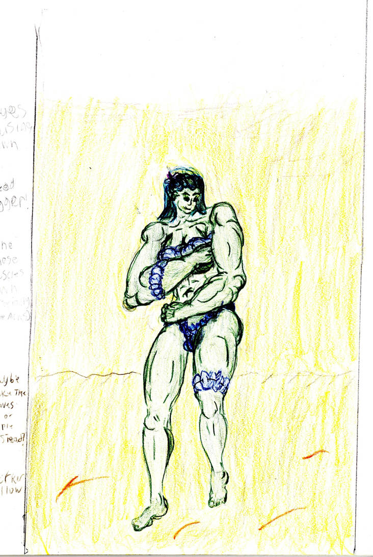
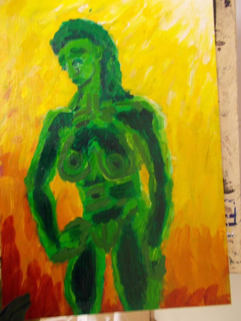
I’ve been basing work on on the novel Peralanda by C S Lewis. A story about a man sent to a second Garden of Eden on the Planet Venus. Shown in the novel as a water planet with yellow skies. My green woman is the new Eve, who is described as having green skin.
The only reason I’ve given her a muscular build is it’s my preference in women, and I find it easier to draw. My wax paintings from last week were also inspired by Perelandra.
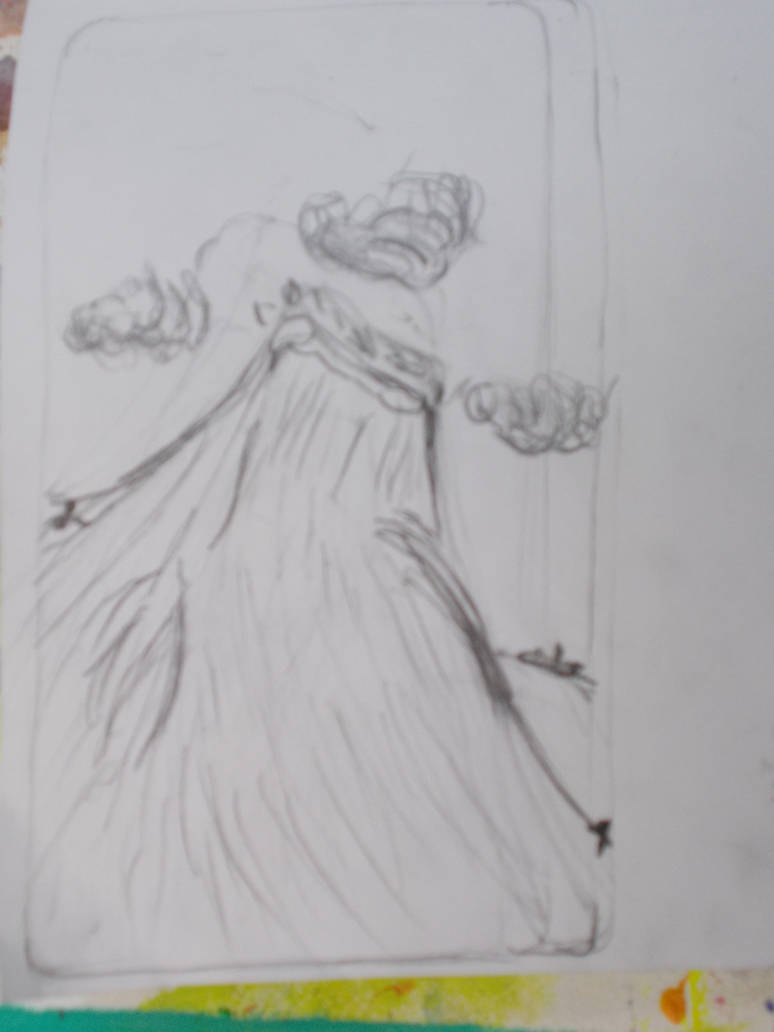
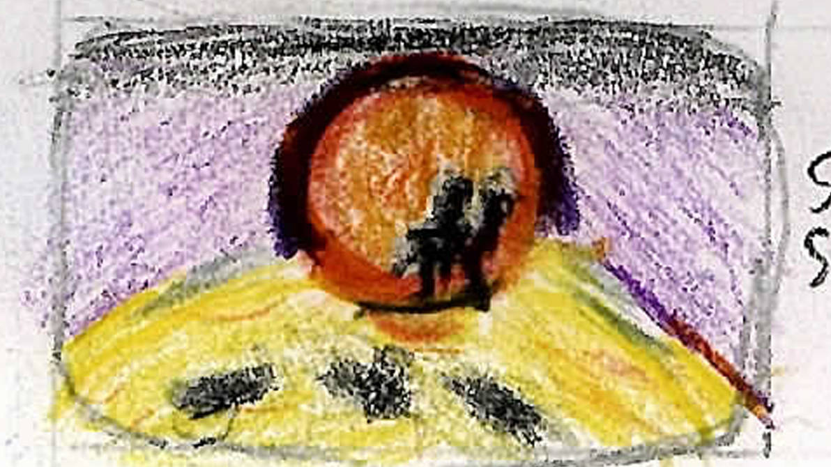
This was inspired by a scene near the end of the novel where a massive centipede-like creature comes out of cave, appearing like a monster to the hero.
This one was meant to represent night in Perelandra. With the new Eve looking out across the sea, wondering where her Adam might be.
Even this was meant to represent something of the mood of the novel. Or maybe in hindsight the water like nature of the planet.
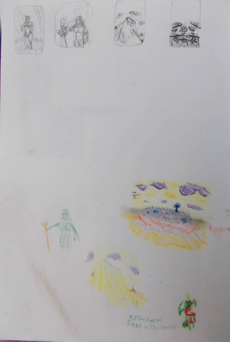
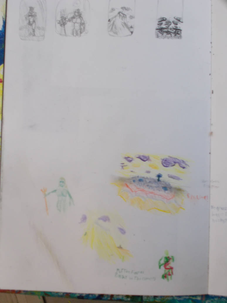
I will try to incorporate these ideas for my final piece somehow. But for the cut out section I knew I wanted to keep with this theme. So I picked out some ideas that worked for me. I’d make paintings showing
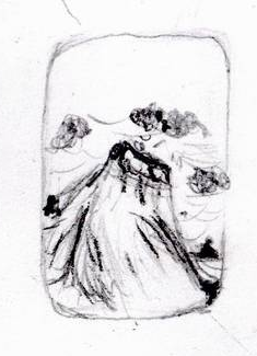
The new Eve wearing the clothes she’s given by the un-man and discovering vanity.
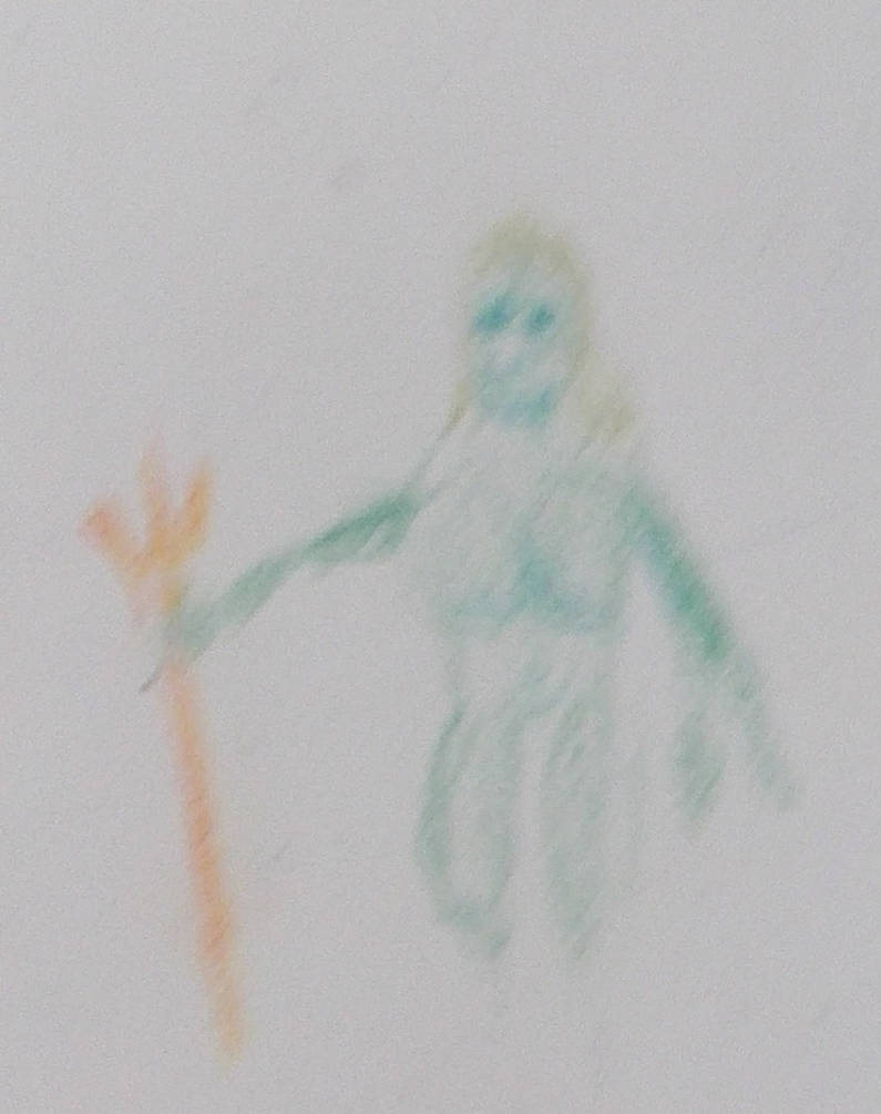
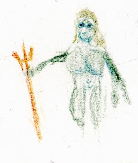
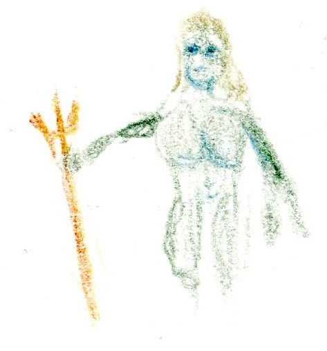
The new Adam holding a trident, looking stern and regal.
The great wave separating the new Adam and the new Eve.
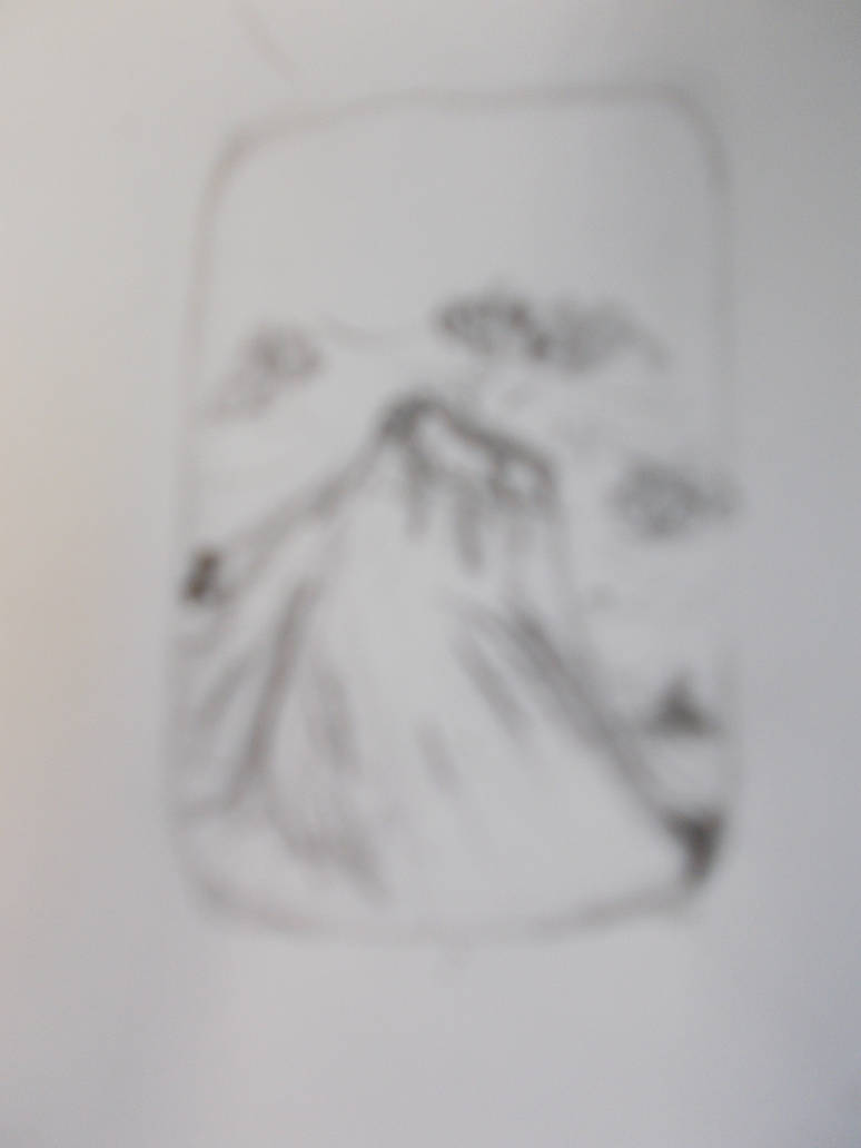
And the fixed land that serves as Perelandra’s forbidden fruit, in the distance.
I’d try several techniques to get the pics looking as good as possible. I started with doodles then moved on to Black and white Thumbnails (I’m getting good at those). The some detailed B&W sketches. And finally I’d draw the whole thing out in coloured pencils to get an idea of how I wanted it to look.
In my next journal I will show the work I did and the differnt techniques I used to record it. hoping to figure out the right way to record the work I do for these projects.
This week’s been a little kinder to me that last week.
I did get the undercoat done by the end of Monday. It was very basic. James (our painting tutor) gives us a lot of good advice and guidance in how to paint with acrylics. But I never retain any of it. I should maybe reconsider taking notes? The problem I’ve had with that in the past is when note taking it takes me so much time to write anything and it takes so much concentration on my part that I miss 95% of what is said. Maybe I should swallow my pride and have a note taker again?
Well for now I’m going to try to compensate for this problem by reading and studying in my spare time. I’ve always struggled learning in a class or even on-to-one. But when teaching myself, like when I wanted to learn the history of Religion or how to play Brutal Doom on the highest difficulty, I do surprisingly well. I’m going to start reading more. Books on general art, and on whatever type of art I’m studying at the time in particular. I would like to thank James for inspiring me with this. He did suggest we look up ideas in the library (though I think he was more suggesting we go there to find unconventional artists to take inspiration from). I have borrowed a book on acrylic painting and a another one on drawings. Maybe this can be a first step to learning how to work with my third pool of energy I mentioned in my journal “Why am I so bad at this?” https://johnhawk.art.blog/2019/11/04/why-am-i-so-bad-at-this/ I’ve said in the past that I work best when I have to use all of my brain as well as my body all at the same time and being able to think about it when not working instead of just doing a purely physical task or problem solving in the moment. Or at least I might learn a little.
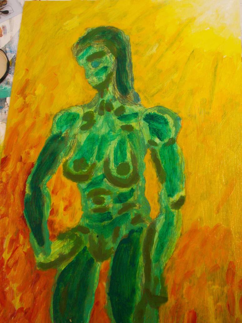
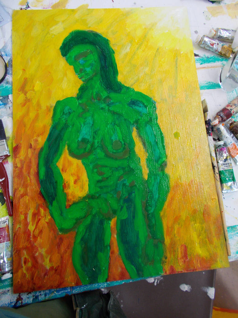
My undercoat was apparently good enough for James. I don’t remember Tuesday in much detail. But something was clear to me by that point. I didn’t have the skills I needed to make this the way it needed to look just using the basic acrylics and colour mixing. I would have to bring in my oils from home. Complete with the turpentine and liquin, it was a heavy bag.
So I had to make a whole oil painting in one day. That’s not an easy thing to do, even for pro. And even after all the years I’ve spent painting (And using painting in two of my final pieces) I have no more idea how to paint than a newcomer.
I regret having no pictures of the underpainting.
I started by adding washes and highlights to the piece. I think this prototype has the best contrast on the woman. And maybe the clearer brush lines on the background added something that has lost.
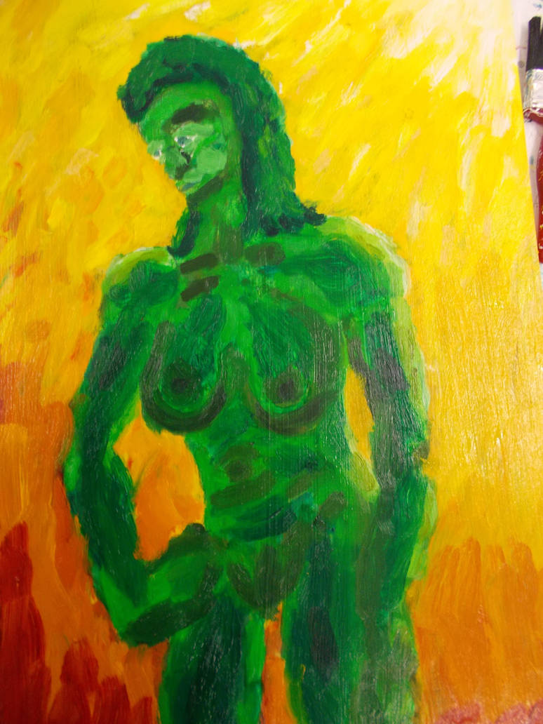
I like the pale blue for the shadow here. I tried to recapture the effect here but never could.
By now I had the background with the colour scheme I was after. It centralises the perpcitve more. Wish i’d kept more white though/
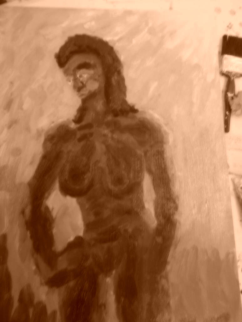
And I also tried photographing it in Sepia. Just for fun. I think it looks good.
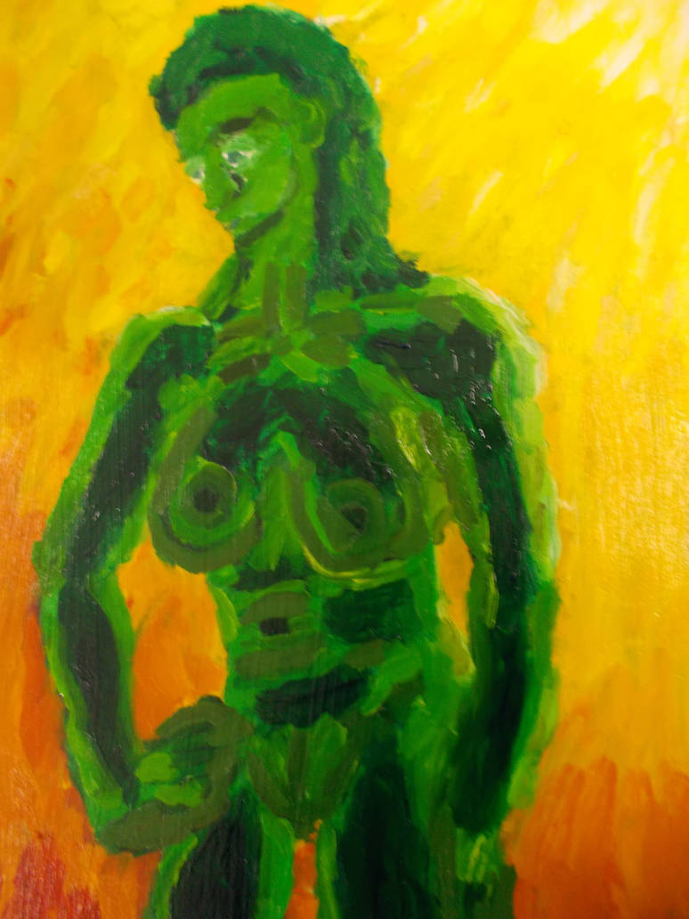
I got some of the contrast back here. She has lost some of her curves though.
I tried altering her expression. But this one looks like she’s sleepy.
i altered it again. She now kinda looks like she’s pouting. But it’s the best expression I was able to get (And by this point the canvas was covered in paint and altering it more could have ruined it). I’d also made the background a little better by this point. It’s not great. But it’s okay for four hours frenzied work (With some breaks).
Sadly, as always when painting. most attempts at planning and logic devolved into a frenzy of just throwing more and more paint onto the canvas. I couldn’t remember any of the techniques or ideas James had told us about. I could only paint. I’m not sure the techniques he suggested for acrylic paintings would have been of much use for an oil painting anyway. But I need to learn how to really paint. With my brain and not just my heart.
Anyhow. Here it is at a higher resolution
When I showed it to James he actually seemed to like it. And he even felt the underpainting was still working. So maybe I did something right.
On Thursday we were given a new task entirely. I’ll give this module this. It’s not giving me too little to do.
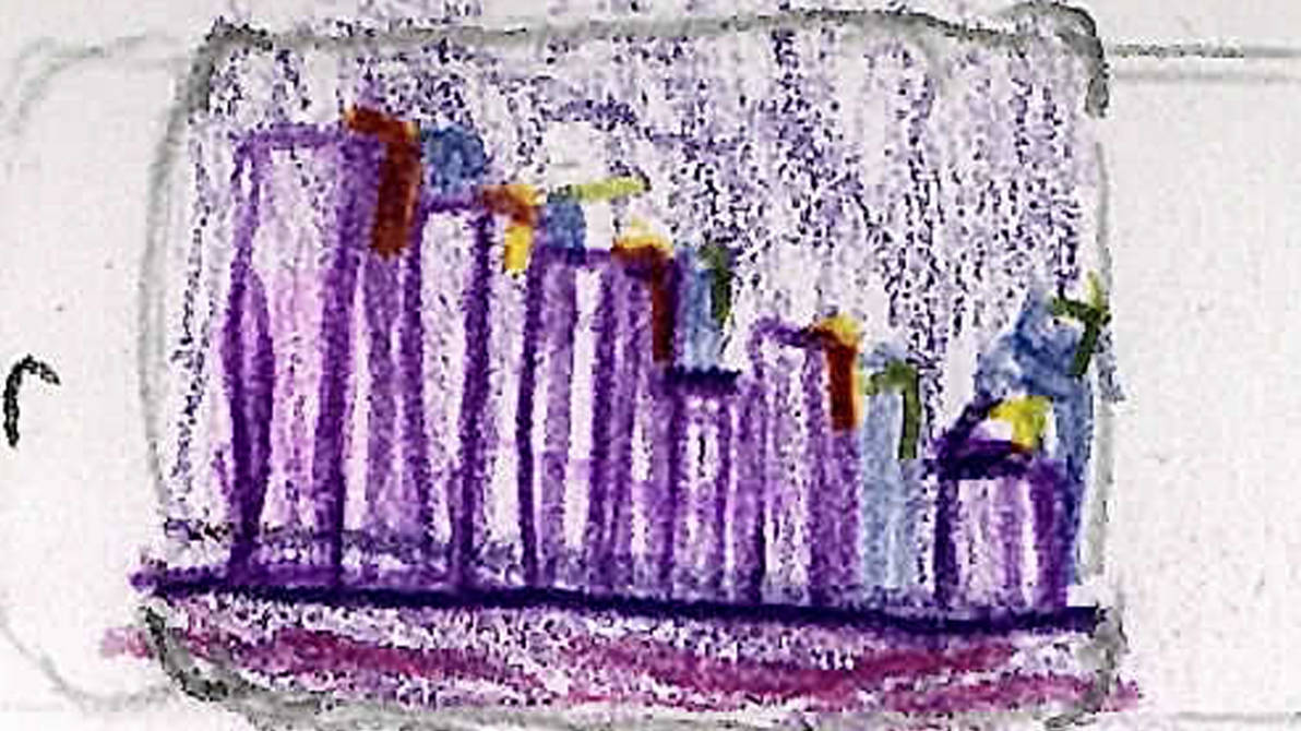
We had to try out using hot wax techniques on acrylics. Similar to batique work.
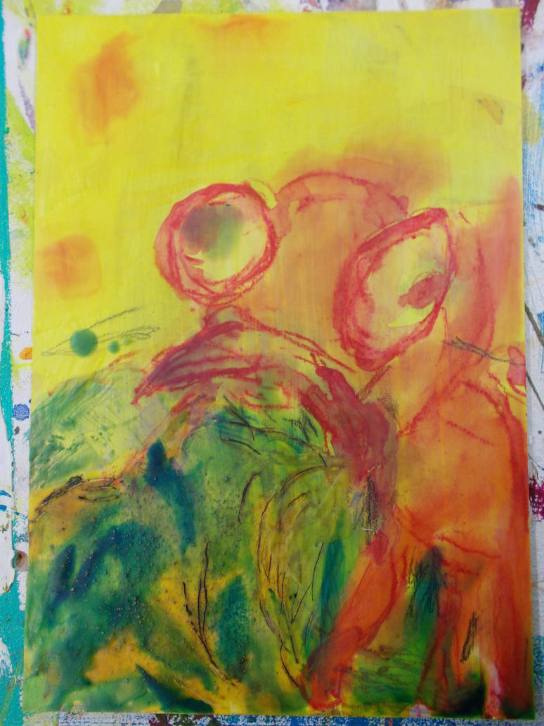
We had to first make some simple paintings. No pressure. At least we were given pieces of wood and card that were smaller than A4. Keeping with the theme I’m working with, I painted them yellow.
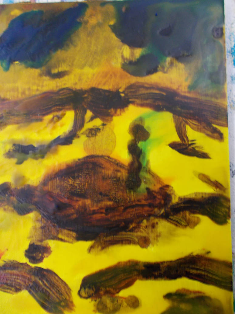
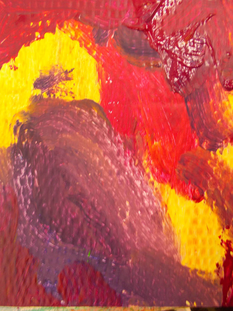
I made one abstract with tick paints. One painting with heavily watered down paints and one with my watersolouable crayons. Thinking they’d blend well with acrylics.
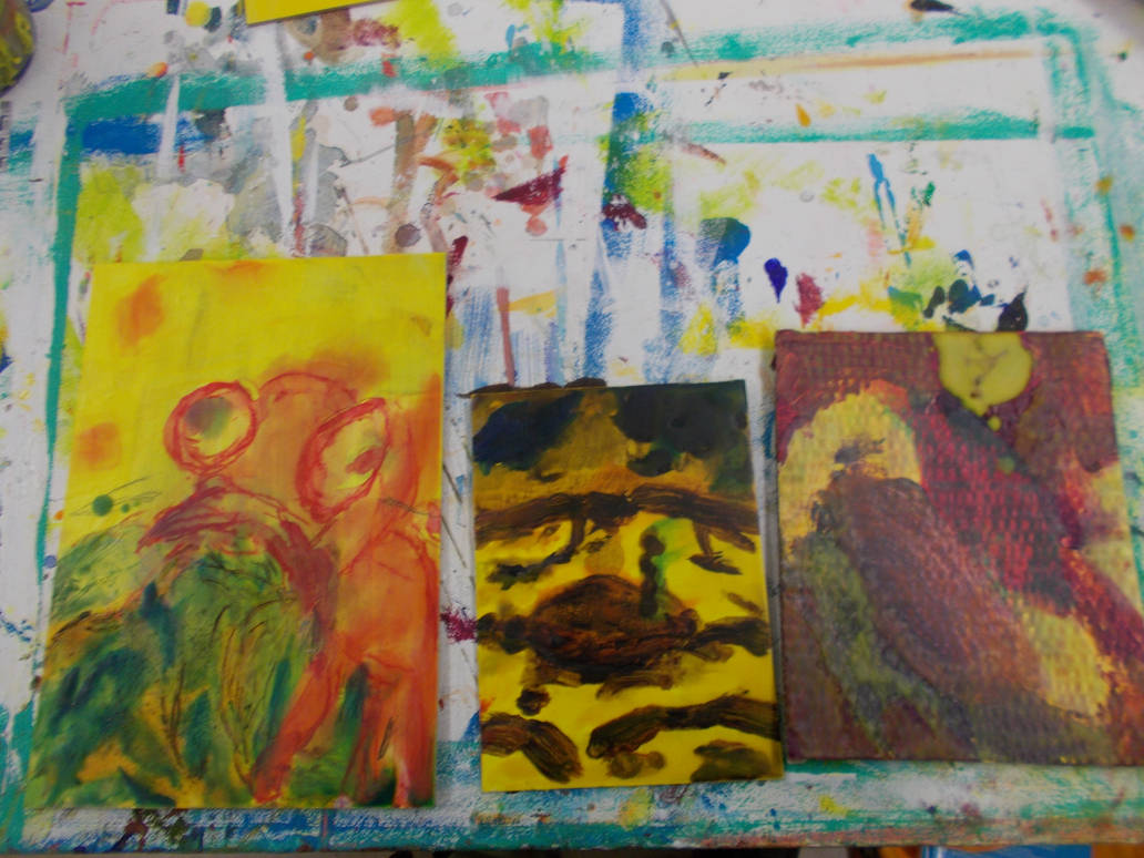
Here’s how they looked.
And here’s how thay look after adding some wax techniques to them.
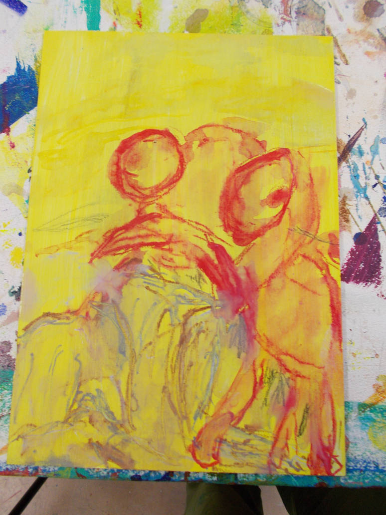
My crayon work had a hard, sketchy look, even using water. I liked how it looked. It could be great using the paint for backgrounds.
I tried using identical wax colours where possible. Only keeping the eyes free of wax. Honestly. I hate it.
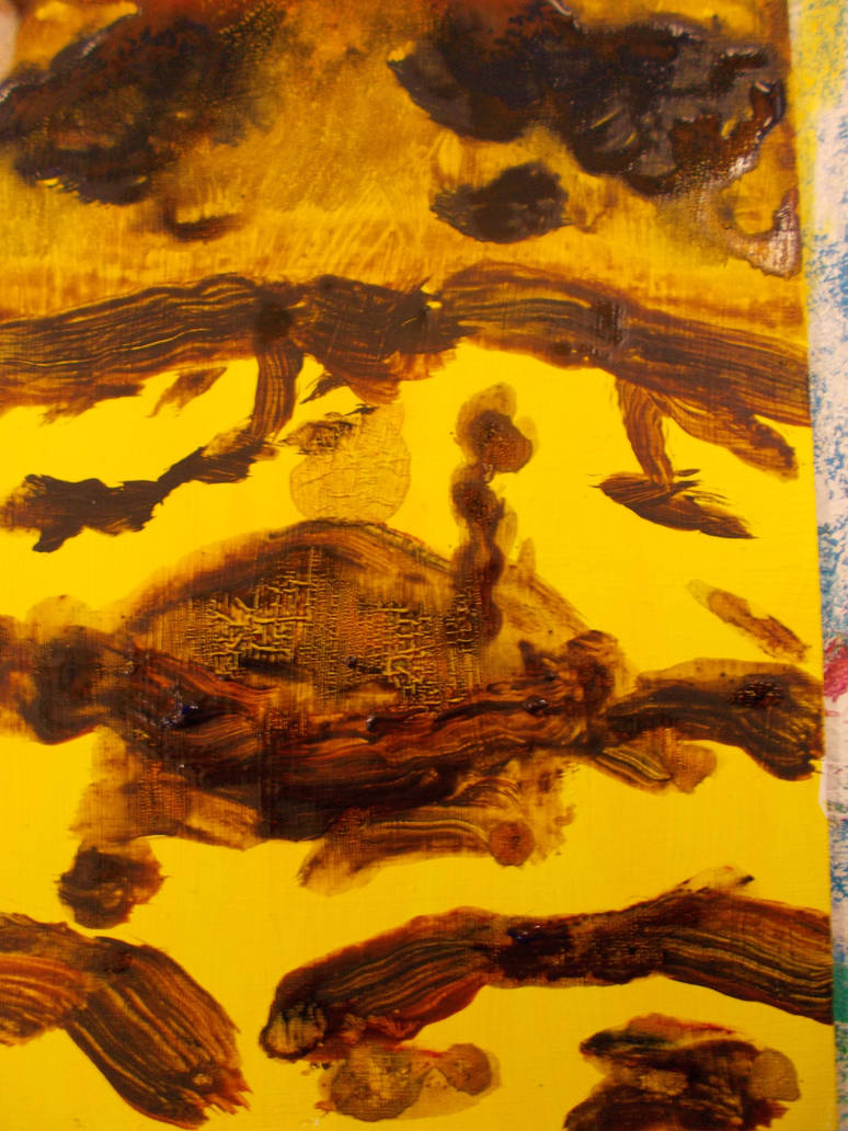
My wash painting was fine. Not much to say.
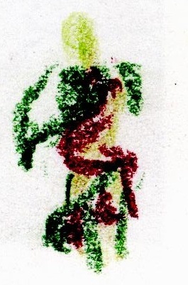
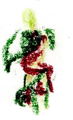
This one actually really looked better with the wax. I added colours that either could have been in the original (Green on the human, Blue on the clouds) or colours that were similar but different to the originals, like orange over the yellow. I like this one. It reminds mr of Rembrandt’s ink and brush work (If I may be so bold).
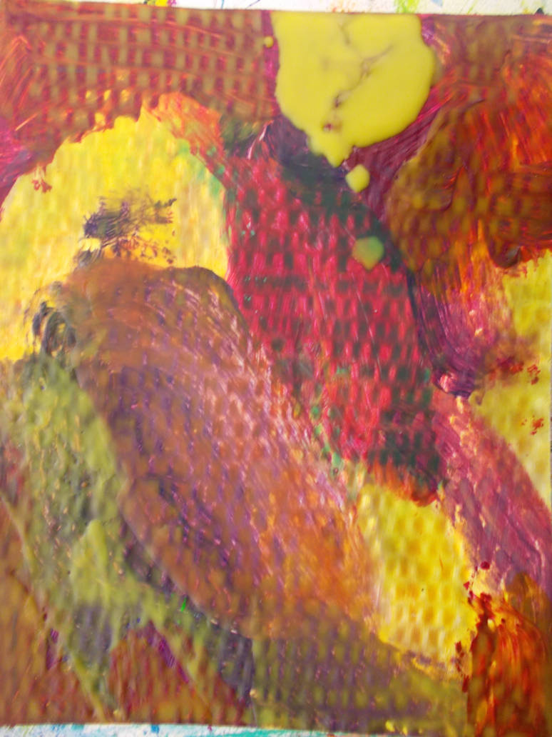
This abstract was lovely. Why’d I have to ruin it?
But there are bits of the second version I like. I tried putting opposing colours on top of each other. I like the yellow wax on the red paint or the black on the pink. But other bits smudge together.
I think this is good for pieces that have a lot of texture on them. Not so much flat bits.
I did try all the techniques we were meant to try like adding sand or painting into the groves. But they didn’t seem to have any real effect on the pieces I made. And even though it was yesterday I’ve forgotten what a lot of those techniques were.
Still. Not bad for a days work. At least I experimented and tried.
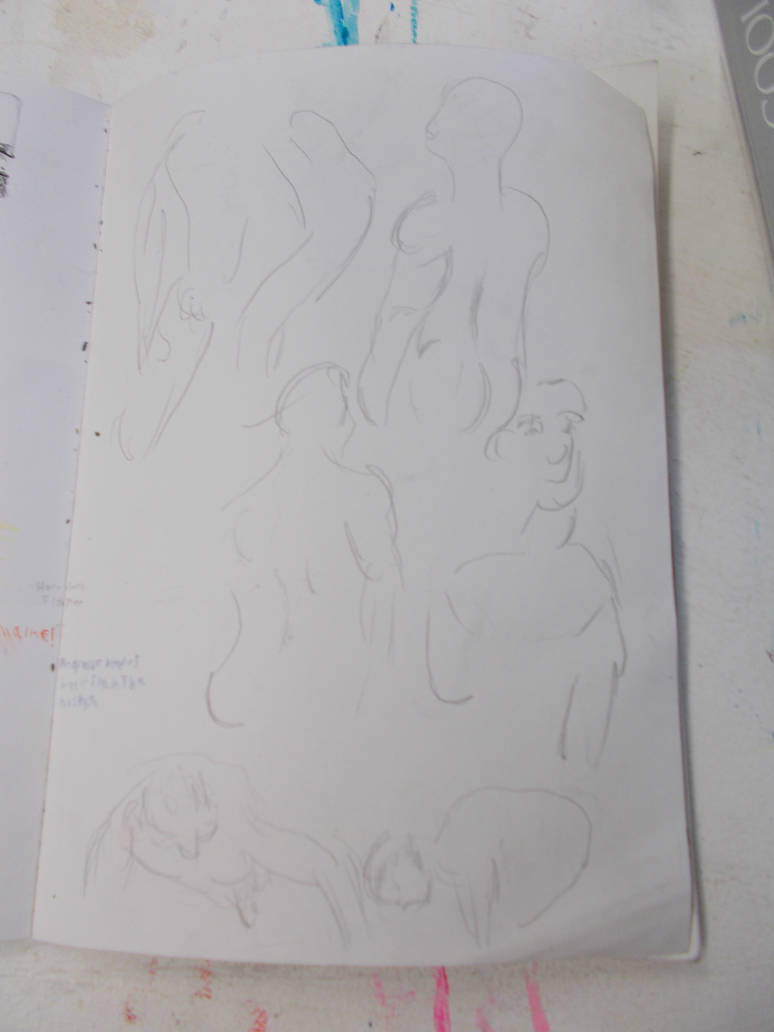
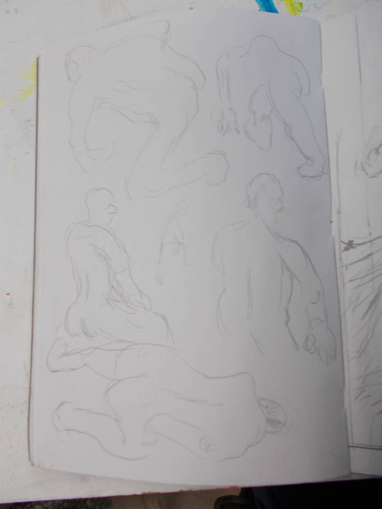
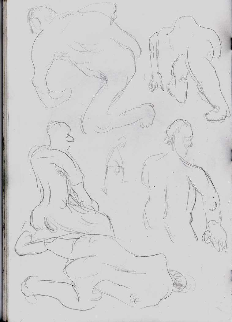
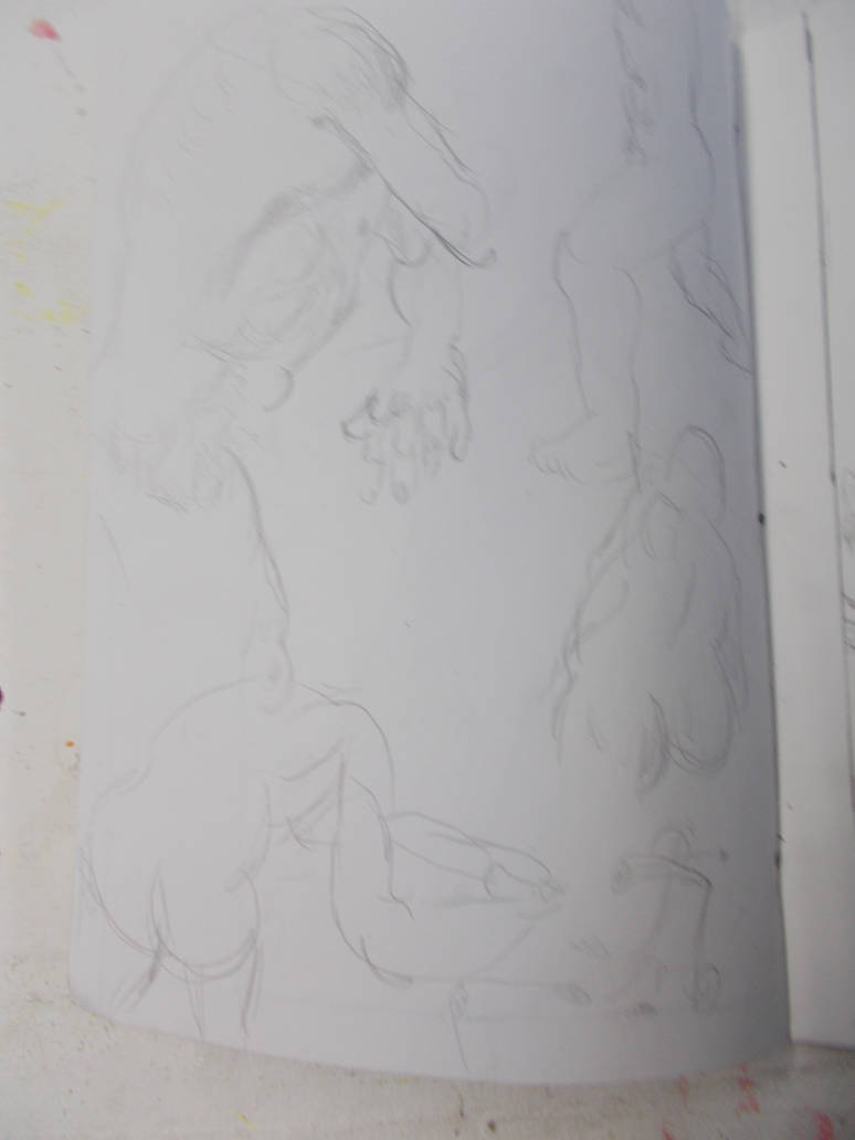
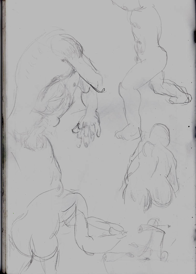
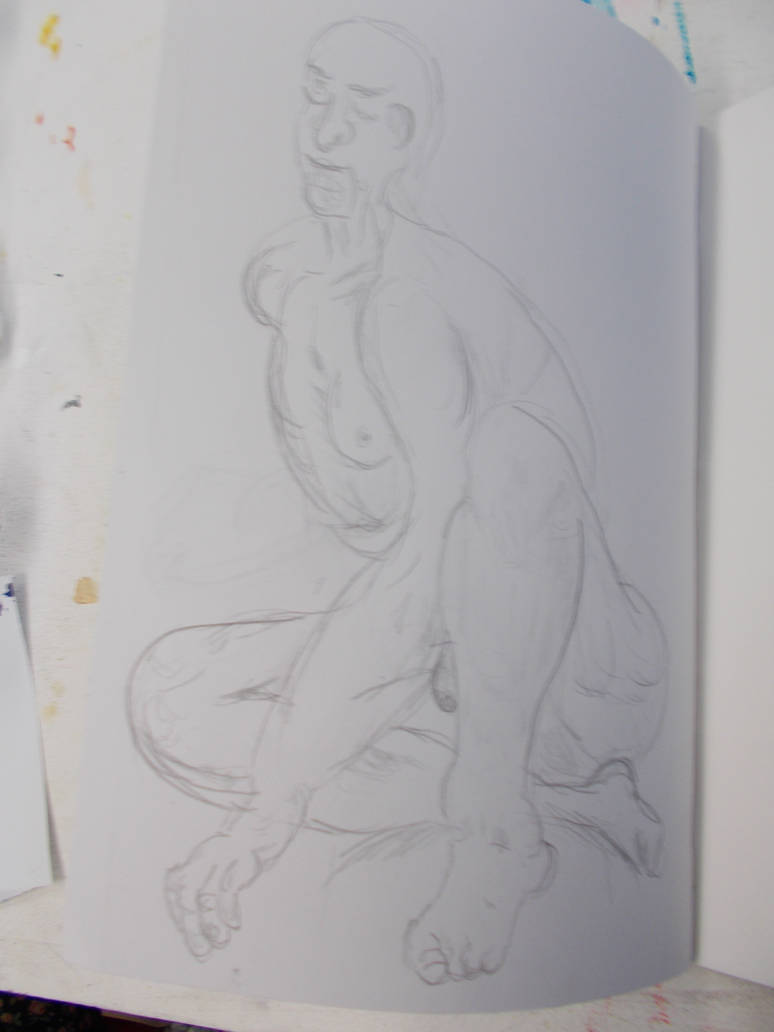
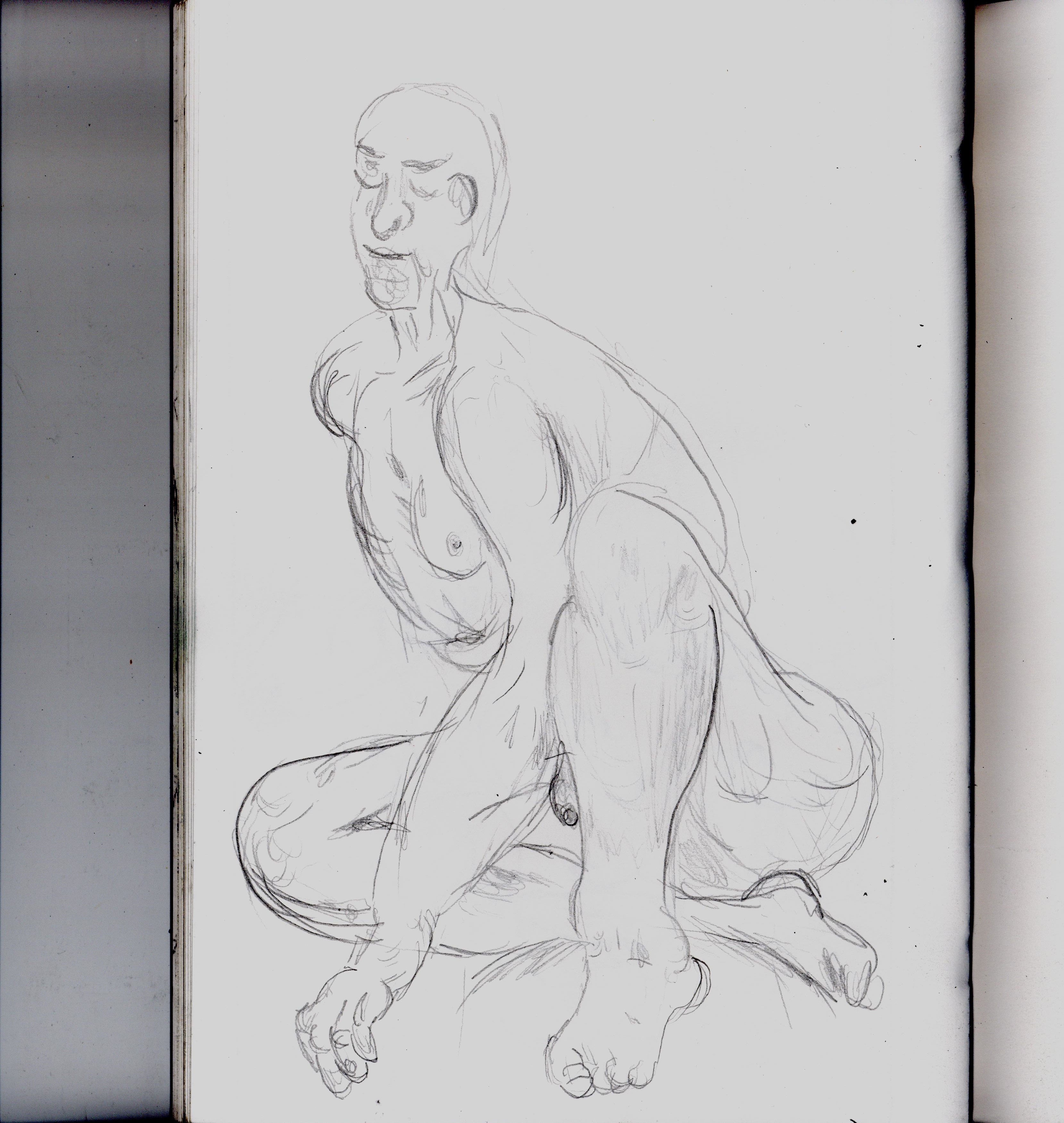
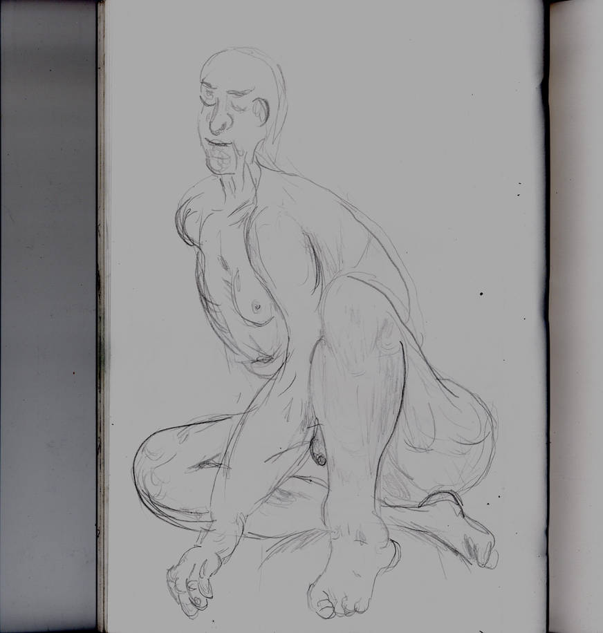
Today I went for the life drawing class here for the first time… ever really. Even brought my huge A2 sketchbook. And despite being so rusty I felt like i could draw at all I somehow lasted about 2 hours. Not bad.
I’ve spent the rest of the day writing this journal.
By next Tuesday I need to have some designs and I ideas I can turn into cutout paintings. I should have been working on that today. So I’m still behind in my work. But not as bad as last week. And at least I still have Monday.


![Dscn0177[1] by Hawkbittern](https://images-wixmp-ed30a86b8c4ca887773594c2.wixmp.com/f/4210065d-d40f-4940-ad49-0fe61ddb480a/ddlzdda-f25cbbe7-72fd-4640-bcda-a61b6b51ca0f.jpg/v1/fill/w_774,h_1032,q_70,strp/dscn0177_1__by_hawkbittern_ddlzdda-pre.jpg?token=eyJ0eXAiOiJKV1QiLCJhbGciOiJIUzI1NiJ9.eyJzdWIiOiJ1cm46YXBwOjdlMGQxODg5ODIyNjQzNzNhNWYwZDQxNWVhMGQyNmUwIiwiaXNzIjoidXJuOmFwcDo3ZTBkMTg4OTgyMjY0MzczYTVmMGQ0MTVlYTBkMjZlMCIsIm9iaiI6W1t7ImhlaWdodCI6Ijw9MTcwNyIsInBhdGgiOiJcL2ZcLzQyMTAwNjVkLWQ0MGYtNDk0MC1hZDQ5LTBmZTYxZGRiNDgwYVwvZGRsemRkYS1mMjVjYmJlNy03MmZkLTQ2NDAtYmNkYS1hNjFiNmI1MWNhMGYuanBnIiwid2lkdGgiOiI8PTEyODAifV1dLCJhdWQiOlsidXJuOnNlcnZpY2U6aW1hZ2Uub3BlcmF0aW9ucyJdfQ.clBrurDSgouDUjLvMEJNnOfyUnwK90lkcmvycpPrmog)